Think pink: a brief history of the trending designer colour
Texto por James Wormald
20.11.23
More than just bubblegum and Barbiecore, the rise of pink as a serious colour for designer interiors and surfaces has been on the (swatch) cards for years. These example projects and products explain.

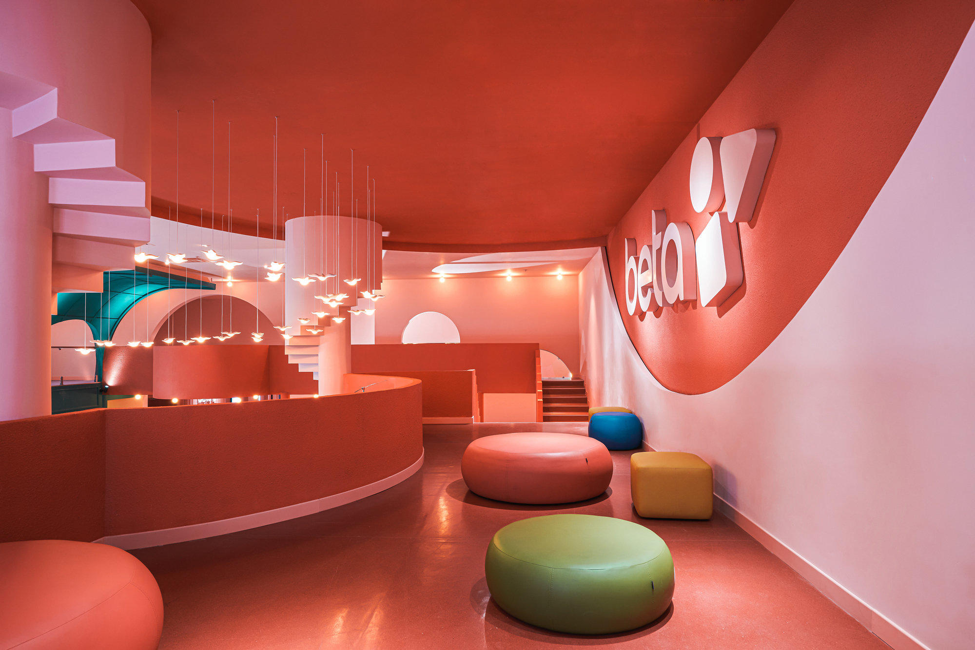
Vibrant bubblegum pink and coral green are applied at the Beta Cinema in Vietnam in a solid colour technique, designed to appeal to Gen Z film fans for its comic-book look. Photo: Do Sy
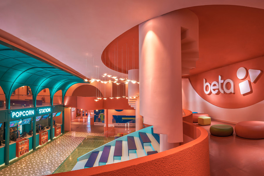
Vibrant bubblegum pink and coral green are applied at the Beta Cinema in Vietnam in a solid colour technique, designed to appeal to Gen Z film fans for its comic-book look. Photo: Do Sy
×Causing an international shortage of pink paint in 2022, the set of the 2023 Barbie film, was covered in bright shades of the colour, and is said to have sparked the current mega trend of colourful maximalism known as Barbiecore. But the route of pink into our hearts – and our interiors – is far more complex than that. When Pantone announced their 2023 Colour of the Year as Viva Magenta, for example, few eyebrows were raised too high. This rise of maximalism and bold, vibrant colours was already in full swing. More important to pink’s rise in favour is how it’s gradually been allowed and accepted into our lives by shrugging off the shackles of gender association. Acceptance first came, however, in everything but name.
Pink is being allowed to leap over the fading gender divide
Due to some misread market research, pink has been used as a gender signifier for girls and ‘femininity’ since the middle of the 20th century. Until recently, men who bravely chose pink wardrobes, for example, either claimed it to be a mistake – bad light in the clothes store – or renamed it as another nearby shade – remember Ross’ ‘faded salmon’ shirt in TV show Friends in 2002?
Finally, with the gradual and ongoing dismantling of the concept of gender binary, we’ve come to realise that splitting objects, interiors and even language – along with people – into one of just two genders is neither healthy nor helpful, and pink is being allowed to leap over the fading gender divide. The following pink products and projects taken from the Architonic catalogue and the ArchDaily archive explain how pink is more than just a way of life, it's a bold and expressive colour that’s open to all.


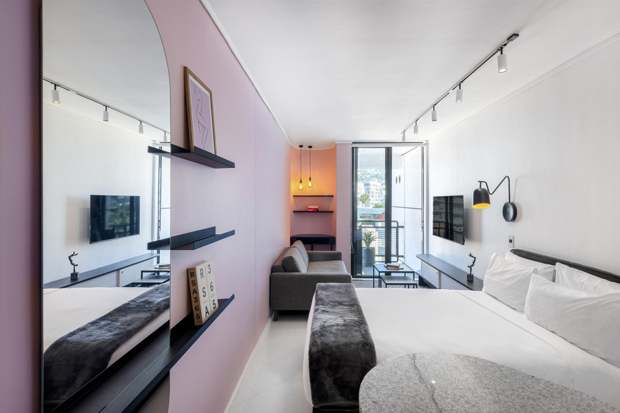

Beta Cinema’s pink palette (top), pastel pink walls at the Flamingo Holiday Apartments (middle) and pink door frames at the Steele's Road House (bottom). Photos: Do Sy (top), Veloz Photos (middle), Lorenzo Zandri (bottom)
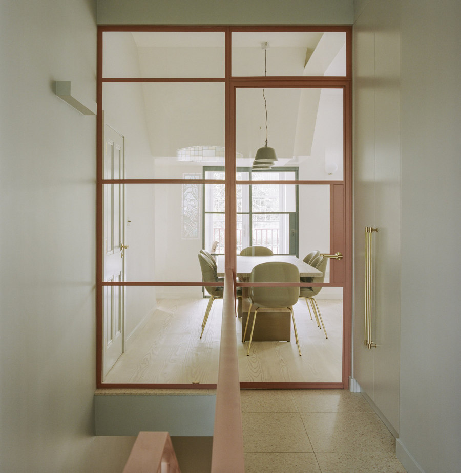
Beta Cinema’s pink palette (top), pastel pink walls at the Flamingo Holiday Apartments (middle) and pink door frames at the Steele's Road House (bottom). Photos: Do Sy (top), Veloz Photos (middle), Lorenzo Zandri (bottom)
×Using bright and pastel pink in interiors
The attention-grabbing interior of the Beta Cinema in Ho Chih Minh City, Vietnam, for example, is overly, but also perfectly, saturated with bubblegum pink amongst a rich art nouveau palette of coral green and warm orange. Combining a solid colour technique with strong geometric shapes, architects Module K have created an instantly instagrammable comic-book interior that targets Gen Z with its virality.
‘Like Bauhaus on heat’
The pastel-pink feature walls inside the Flamingo Holiday Apartments, meanwhile, separated by thick black lines, bring a touch of ‘tropical modernism’ to its coastal setting in Cape Town, South Africa, as architects Robert Silke & Partners put it, ‘like Bauhaus on heat.’ As well as similarly using thick black lines to separate a neutral palette in its interior door frames and hardware, architects Neiheiser Argyros explain how they used thick lines of pastel pink in door frames and stair railings to ‘define the entry space’ of the Steele's Road House.

-

Osaka
La Cividina
-
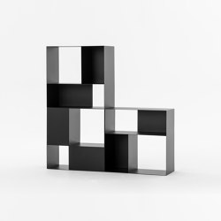
B302 Bookcase
Mara
-
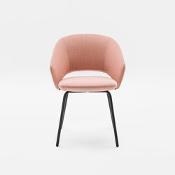
Icon 7000
Mara
-
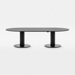
Follow Meeting Large 298ML
Mara

Pastel palette of pinks and lilacs at the calming CAIA cosmetics office (top), Mara’s Icon pink-upholstered office chairs (middle) and WYE’s bright pink |chamfer| bench (bottom). Photos: Emil Fagander (top)
Pastel palette of pinks and lilacs at the calming CAIA cosmetics office (top), Mara’s Icon pink-upholstered office chairs (middle) and WYE’s bright pink |chamfer| bench (bottom). Photos: Emil Fagander (top)
×-
|chamfer| Bench Calypso-Red
WYE
The modern gender-neutral office space in pink
Even in more formal settings such as offices, designers can use the pinkvolution to give workplaces more colourful and comforting, yet still neutral, colour palettes. This head office and showroom for a cosmetics brand, for example, blends pastel pinks and lilacs with neutral whites and earth tones in curved shapes and draped fabric backdrops for a stress-free atmosphere. The Icon office chair, for example, for office furniture brand Mara, is one such product designed for the workplace that combines its curved form with pastel fabric options, including pink. WYE’s Lowboard sideboard, meanwhile, from the |chamfer| collection is multifunctional in its simplicity and able to feature in many pastel-based settings.
-

Marrakesh | Ivory
RAK Ceramics
-

Marrakesh | Dark Grey
RAK Ceramics
-
Marrakesh | Pink
RAK Ceramics

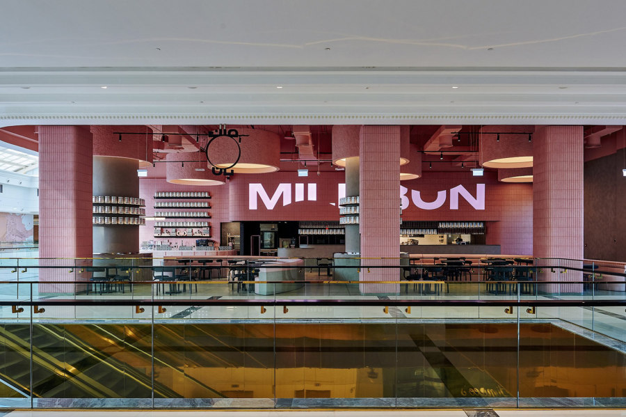
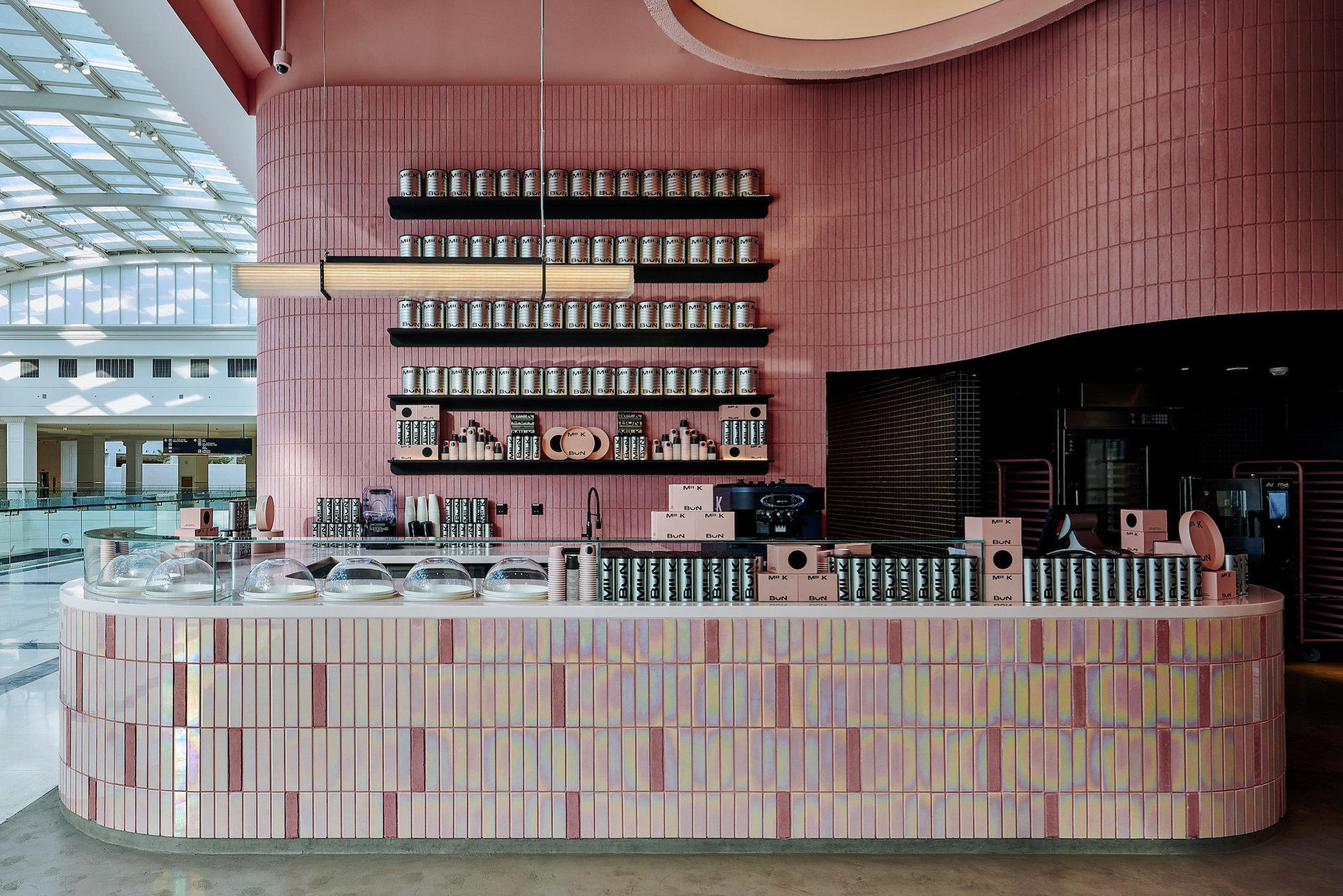
Glittering pink Marrakesh tiles from RAK Ceramics (top) and the pink-tiled surfaces of the MILK BUN fast-casual restaurant in a Qatari shopping mall (middle, bottom). Photos: Ingrid Rasmussen (middle, bottom)

Glittering pink Marrakesh tiles from RAK Ceramics (top) and the pink-tiled surfaces of the MILK BUN fast-casual restaurant in a Qatari shopping mall (middle, bottom). Photos: Ingrid Rasmussen (middle, bottom)
×Sparkling pink tiles
A large part of Barbiecore is to embrace the fake. And although I’m not suggesting we build our own life-size Barbie Dreamhouses with pink plastic, there are more sustainable materials, like the glossy pink Marrakesh tiles from RAK Ceramics, for example, that offer a glamorous sparkle and shine. Again, targeted towards younger generations, the MILK BUN fast-casual restaurant in a Lusail shopping mall in Qatar fills many of its surfaces with pink tiles, including the pink-hued iridescence of those under the dessert counter.


-
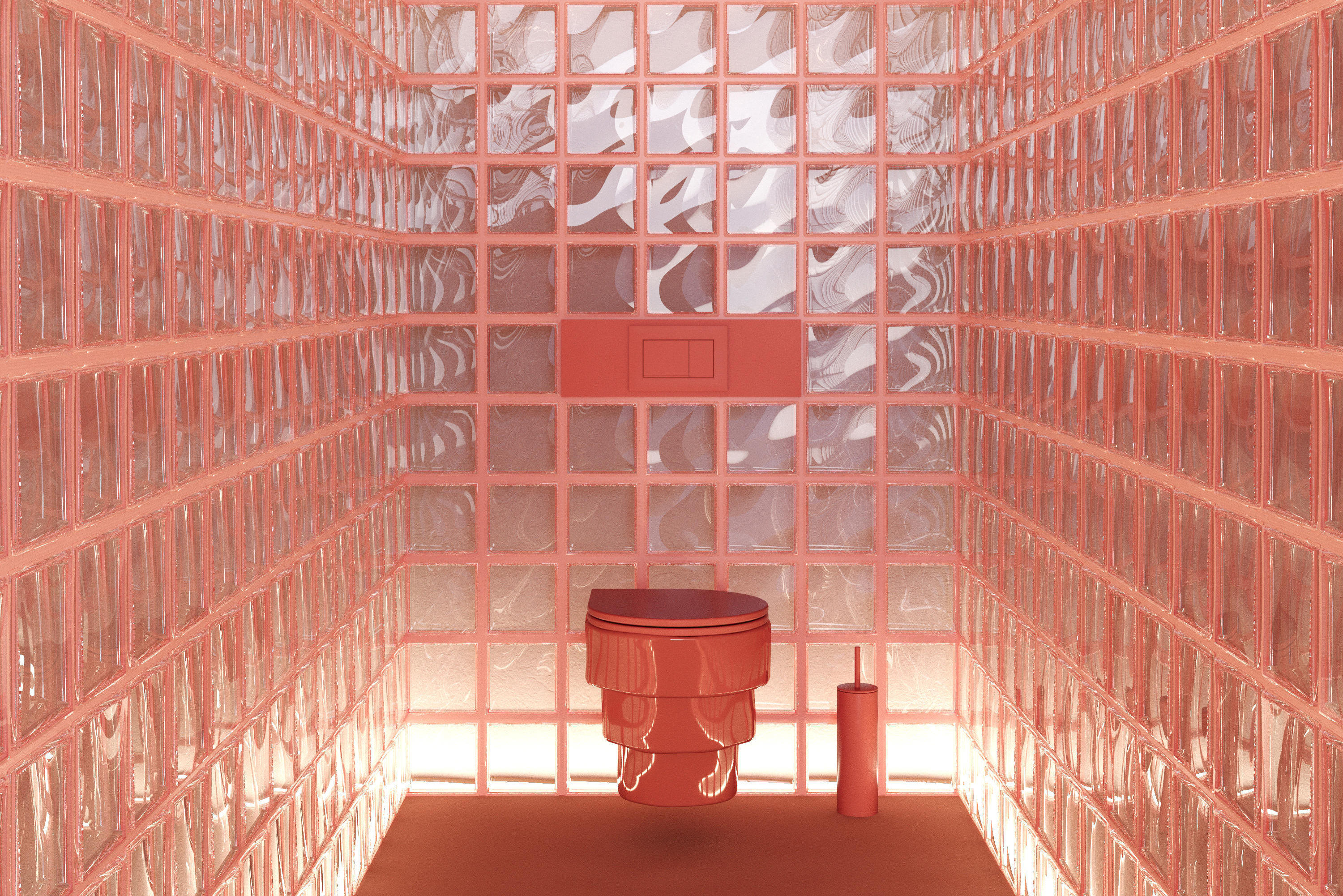
Callipyge | Rosa
Trone
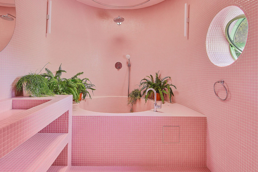
The Hope House bathroom (top), covered in floor-to-ceiling pink tiles, and Trone’s contemporary pink-hued Callipyge WC (middle, bottom). Photos: José Hevia (top)

The Hope House bathroom (top), covered in floor-to-ceiling pink tiles, and Trone’s contemporary pink-hued Callipyge WC (middle, bottom). Photos: José Hevia (top)
×-
Callipyge | Rosa
Trone
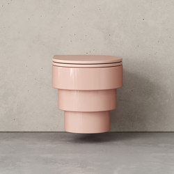
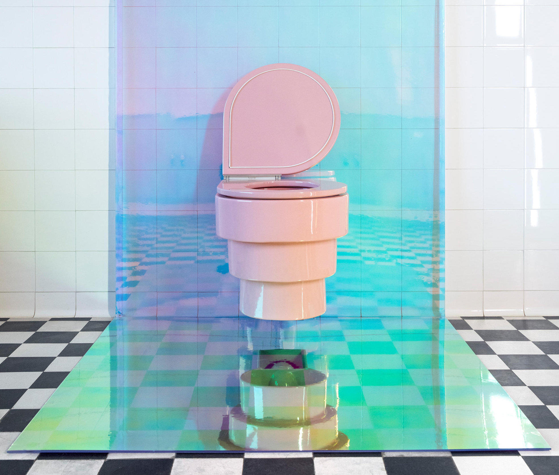
The sweet return of pink in the bathroom
It wasn’t long ago, of course, that we decided to nail shut the lid on the mid-century pink bathroom suite, so it’s a surprise to see it make its return so soon. With the rise of pink as a suitable and serious decor colour, however, the pastel-pink bathroom makes perfect sense. This is the belief, at least, of the owners of Hope House in La Floresta, Spain. Their monotone flamingo-pink bathroom features pink tiles from floor to-and-including ceiling, including the bathtub and basin fixtures, too. The only respite comes in the form of resident plantlife, itself given extra verdure by its contrast to the surrounding surfaces. With a pink version of the Callipyge WC, meanwhile, manufacturer Trone forgets the shade’s past bathroom transgressions and looks only to the future, with an ultra-contemporary, some may say futuristic, even, form.


-

265
Flos

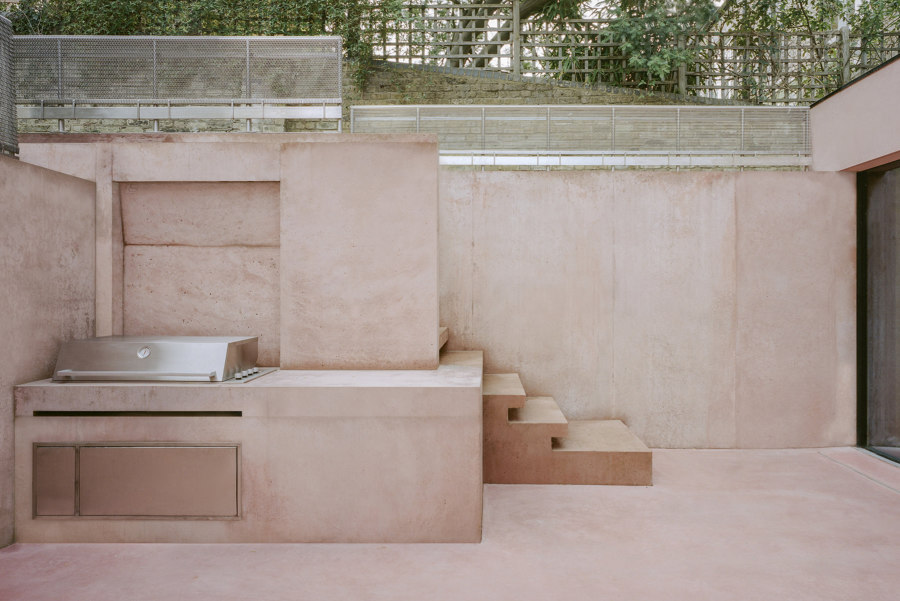
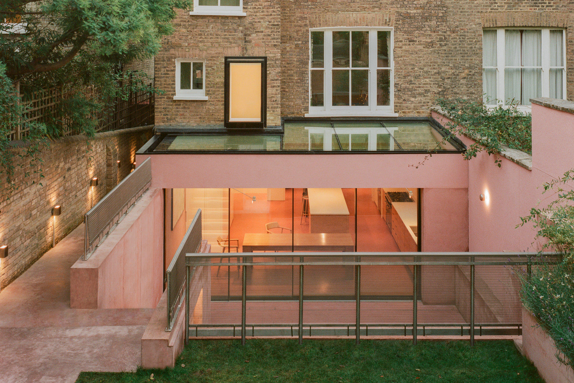
Pigment House’s concrete rear lightens both the home’s exterior and nearby interior areas with its pink pigment. Photos: Lorenzo Zandri
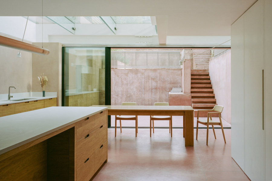
Pigment House’s concrete rear lightens both the home’s exterior and nearby interior areas with its pink pigment. Photos: Lorenzo Zandri
×-
265
Flos
A pretty exterior leads to inner beauty
It’s not just inside homes, offices and shopping malls where pink is making its comeback, it’s becoming a popular colour option for exterior spaces, too. Take the Pigment House project in North London, for example; set on a steep hill, the ground at the front of the house falls away, while the rear of the property felt dark and damp, surrounded by high retaining walls. By digging out the rear, architects Unknown Works were able to create a multi-level space at the rear for adults and children to enjoy and explore. With its own concrete walls, however, it would have been easy for the space to resemble a prison courtyard, if not for the pink hue added to the pigment – hence the name of the project. The colouration, inspired by the client’s travels in Mexico and reminiscent of Mexican architect Luis Barragán’s iconic use of the colour, gives the outdoor space a warm and exotic atmosphere.
© Architonic
Head to the Architonic Magazine for more insights on the latest products, trends and practices in architecture and design, or find inspiration in a whole world of projects from around the globe through ArchDaily’s architecture catalogue.