Ultrafabrics: bringing the Pantone Color of the Year to life
Historia de la marca de Harriet Thorpe
Leicestershire, Reino Unido
17.04.23
With its Pantone collaboration, premium producer of high-tech performance materials Ultrafabrics is helping the design industry to comfortably connect with the chromatic zeitgeist.

Vibrant energy has been injected into this living space with Ultrafabrics’ take on Viva Magenta for materials: ‘Vivid Punch’
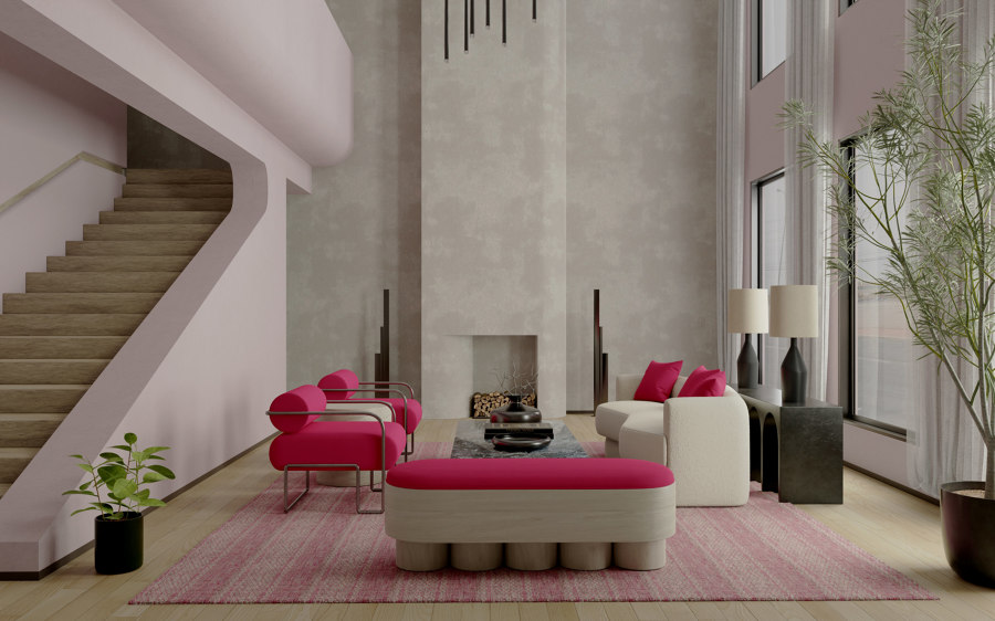
Vibrant energy has been injected into this living space with Ultrafabrics’ take on Viva Magenta for materials: ‘Vivid Punch’
×-

Montage | Vivid Punch
Ultrafabrics
The celebrated Pantone Color of the Year grabs design industry headlines every year. The colour choice results from strategic trend analysis, manifesting itself in global lifestyle shifts, in culture from fashion to film, and in new material and technological innovations. It has influenced design across industries for 24 years; more than 10 million designers and producers around the world communicate through Pantone’s universal colour language, which provides consistency across materials and finishes.
This year’s colour of the year, Viva Magenta, 18-1750, was chosen as a ‘signal of strength’; fearless, optimistic and pulsating with energy. Yet – seeing as not every interior is as audacious and rebellious as this shade – designers might be wondering how Viva Magenta can be embraced in interiors across every sector. And why exactly should a bold, warm colour such as Viva Magenta be embraced at all?

-
Montage | Vivid Punch
Ultrafabrics
Ultrafabrics’ Awakening palette shows how Viva Magenta can work alongside neutral colours, natural materials and biophilic design

Ultrafabrics’ Awakening palette shows how Viva Magenta can work alongside neutral colours, natural materials and biophilic design
×-
Montage | Vivid Punch
Ultrafabrics
Complementary colour palettes
Providing some answers here is Ultrafabrics. The leading producer of premium, high-tech performance materials for indoors and outdoors has partnered with Pantone to create a series of complementary colour palettes and a suite of future-forward virtual interiors for ideas and inspiration. ‘Pantone’s Color of the Year is a critical driver of design. Together with Pantone, we’re helping designers bring cultural timeliness to timeless design. The collaboration will help the design industry connect to the colour zeitgeist in a sustainable and enduring way,’ says Barry Silverman, vice president of marketing and branding at Ultrafabrics.
Using a bold colour in space can be daunting, but Ultrafabrics has launched the first in a series of custom palettes inspired by Viva Magenta to help
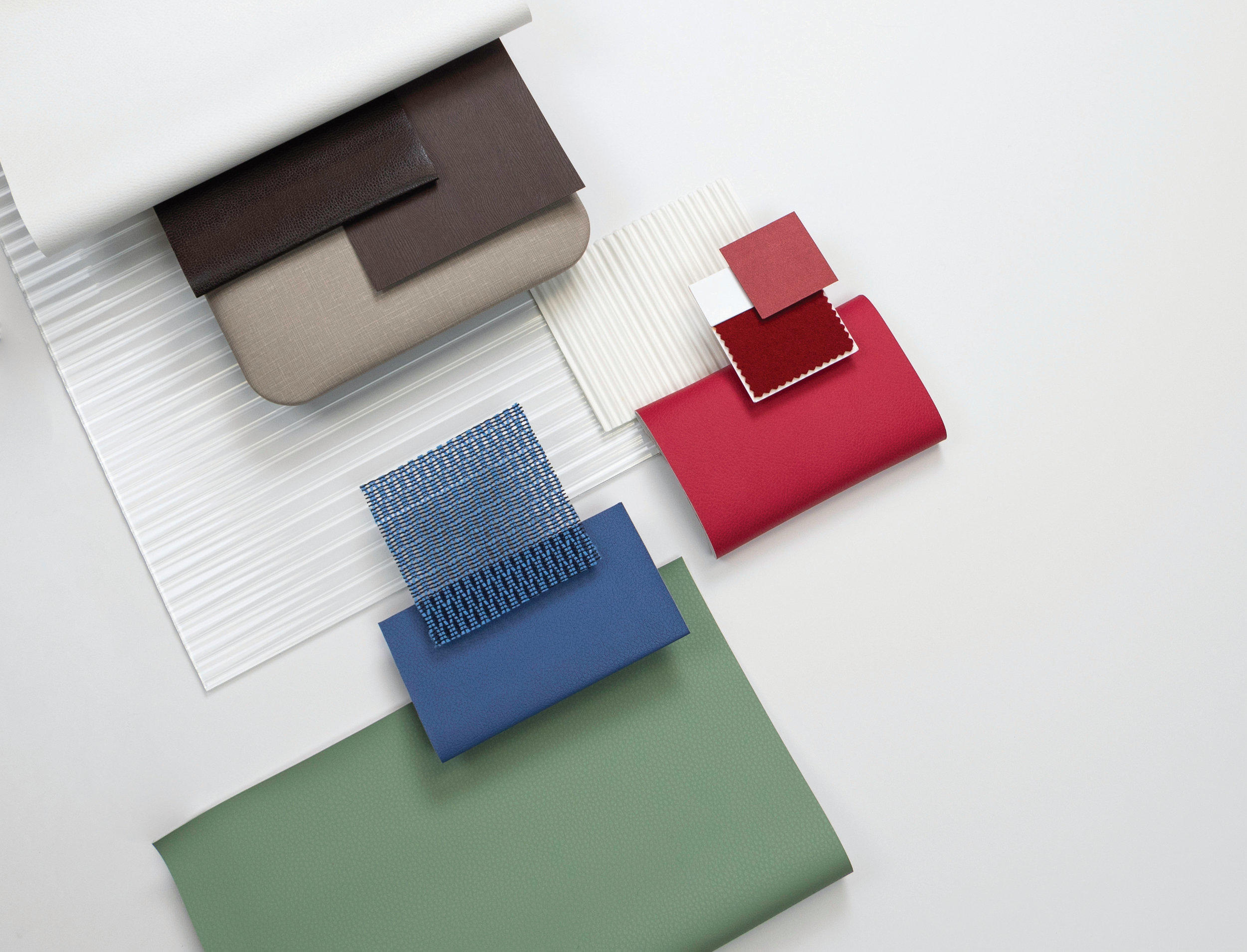
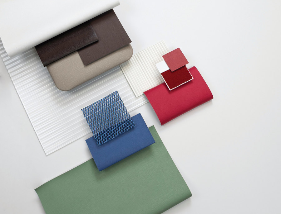
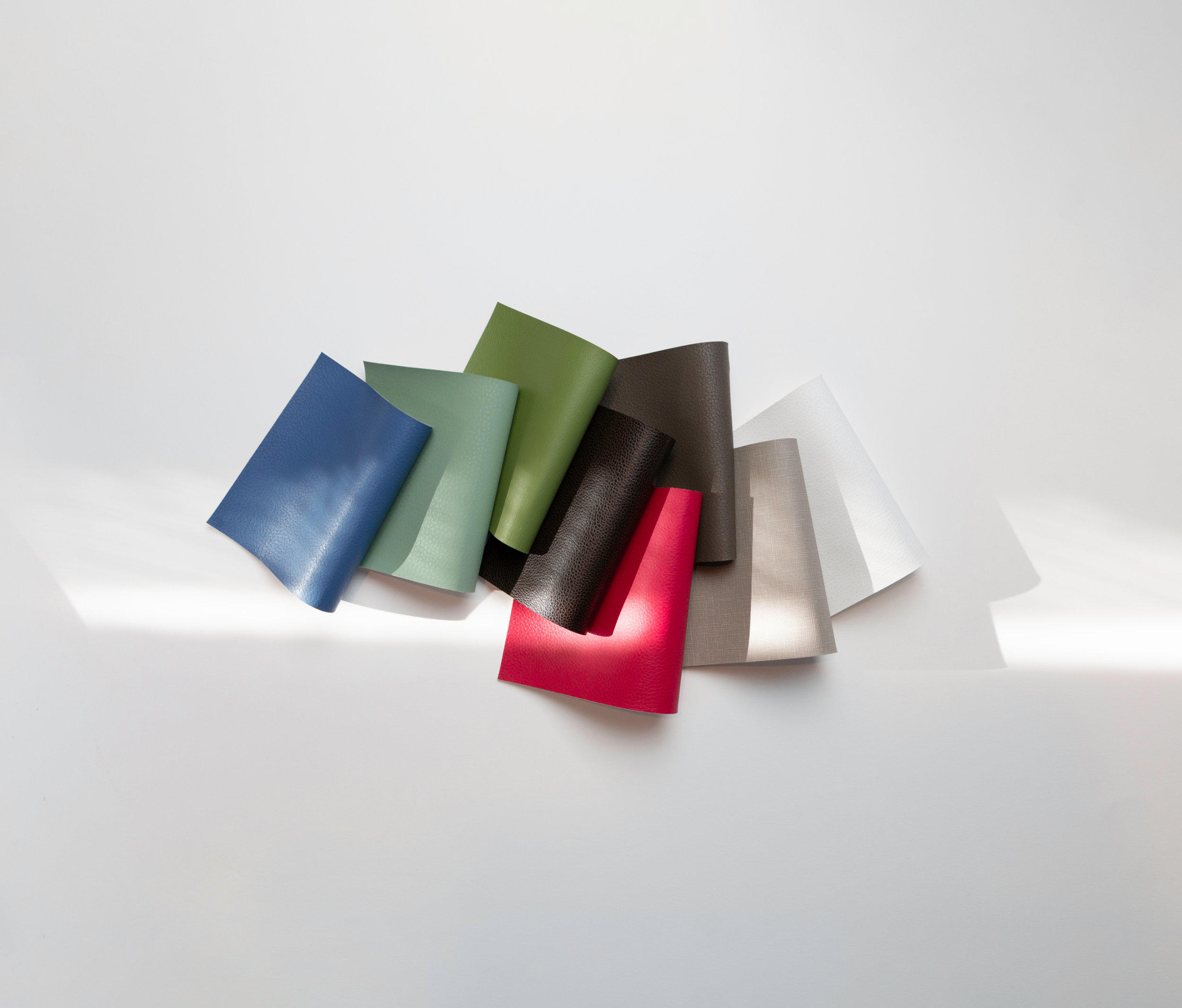
Using a bold colour in space can be daunting, but Ultrafabrics has launched the first in a series of custom palettes inspired by Viva Magenta to help. ‘We want to inspire designers and encourage them to think a little differently about approaching bold colours like Viva Magenta,’ says Kimberle Frost, resident colour specialist at Ultrafabrics. The first palette named ‘Awakening’ is a collection of eight Ultrafabrics products, closely matched to Pantone shades. Vivid Punch replicates Viva Magenta and is available as part of the UF Select Montage collection and can be custom developed across the material portfolio.

-
Lino | White Marigold
Ultrafabrics
-
Brisa | Skyway
Ultrafabrics
-
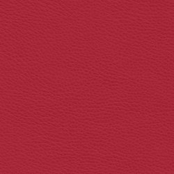
Montage | Vivid Punch
Ultrafabrics
-
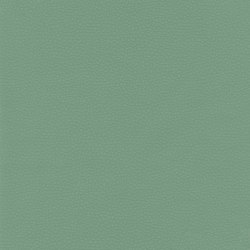
Volar Bio | Matcha
Ultrafabrics
Kimberle Frost, colour specialist at Ultrafabrics, explores the many dimensions of Viva Magenta; the Awakening palette combines colours and materials for designers to mix and match across interiors

Kimberle Frost, colour specialist at Ultrafabrics, explores the many dimensions of Viva Magenta; the Awakening palette combines colours and materials for designers to mix and match across interiors
×-
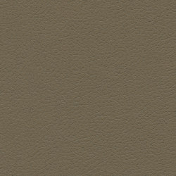
Brisa | Bark
Ultrafabrics
-
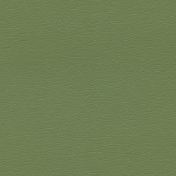
Ultraleather | Sonora
Ultrafabrics
-
Montage | Vivid Punch
Ultrafabrics
-
Promessa | Horsehair
Ultrafabrics
Ready to reset
‘Awakening’ combines Vivid Punch with nature-inspired colours such as soft green Matcha, cool brown Bark, and dusky blue Skyway. ‘They combine the beauty of warm, grounded neutrals with harmonious colours found in nature, all tied around Viva Magenta, which gives this palette a vibrancy and energy,’ says Frost. ‘Calling it “Awakening” feels appropriate given that we have come out of a pandemic, and we’ll soon be emerging from winter hibernation. It’s about a moment when we’re suddenly aware and ready to reset.’
‘This isn’t just about envisioning our fabrics in spaces, it’s about a chorus of materials that reference the depth and breadth of how the Color of the Year’
Ultrafabrics’ client list of luxury brands spans industries, from residential and contract furniture to upholstery for yachts and private jets. Olly Mason, head of interiors at Wallpaper*, and Brazilian digital visualisation studio jformento were tasked with envisioning five different, future-forward and highly imaginative spaces that demonstrate how embracing the upbeat Viva Magenta can provide an everlasting effect on wellbeing and how bold colour can be used as a smart tool in space.
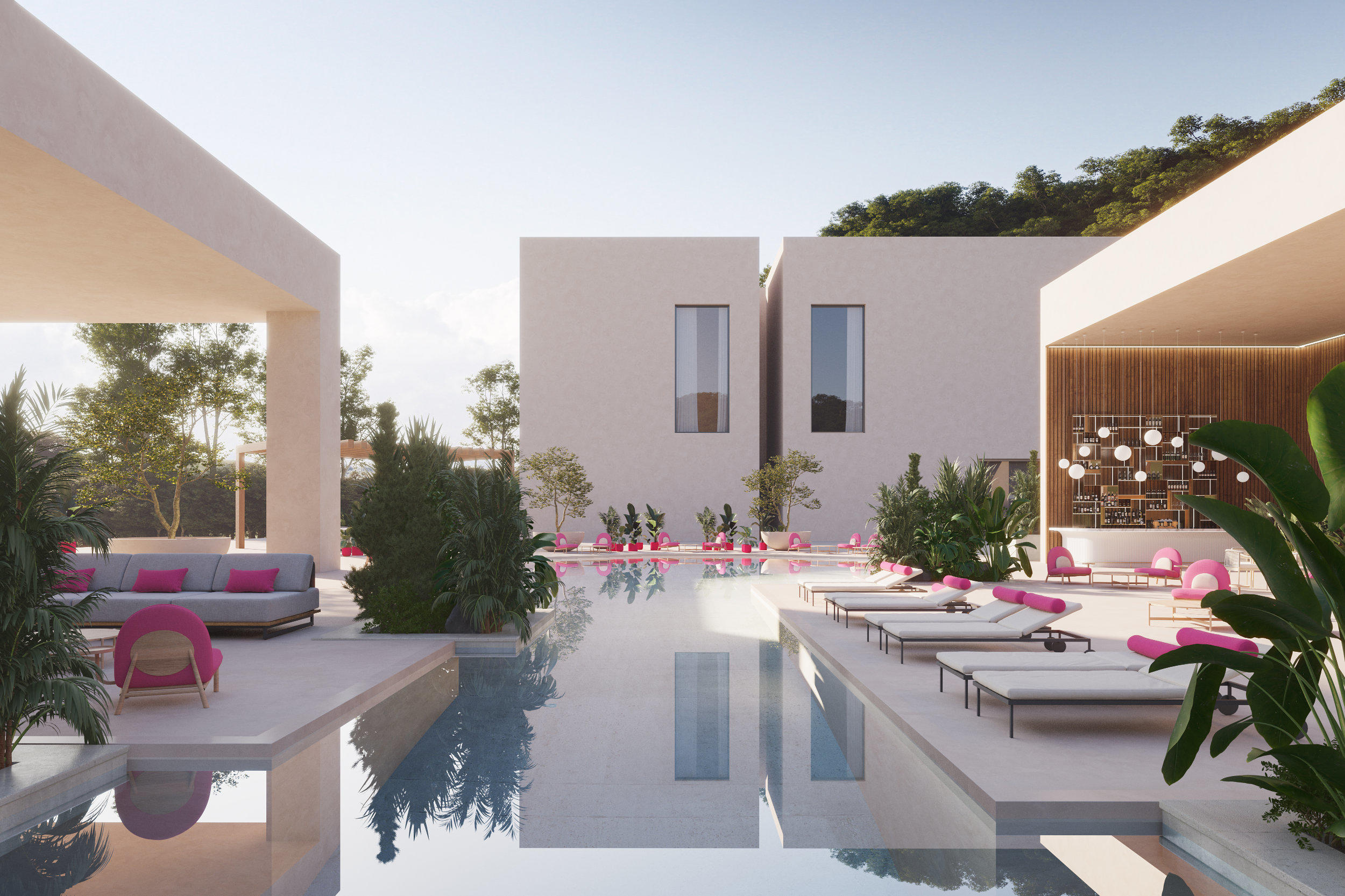

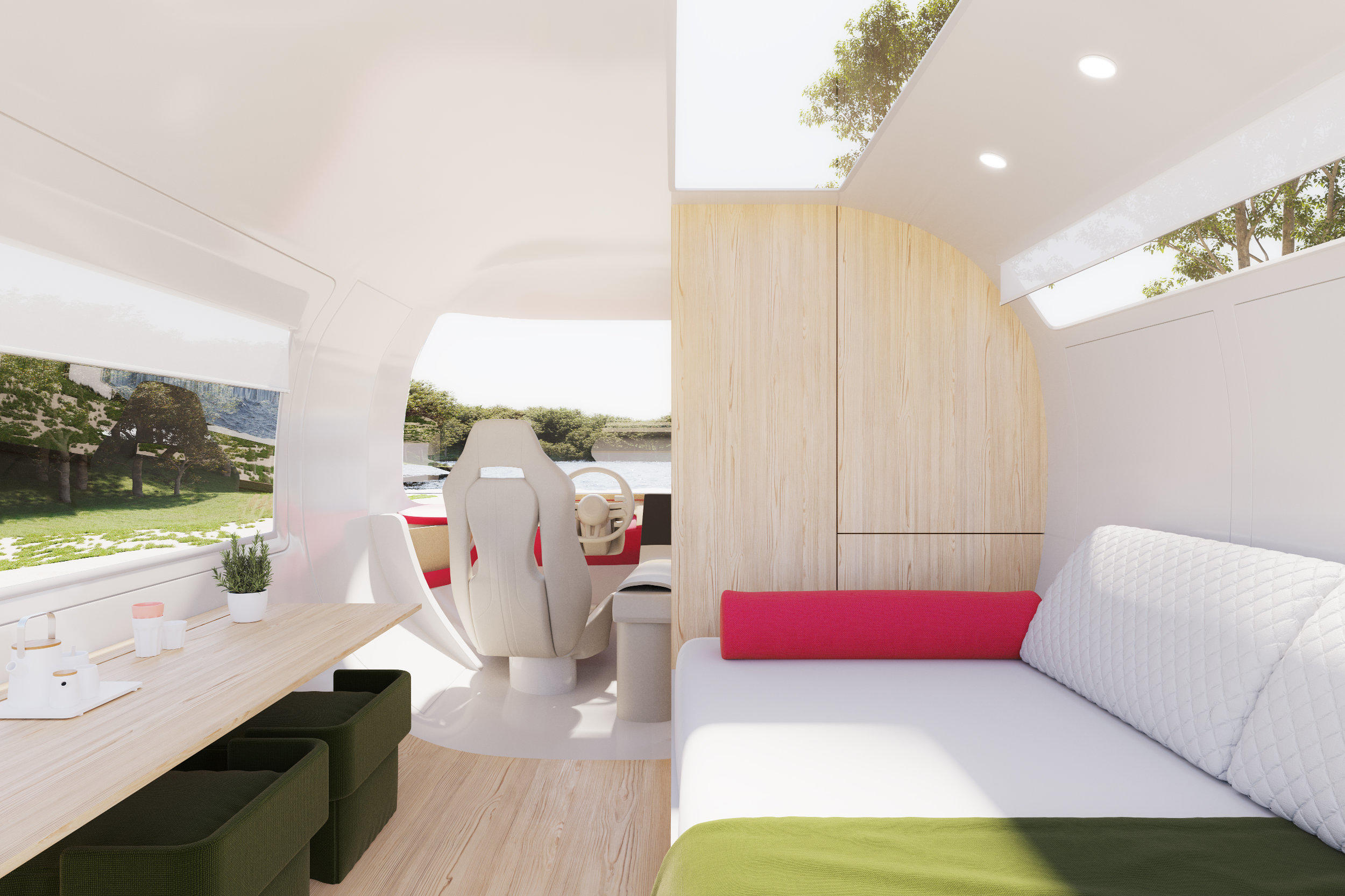
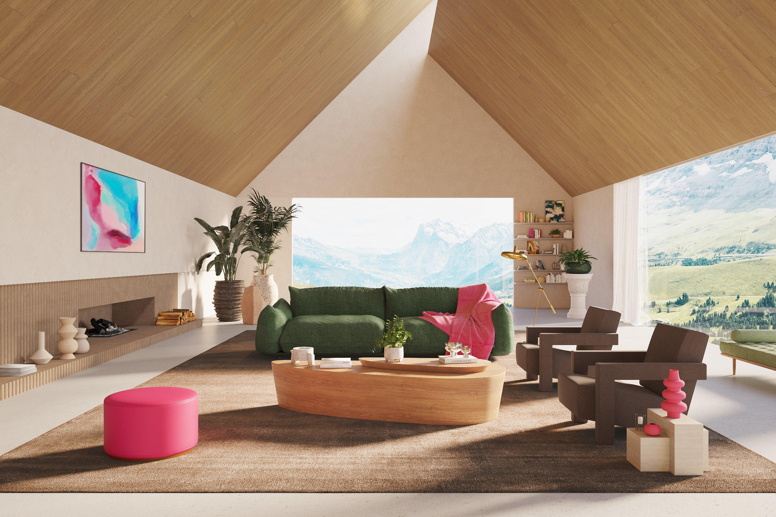
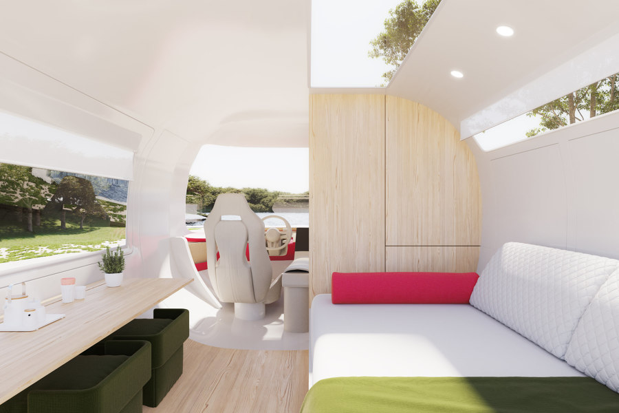
Here, Viva Magenta packs a punch at a hotel poolside and brings dynamism to the interior of an RV
-
Montage | Vivid Punch
Ultrafabrics
A design vision for the future
In workplace and healthcare settings, Ultrafabrics’ Vivid Punch offers something unexpected, enlivening modular furniture and dividing otherwise neutral space with impact, encouraging socialising and collaboration. Poolside at a tropical hotel, bright outdoor seating and lounge chairs punctuate natural environments with modernity. In living spaces at home and in an RV, the colour of the year proves that it can feel both fresh and domestic.
‘Pantone trusted Ultrafabrics to explore how their Color of the Year works in the built environment. Viva Magenta is a starting point and ‘Awakening’ takes it further. This isn’t just about envisioning our fabrics in spaces, it’s about a chorus of materials that reference the depth and breadth of how the Color of the Year is used, combined with a design vision for the future,’ concludes Nicole Meier, director of branding at Ultrafabrics.

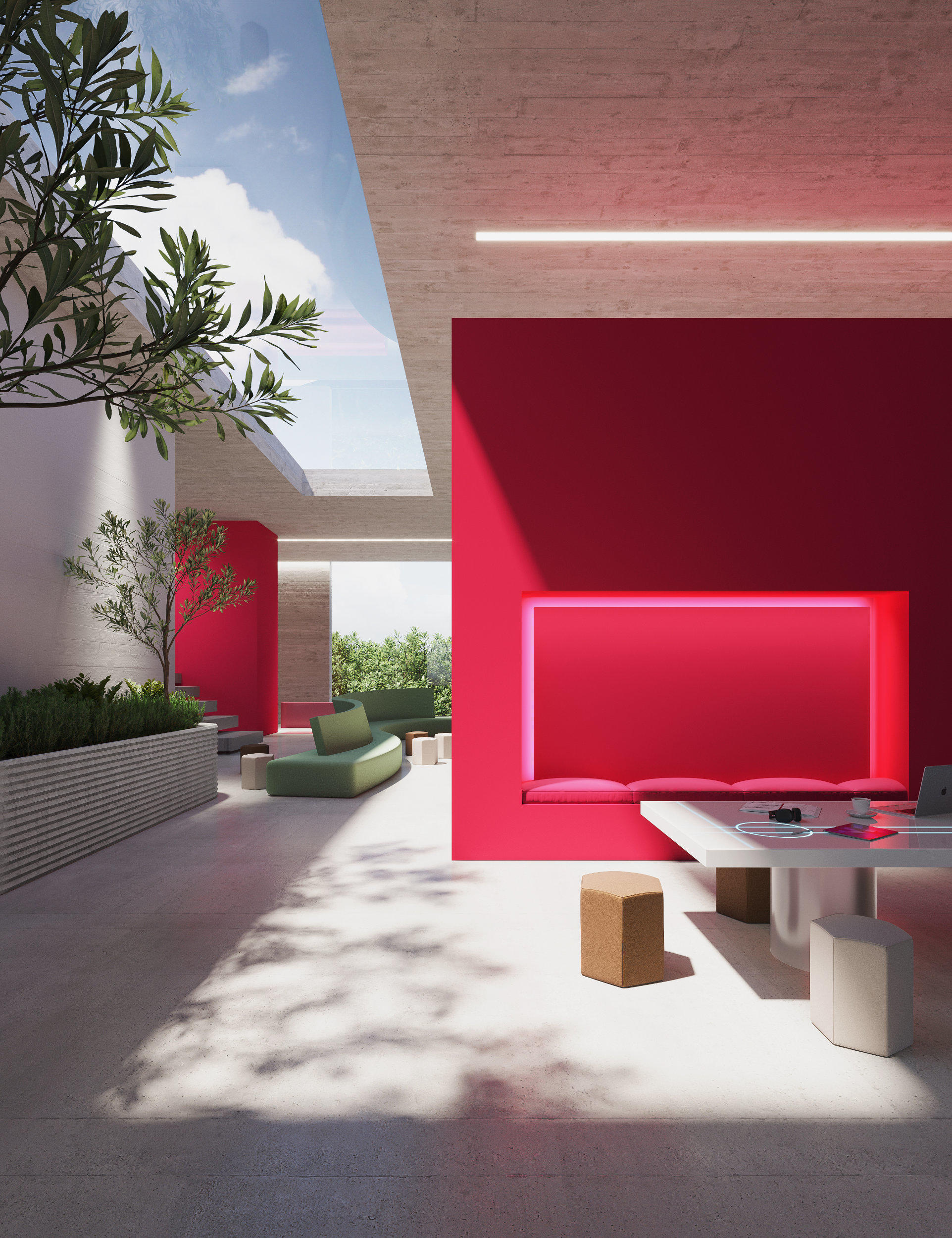
Ultrafabrics shows how bright magenta pink can bring workspaces and healthcare and education interiors to life
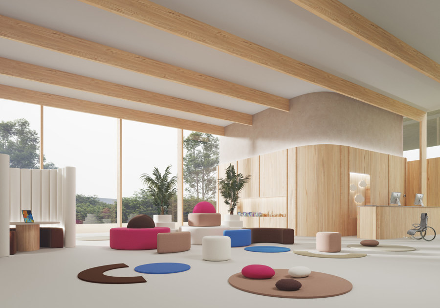
Ultrafabrics shows how bright magenta pink can bring workspaces and healthcare and education interiors to life
×-
Montage | Vivid Punch
Ultrafabrics
Keeping energy levels high, Ultrafabrics is launching further Viva-Magenta-inspired colour palettes throughout the year for fresh interior inspiration, plus a creative event series hosted in partnership between Ultrafabrics and Pantone. The future, for 2023 at least, looks bright.
© Architonic
Head to the Architonic Magazine for more insights on the latest products, trends and practices in architecture and design.