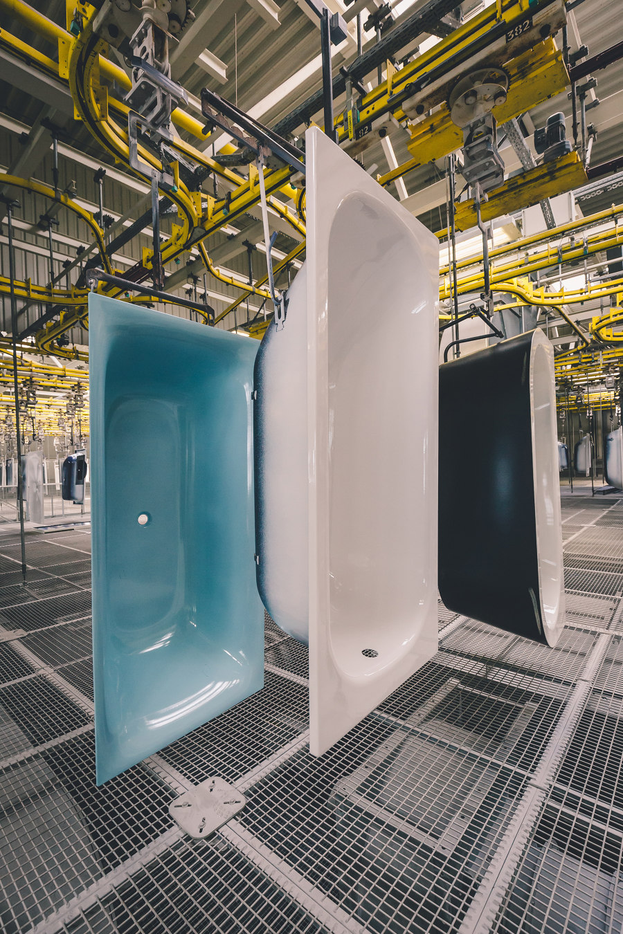
All fired up: Bette does colour
Brand story by Simon Keane-Cowell
Delbrück, Germany
06.10.20
Calling all individualists! Leading German bathroom specialist BETTE turns the bathroom into an interior space for unique chromatic expression.
‘So long as it’s black.’
The godfather of standardised production, Henry Ford, famously extended his zealous drive for optimisation to the realm of taste, offering customers of his Model T automobile zero choice in terms of colour.
From our 21st-century perspective, this might smack of hubris, but the patrician-like pioneer of assembly-line manufacturing saw it differently. ‘Standardisation means nothing unless it means standardising upward,’ he is also quoted as saying.
But how we design, how we manufacture, and how we consume has clearly changed.
The rise of the individual, as opposed to the collective, and how this is played out in the material world around us, has meant the increased proliferation and significance of colour in our daily lives. We now have a greater understanding of the emotional and psychological effects that the chromatic wields, whether we are, in the moment, consciously aware of them or not.
We now have a greater understanding of the emotional and psychological effects that the chromatic wields, whether we are, in the moment, consciously aware of them or not
Within the interior landscape that is the bathroom, the past few decades have been dominated by one particular chromatic expression – white.
While the 1970s saw a maximalist deployment of colour in bathrooms, in particular in the form of browns and greens (the infamous avocado suite), the years that followed were dominated by white as the universal hue for sanitary products. Here, a metaphoric purity in terms of aesthetics was mapped onto the notion of actual purity, white being associated traditionally with hygiene. Think hospitals.
German bathroom specialist Bette has long ploughed its own innovative furrow. While others have explored the various formal possibilities and material limits of ceramic, the family-run manufacturer, in business since 1952, has never departed from its materials of choice and expertise – steel-titanium alloy, enamelled with all-natural materials.
The result: a range of robust and super-hygienic, archly architectural bathroom components, popular with interior architects and planners internationally. Given Bette’s experimental bent, it should come as no surprise that its approach to colour is equally leading-edge.
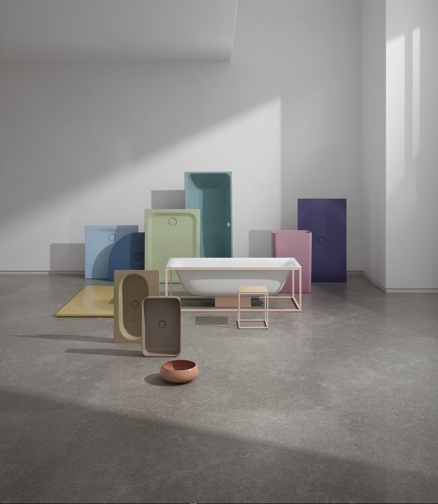
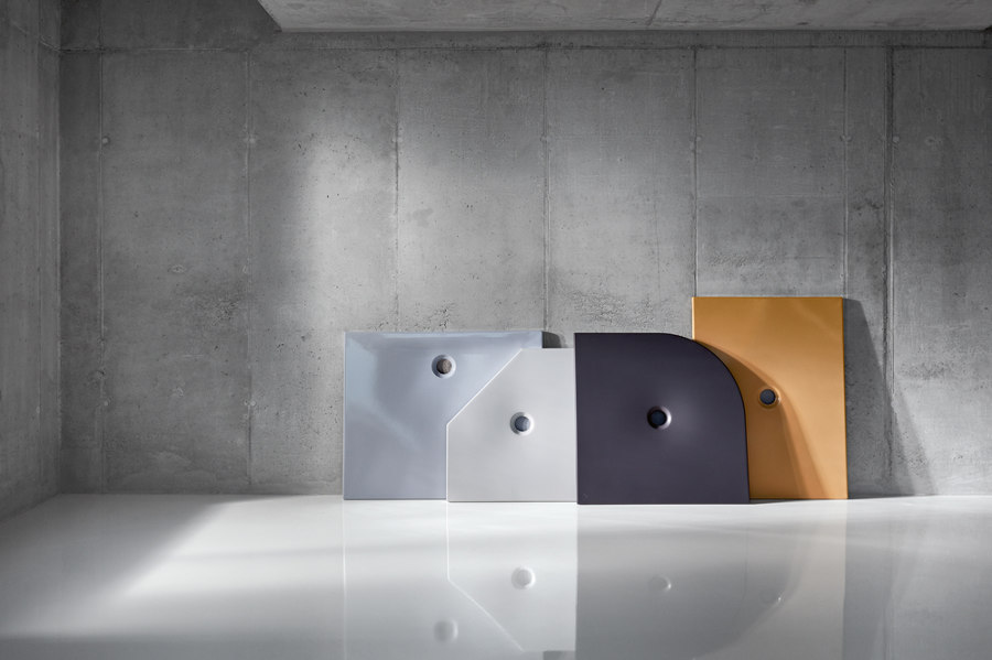
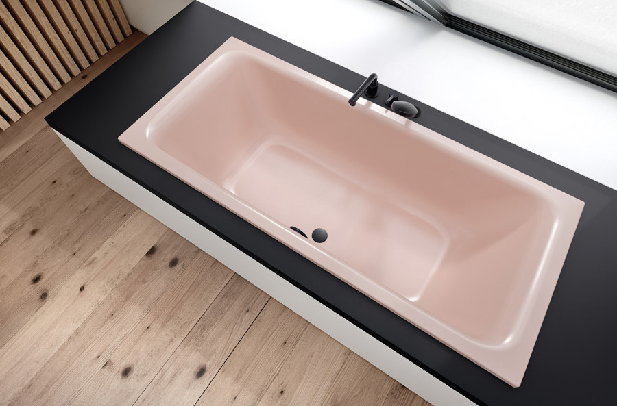
The brand presents specifiers with a legion of chromatic options for baths, washbasins and shower trays – some of them legacy colours from the big ceramic-sanitaryware producers, but the majority of them hues especially developed in-house by Bette as part of its research, not to mention unique, bespoke colours created for specific bathroom projects.
Given Bette’s experimental bent, it should come as no surprise that its approach to colour is equally leading-edge
‘We don’t follow fashion trends,’ explains marketing director Sven Rensinghoff, ‘but, rather, identify longer-term tendencies via our regular dialogue with the market and with designers and other professionals. We also keep an eye on what the big colour producers are doing.’
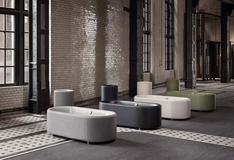
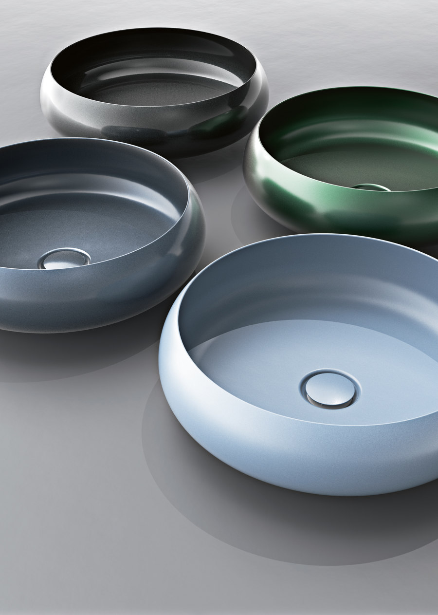
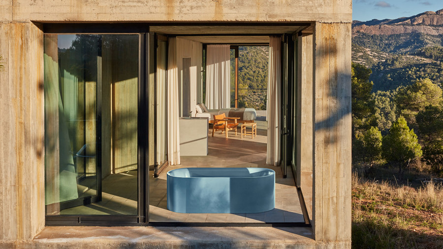
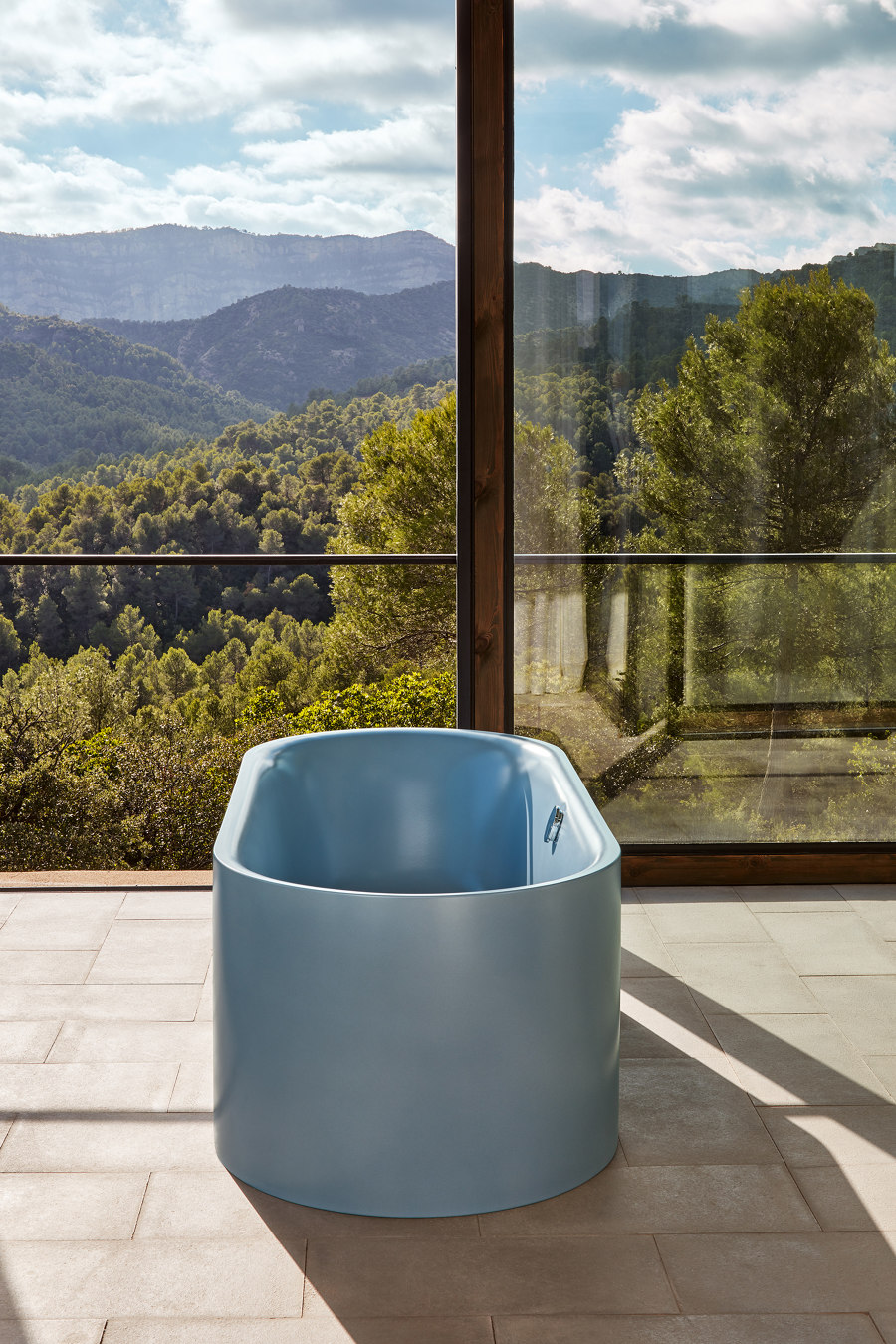
The result are products that can be deployed either as isolated colour accents in an otherwise monochrome setting – for example, Bette’s super-sculptural, convex-shell BetteCraft basin or its circular, stand-alone BettePond bath – or coordinated with other coloured elements in a more chromatically emphatic scheme.
No prizes for stating that the decision to bring colour into the design process affords specifiers far more creative scope when planning, particularly when it comes to one-off-colour or colour-match commissions – but it’s important to underscore this nonetheless. ‘Our ability to individualise in terms of colour allows the bathroom to really become an interior room,’ is how Rensinghoff puts it.
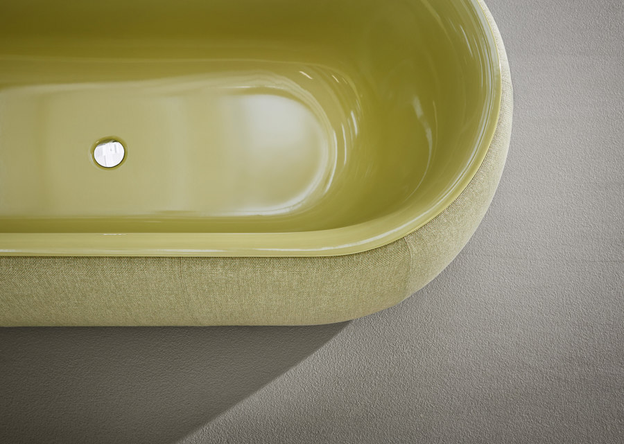
‘For a long time, all we’ve had is white and chrome, white and chrome. And colour only becomes more important as the trend for open-plan bedroom-bathrooms continues to grow.’ In addition to matt shades, more dynamic, shimmering hues are available, which deliver a particularly compelling optical texture.
And the process? Special chromatic requests are tested in Bette’s laboratory first of all to ascertain their feasibility. Every colour to be applied must meet the manufacturer’s standards for, among other things, scratch, acid and UV resistance.
Once approved – or selected, in the case of its two dozen or so, ready-to-go hues – the colours are mixed in the lab and then melted together with the titanium steel in Bette’s wet-in-wet enamelling process. This means, unlike your favourite pair of jeans, they won’t run. Ever. This is tough-as-nails, long-life stuff. Henry Ford would have approved of that part, at least.
© Architonic

