Designer Justine unravels the Delight collection: modulyss
Text von modulyss
Zele, Belgien
15.05.19
MODULYSS has launched Delight, a collection of five carpet tile designs bringing the joy of shimmering effects and subtle metallics to work and hospitality spaces. We asked Justine, the designer of the Delight collection, about her creative process.


Hi Justine, as a way of introduction, can you tell us a little about yourself?
I’m Justine Huysman, and I’ve been working as a product designer at modulyss for about 5 years. Previously, I studied textile design at the Luca School of Arts in Ghent, Belgium. My job entails a lot of creativity, trend-watching and innovativeness. I thoroughly enjoy the process of translating creativity into carpet tiles and often take my inspiration from current trends found in daily life. For each collection, we look for a different approach to designing and always create a new concept. The main challenge during our design process lies in finding the sweet spot between creative freedom and the achievement of technical specifications in order to develop a high-performance carpet tile.

What inspired you to design the Delight collection?
Delight is our sophisticated response to the mixed metallic trend. Mixing metals by combining deep colours and different textures and metallic finishes, has been an edgy interior and fashion trend for some time. Recently, we have noticed that the line between residential and commercial spaces is becoming blurred. That’s why we wanted to respond to this trend with a new collection. However, in contrast to the bold presence of metallic shine in interiors, we translated it into a subtle gloss that gives the Delight collection a timeless and luxurious character.
How is the metallic effect in the carpet tiles created?
We experimented with dull and glossy yarns to create a sophisticated shine. The combination of both types of yarn allowed us to represent the metallic effect subtly and more alluringly. Our plan was to do this for several products, each having its own look. The 5 designs are tied together by their similar colour palette and different but compatible textures, which also allows them to be mixed & matched, one of the strengths of our collections.
Blaze was inspired by the digital pixel rain. It combines the minimal design of a minituft with a subtle shine and an irregular yarn pattern. We really wanted to add a minituft to the Delight range because it’s one of modulyss’ signature designs.
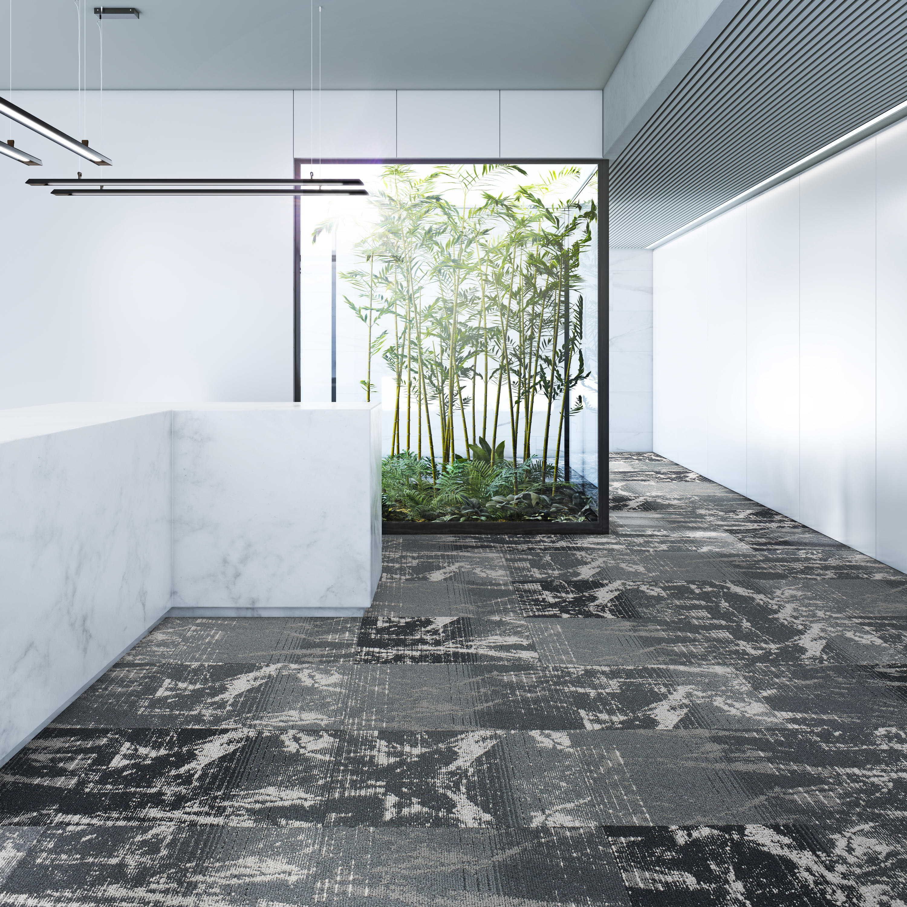
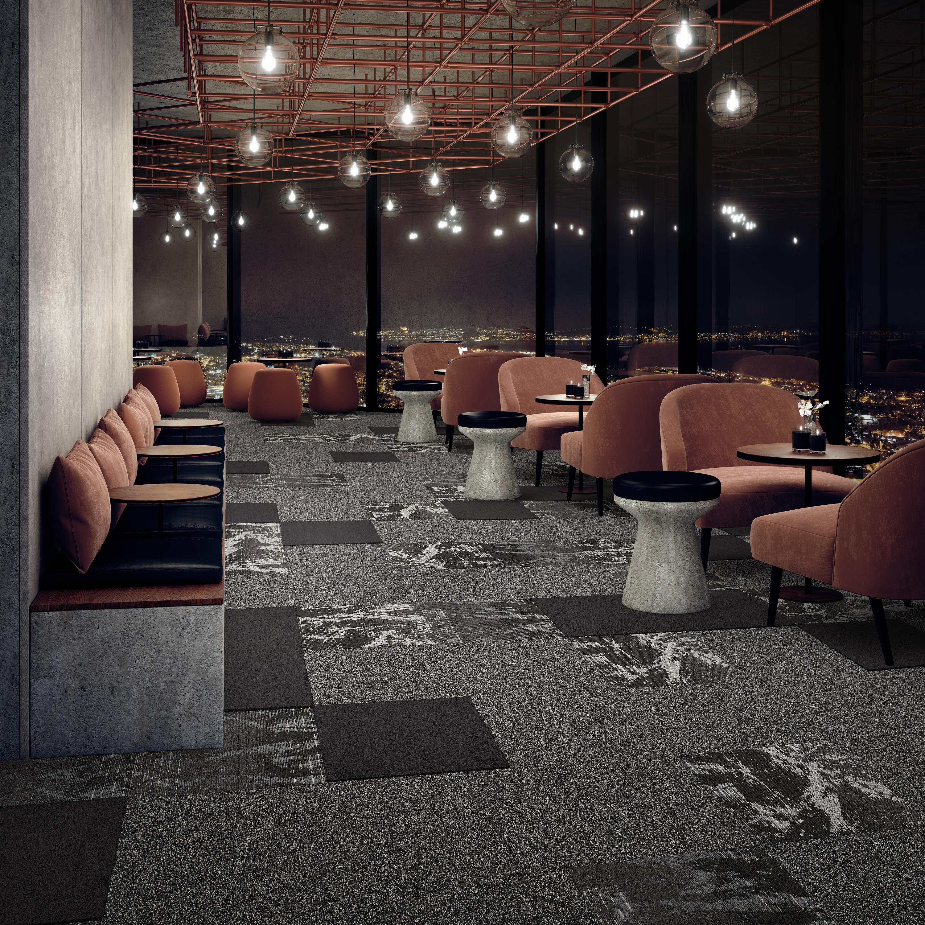
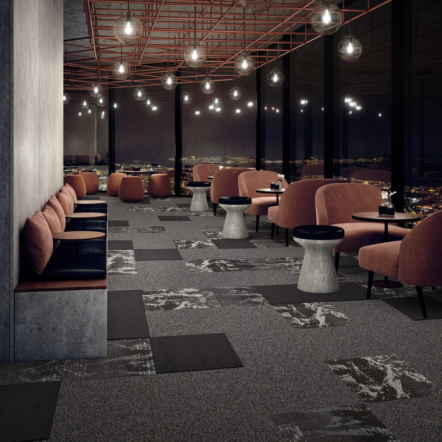
Dusk and Dawn have the most expressive drawings. Both feature a multi-layer effect that only reveals the metallic shine randomly, in different spots and only after a few layers. Dusk translates this effect into a geometric structure that is reminiscent of the ageing process of materials like peeling paint. Dawn, on the other hand, has a more organic marble look.
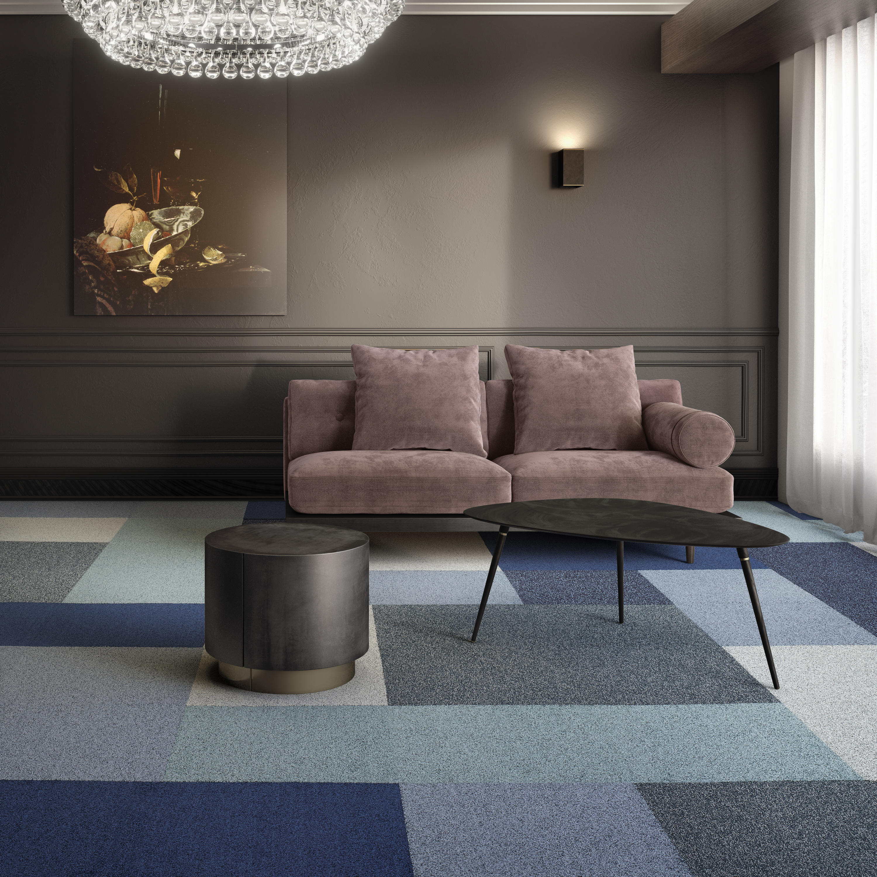
Inspired by the lush and luxurious residential carpets, Gleam offers a rich and dense carpet tile. It invites you to take off your shoes and feel its softness. When you walk on it, the long piles lie in different directions, providing a deep texture and a colour-changing effect that we love. By adding black yarns to the dull and glossy yarns, we created an even more intense and aged colour effect.
For the Spark collection, we started with a layer of colour and put a subtle metallic effect on top. It’s the perfect substitute for the Metallic collection, but transcends it in its elegance. The colour palette allows you to go for a ton-sur-ton look, or to create a bold colour combination.

Dawn matt & bright (top); Spark mixed & matched with Gleam and Dawn (above)
Can you tell us something about the colour palette?
Metallic chic is all about rich and deep colours. For Delight, we based our colour palette on the main metallic hues like gold, copper, silver and rose gold, to which we added rich and trending colours. From the start of our design process, we kept in mind that the 5 products should be mixed & matched. That’s why we designed them in similar colours. Fun fact: when you arrange the sample folders below one another, you can clearly notice the parallel colour palette.
Why are Dusk and Dawn divided into a matt and bright version?
We wanted to give creative freedom to architects and designers. The matt version has a minimum share of glossy yarns, and the bright version has a minimum share of dull yarns. This allows designers to combine them, but also to use them separately without losing the metallic effect. By mixing both versions, you can create a lot of depth with just one colour or one design.
How do you envision this collection being used in a project?
Thanks to the diversity in designs and the unifying colour palette, we’re looking forward to seeing how designers and architects will use their creativity in mixing & matching the 5 designs. Ultimately, we imagine them being combined in one building.