Beyond the pale: VOLA
Storia del Marchio di Gerrit Terstiege
Horsens, Danimarca
11.04.19
Even after fifty years, the revolutionary and iconic 111 mixer from Danish manufacturer VOLA is still embraced – and evolving, with a continually expanding colour palette.

Arne Jacobsen is one of only a few 20th-century architects, among them giants like Mies van der Rohe and Le Corbusier, who have created not only spectacular houses, but smaller scale designs that are still in production decades after they were conceived. All classics now, they were oftentimes designed for a specific architectural environment, and as a bold formal statement. As architects, they aspiredto create something new, while solving an aesthetic or functional problem they perceived.
This was also the case when Jacobsen, together with Verner Overgaard, developed a line of fittings for the National Bank of Denmark that is still produced by Vola to this day. Of course, for this remarkable building, Jacobsen also used lamps and door-handles he designed – striving to create an architectural Gesamtkunstwerk: a coherent aesthetic expression. 1968 was in many ways a revolutionary year, and Jacobsen's designs for Vola´s iconic 111 system from that year had a truly innovative concept: to hide all the tubes in the wall. The simplicity and functional beauty of his designs still appeal to today's architects and interior designers.

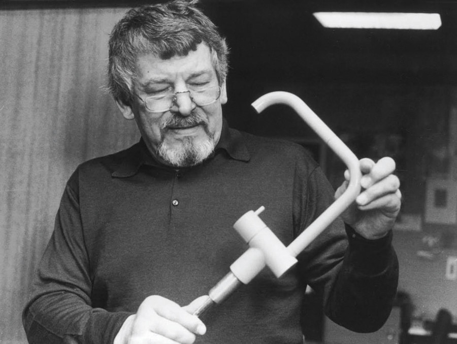
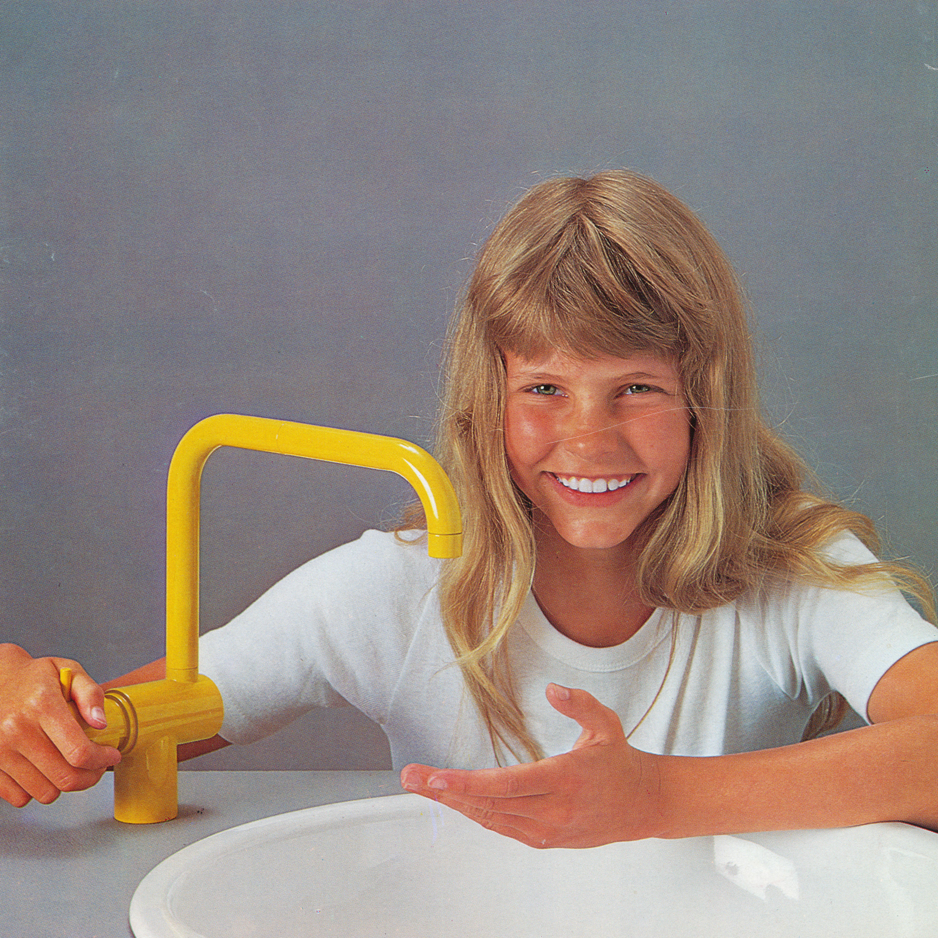
Top: Vola founder Verner Overgaard with the KV1, a fitting that has turned into a design classic. Above: A historical advertising photo from the 1970s, when Vola introduced colours in line with the spirit of the times
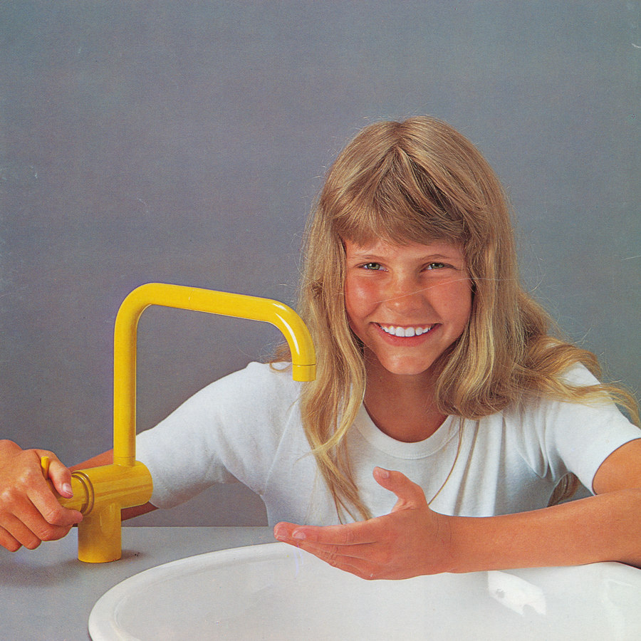
Top: Vola founder Verner Overgaard with the KV1, a fitting that has turned into a design classic. Above: A historical advertising photo from the 1970s, when Vola introduced colours in line with the spirit of the times
×But how do you keep a product family alive that was created more than 50 years ago? Our taste, our sense of style have surely changed since the late sixties. As a company, you cannot ignore trends and the preferences of your customers. One of the advantages of the Jacobsen/Overgaard fittings is their flexibility, which due to a systematic approach, enables the possibility to combine elements and to adjust to various environments. Its formal DNA is so strong that it was (and is) transferable to a great number of new products in the same style without losing its character.
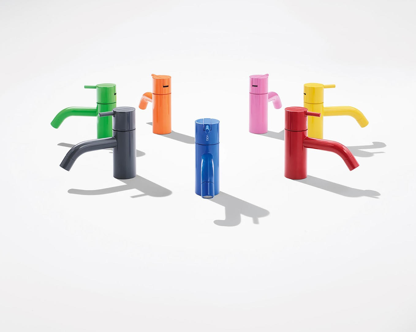
Without a doubt, one of the determining factors of its overall design and appeal is quite a simple one: colour. It may be the natural colour of a specific metal used, be it polished or brushed. Or a colour specially developed to fit and complement Vola´s existing colour rage.

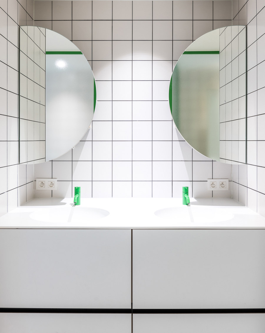
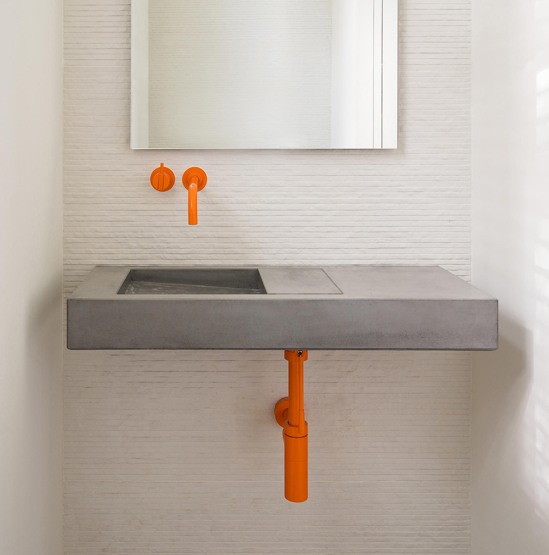
No matter if you choose a bright green or orange, the more toned-down and neutral the rest of a bathroom interior is, the stronger the effect colourful fittings and pipes will have; Photos: 1 Johan Van Staeyen, 2 Eric Roth
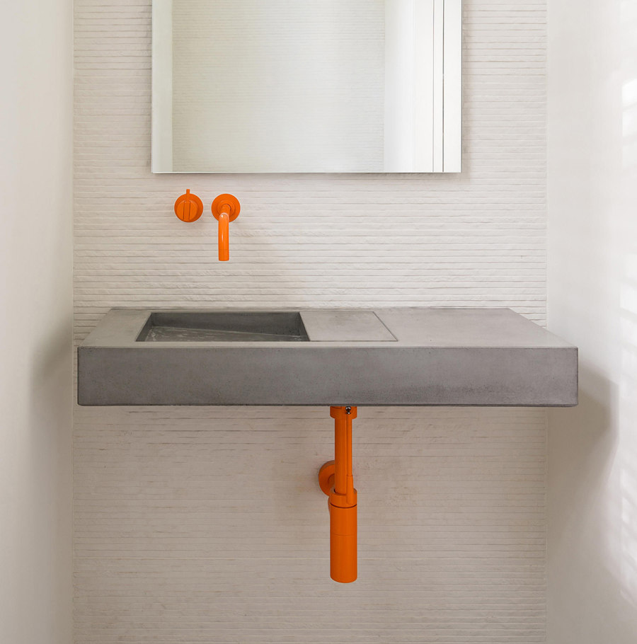
No matter if you choose a bright green or orange, the more toned-down and neutral the rest of a bathroom interior is, the stronger the effect colourful fittings and pipes will have; Photos: 1 Johan Van Staeyen, 2 Eric Roth
×And once it comes to choosing a new colour for a design classic, trends and preferences of various markets and cultures play an important role. After all, one of the prominent trend topics of this year´s ISH in Frankfurt was that of new colours for bathroom interiors. The development of bathrooms moving from merely functional to very personal spaces has significantly raised the importance of colours. However, choosing a certain colour for a fitting is a much more difficult task than choosing a colour for the walls of a bathroom, simply because the decision will have a more lasting effect.
So following trends in this field has two sides: yes, a certain colour can be a strong statement, but keeping in mind its lasting effect, it must be wisely chosen.

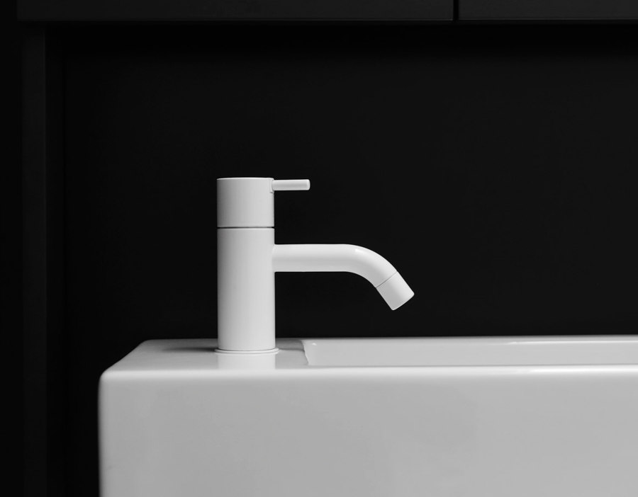
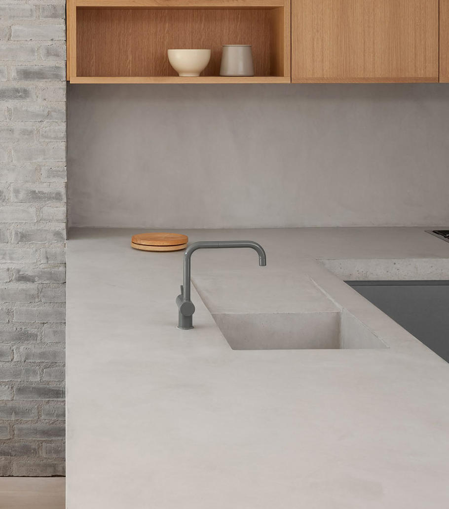

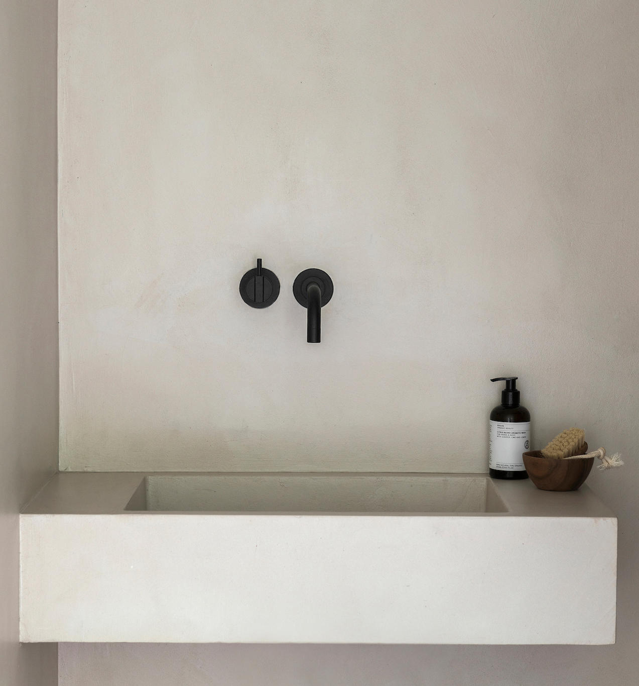
Unobtrusive colours can be integrated in a simple interior design: the 111 in white, the KV1 in grey and the 111 in black, which is Vola´s most sought-after colour of 2019; Photos: 1 Tom Blachford & Sonia Mangipane, 2 Ståle Eriksen, 3 Paulina Salone
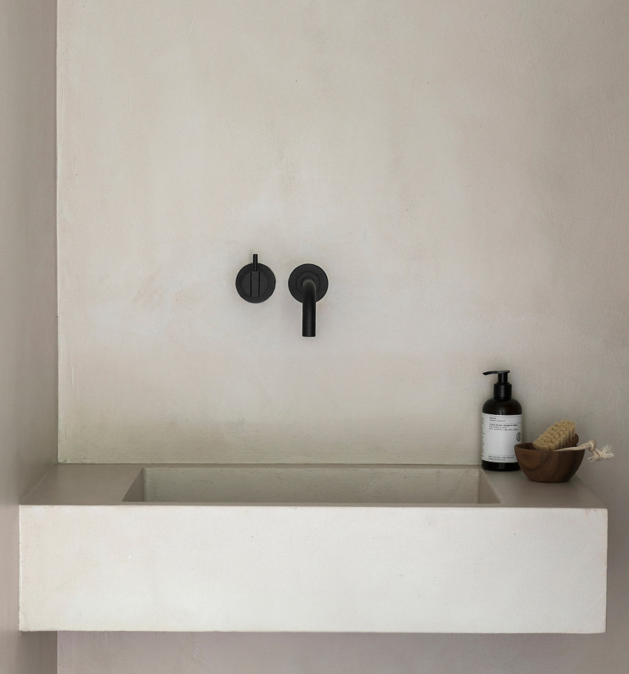
Unobtrusive colours can be integrated in a simple interior design: the 111 in white, the KV1 in grey and the 111 in black, which is Vola´s most sought-after colour of 2019; Photos: 1 Tom Blachford & Sonia Mangipane, 2 Ståle Eriksen, 3 Paulina Salone
×If we ask Birthe Tofting, who has been with Vola for more than 30 years and is currently the Director of International Sales, Marketing & HR, we get a bigger picture of how the use of colours in bathrooms has changed over the years: “During my time in the sanitary business I have seen many different trends. In the 70s and 80s, there was a colour revolution in the bathroom. Suddenly the tapware were no longer just chrome, but brown and olive green or orange." With a unique matt white, Vola adds a new choice to its range that already offers 14 different colours and one which complements Vola´s most sought-after colour of 2019: black. Now architects and interiors designers really have the freedom to choose.
© Architonic