A nuanced game: the PALMBERG Intelligence Series
Storia del Marchio di Markus Hieke
Schönberg, Germania
05.05.23
Whether it is possible to work in a creative, concentrated and productive way in an office depends on a variety of factors. To kick off the Palmberg Intelligence Series – a three-part series presented by office furniture manufacturer Palmberg – Timo Rieke, an expert in colour and surface design, explains how visual and tactile components influence the working atmosphere.
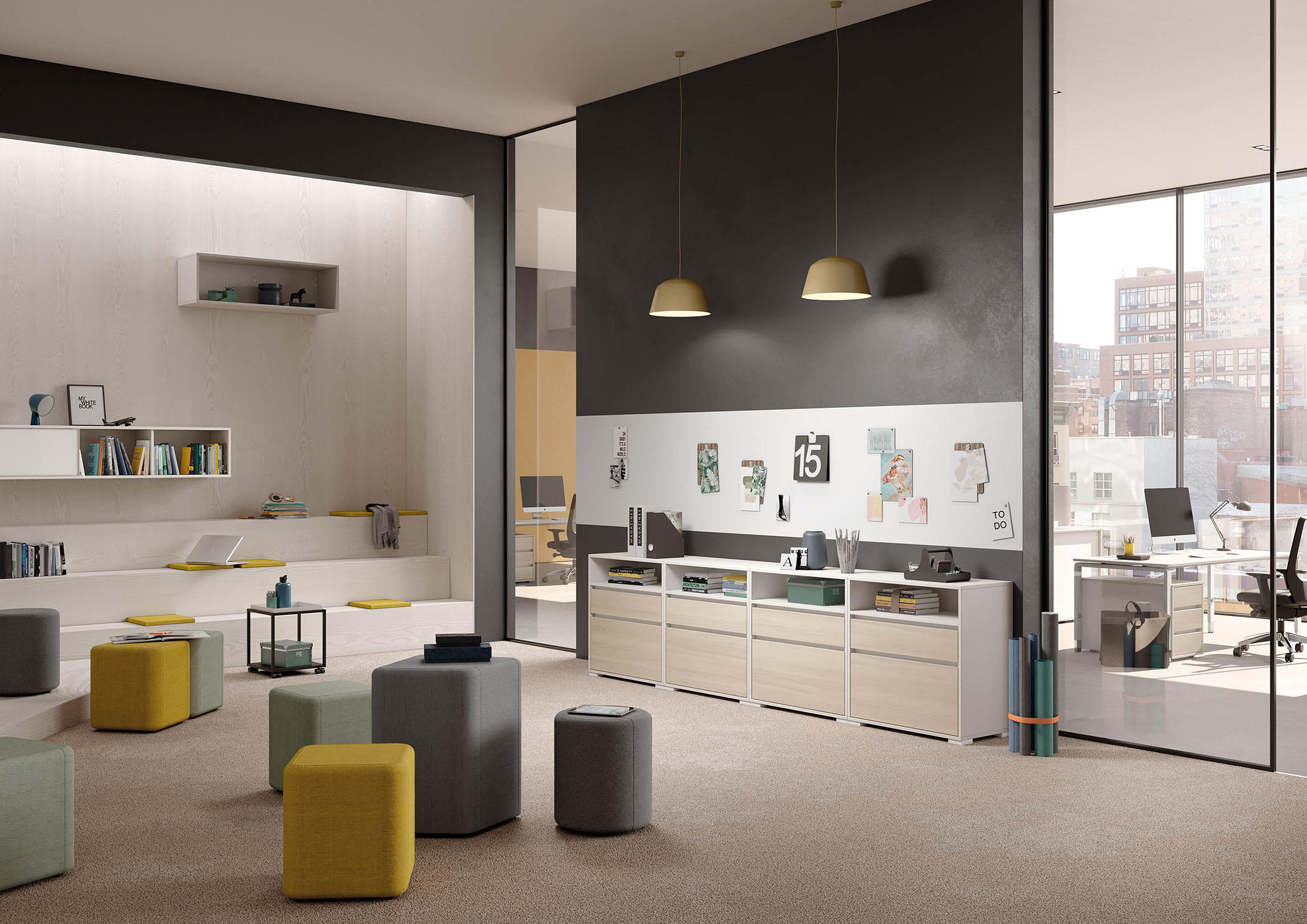
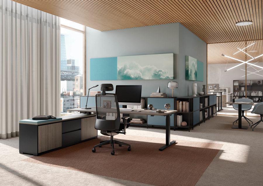
Bringing colour into an office does not always mean that it has to be colourful. Its discreet use can influence the perception of a working environment, for example, as harmonious, inspiring or lively
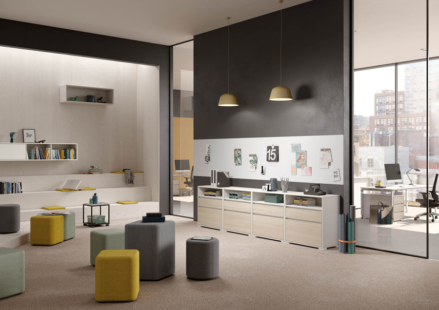
Bringing colour into an office does not always mean that it has to be colourful. Its discreet use can influence the perception of a working environment, for example, as harmonious, inspiring or lively
×Timo Rieke, the German designer and professor of colour and surface design at the Faculty of Design at the HAWK University of Applied Sciences and Arts in Hildesheim, puts it precisely: white seminar rooms are not simply white, but ‘slightly off-white’, or, to be even more exact, RAL 110 90 05. What do our colour and surface choices in the workplace do to us, we want to know. And why is subtle better than too much?
Break times feel different from focused work periods or communicative creative meetings. Colour design can support this in a targeted way
Can a visual effect, e.g. the imitation of a wooden surface, evoke comparable emotions in us as the natural original without necessarily offering the same, expected tactile quality? As chairman of the board of the German Colour Centre, partner of the Institute International Trendscouting at HAWK and design director of the Visual Haptics Lab founded in 2004, Rieke is on the trail of answers to such questions on a daily basis. With the RAL Colour Feeling Trend Report, he has developed a design tool for designers and architects which provides inspiration for projects in both the physical and virtual world.

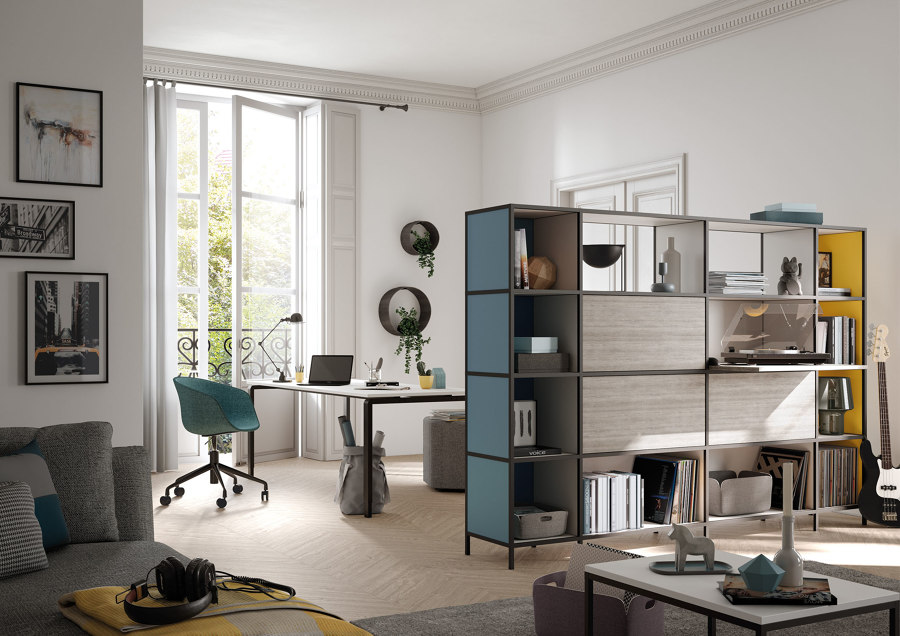
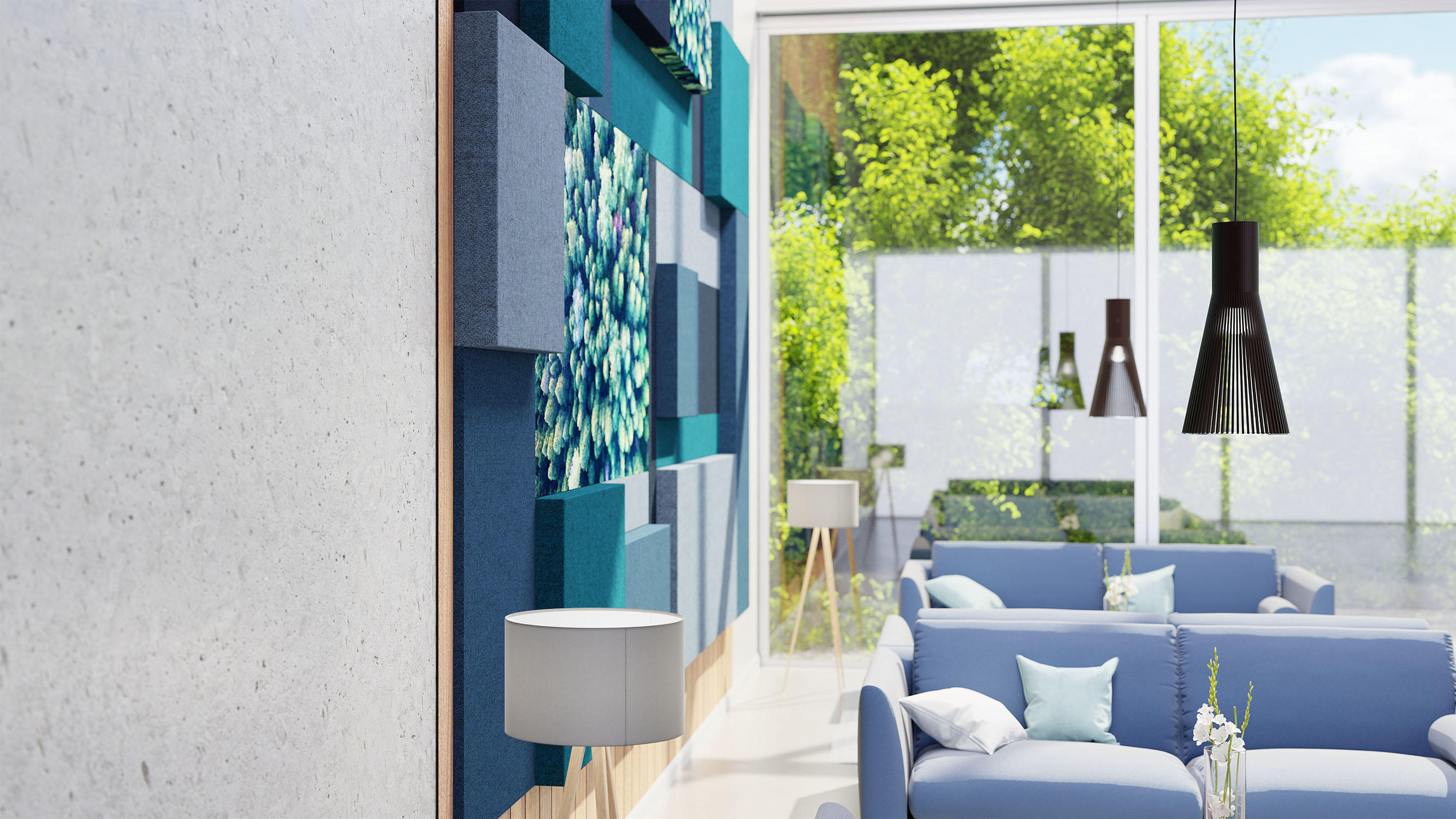
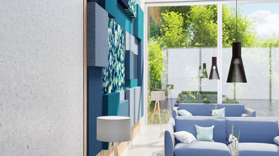
Whether in an old building or a new office, colour design, haptics, textiles and authentic surfaces create atmosphere. Timo Rieke recommends cooler tones in the workspace, for example, Candis Oak and Blueberry by Palmberg
Whether in an old building or a new office, colour design, haptics, textiles and authentic surfaces create atmosphere. Timo Rieke recommends cooler tones in the workspace, for example, Candis Oak and Blueberry by Palmberg
×Your studio Visual Haptics Lab explores the effect of colours, but also of tactility in all areas of life. Focusing on the office environment, where do you yourself work most regularly? Describe the room for us: the wall colours and table surfaces, etc?
I work in the studio, at the university and in my home office. At the university, I now prefer to work in the seminar room rather than in the office, because the space is wider and more lively, and it also allows me to interact more quickly with students and colleagues. My workrooms are always a different size, but they are laid out quite similarly. Since I have to judge colour first and foremost, the rooms I work in tend to be white. Not bright white, but slightly off-white (RAL 110 90 05). This gives the walls a designed look, so the atmosphere becomes calmer and more natural. The room becomes an object. The table surfaces are very different. I prefer to work on a top made of maritime pine with a pad on top for the keyboard and mouse. For collages and material work, I prefer light-coloured tables – more specifically light grey RAL 7035.

In addition to being a professor at HAWK in Hildesheim, Rieke is chairman of the board of the German Colour Centre, partner at the Institute International Trendscouting at HAWK and design director of the Visual Haptics Lab founded in 2004

In addition to being a professor at HAWK in Hildesheim, Rieke is chairman of the board of the German Colour Centre, partner at the Institute International Trendscouting at HAWK and design director of the Visual Haptics Lab founded in 2004
×What effect can the colour of a wall have on office workers? In task-related multi-space concepts, would you advise a differentiated colour design, i.e. depending on whether it's a single desk space, informal couch area, meeting island or conference room?
Actually, yes, function-oriented colour concepts are very important, especially in the office area. Unlike monotonous office concepts, sensitive and nuanced colour profiles create a differentiated, atmospheric environment. This is important, for example, to consciously structure and diversify the working day. Break times feel different from focused work periods or communicative creative meetings. Colour design can support this in a targeted way. Walking through the different areas should have the feel of a lively stroll. In the work area, there should be fewer distractions and the colours should have more of a cooling effect. Communication areas should have more contrast while break rooms should be more natural and material-oriented. Function-oriented colour concepts that use colour tones atmospherically lead to better identification with the working environment and higher satisfaction. The senses are stimulated and we become more alert and efficient.
‘Good colour design is often more of an atmospheric background than a foreground, aiming to guide the eye in a targeted way and to structure and order areas in terms of content’, says Rieke

‘Good colour design is often more of an atmospheric background than a foreground, aiming to guide the eye in a targeted way and to structure and order areas in terms of content’, says Rieke
×How do you evaluate and asses corporate colours in interiors?
Corporate colours should be used very discreetly. The logo on a letterhead, for example, is usually small. Logos are often very colourful and shades like that are not always suitable when it comes to two-dimensional, atmospheric colour design. A good colour design should be oriented towards the people who work in the environments and not first towards the brand colour. The brand colour can be placed at certain strategic points such as in the entrance area, but not in the workrooms where people spend all day – not even for the textile covering of the chairs in the conference room. Rooms which themselves display very strong colours are so dynamic that it is difficult for other elements and structures to have an effect. The ability to concentrate decreases in spaces like this.
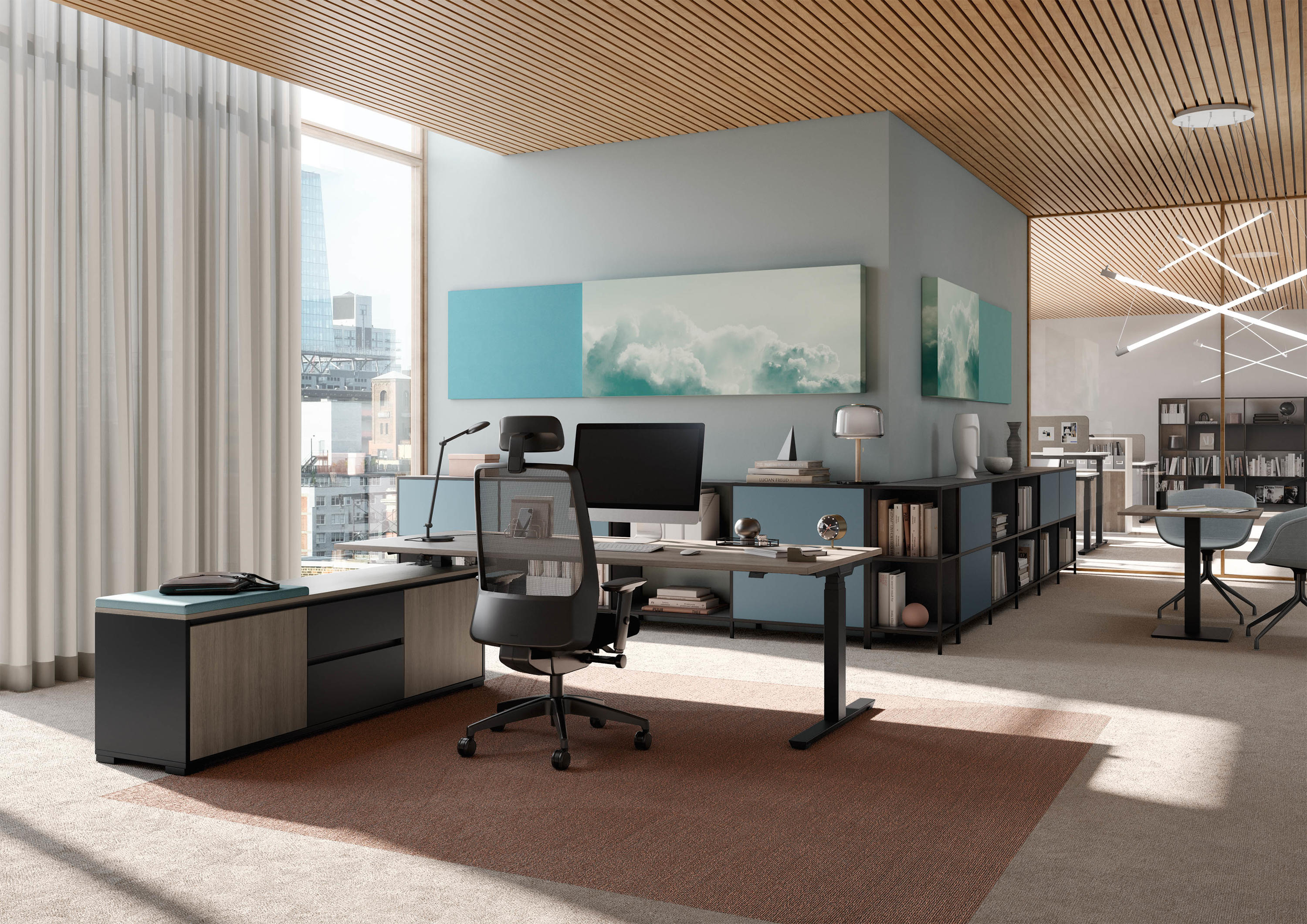
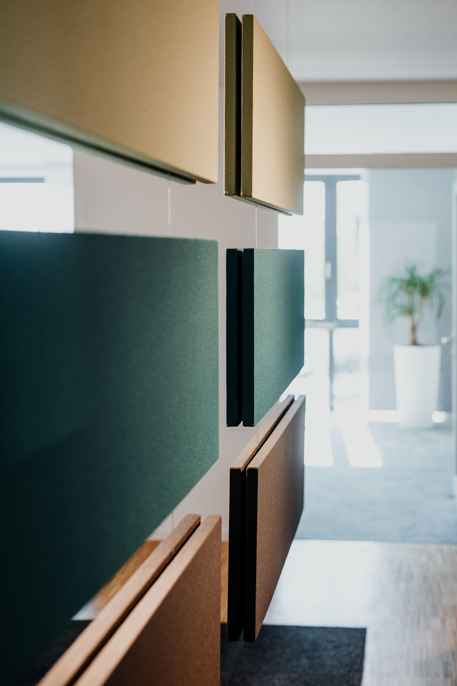
Colour tones should fit together harmoniously and only be rich in terms of contrast if it is done consciously and for a good reason
Good colour design is often more of an atmospheric background than a foreground, aiming to guide the eye in a targeted way and to structure and order different areas in terms of content. This means choosing colour tones which are less colourful and appear more natural. Above all, the colour tones should fit together harmoniously and only be rich in terms of contrast if it is done consciously and for a good reason. For example, to emphasise technical functions or to create space in the room. It should be noted that the ‘grass green’ in the colour chart is not necessarily a natural colour, even if the name suggests otherwise. Natural hues are duller and set much lighter for interiors than the artificially colourful pigment of ‘grass green’. Highly variegated colours, whether red, green or blue, all have a very dynamic effect and are distracting by drawing all the attention to themselves.

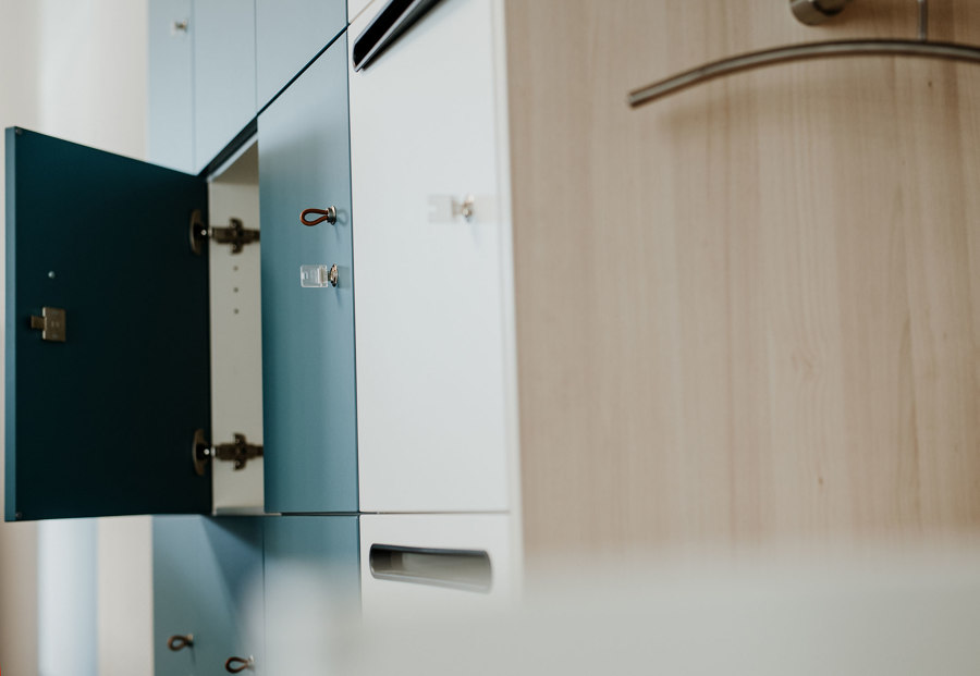
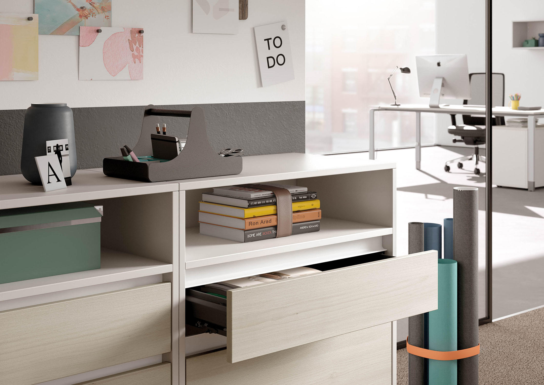
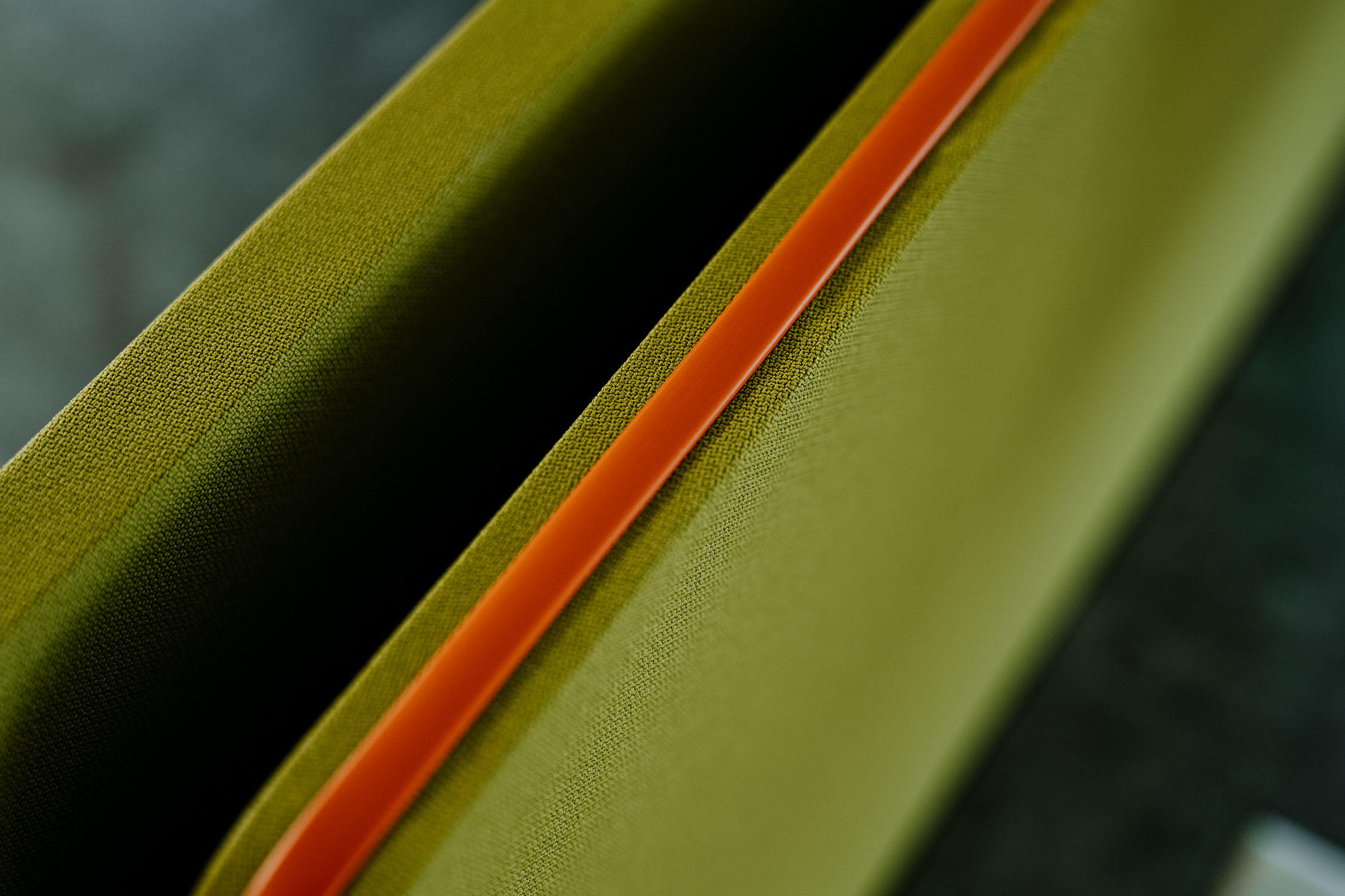
Well-suited elements for colour accentuation are, for example, lockers or acoustic panels, which can also serve to divide the room

Well-suited elements for colour accentuation are, for example, lockers or acoustic panels, which can also serve to divide the room
×It is not only the walls that can be carriers of colour. Textile details such as curtains or the furniture itself can also be used to bring colour into play. How do you define the right measures? When is it too colourful?
Furniture, textiles or acoustic elements are good ways to bring colour into rooms. Interiors are at their best when architectural colour and furnishings are related to each other. There are designers who say it can't be too colourful. I have to give an evasive answer here and refer to the context of the building task. For some clients, colourfulness is part of their brand and philosophy of life. For others, it is more about elegance and restraint.
Generally speaking, however, I can repeat myself and say that it is the person to whom a colour scheme should be oriented. In office environments, colour spectrums that are natural, yet varied, enjoy high levels of acceptance – colour spectrums that hold back where they should and only play to the fore when necessary. The right balance emerges during the design process when the architectural conditions and the room's uses are discussed. Large rooms need colourful, structure-lending islands, whereas small rooms cope less well with high-contrast colourfulness. Well-lit rooms need different levels and types of colour than those with little natural light.
Natural yet varied colour spectrums enjoy high acceptance in office environments: ‘Colour spectrums that hold back where they should and only play to the front where they have to,’ as Rieke puts it

Natural yet varied colour spectrums enjoy high acceptance in office environments: ‘Colour spectrums that hold back where they should and only play to the front where they have to,’ as Rieke puts it
×When we talk about colour, we should also look at materiality in the office environment. What kind of response do wooden surfaces, textiles, metals, plastics or linoleum elicit from us – both visually and haptically?
Haptics and visual sense are closely related. A material is good if its visual expectations can also be fulfilled or exceeded by its haptics. This is almost always the case with natural woods unless they have a glossy lacquer finish. Currently, velvet and matt finishes are two defining surface characteristics. Only colourfully lacquered surfaces are still glossy. High gloss is hardly ever seen. The haptic qualities of a thing have a sensual effect on people.
Haptics are so important in interior architecture or interior design: Charmless rooms do not touch me and remain alien to me
And those who can feel an environment sensually, find it easier to identify with it. We can call this resonance. When a material feels good, the feeling becomes part of me. That's why haptics are so important in interior architecture or interior design. Charmless rooms do not touch me and remain alien to me. Very few employers want that. Woods have a warmer and more natural effect on us than metals, which are technical, cold and often not very pleasant. Of course, this can be used as a good way of differentiating. Increasingly too, the original colour of a material is being used as the chosen colour, with unbleached fabrics and recycled plastics often possessing a less standardised colour. In the future, this will be expected more and more in order to create visible argumentation regarding resources and the use of environmentally friendly materials.
‘Those who can sensually feel an environment find it easier to identify with it,’ suggests Rieke. Break areas or informal lounges should be viewed differently than desk areas or meeting rooms
‘Those who can sensually feel an environment find it easier to identify with it,’ suggests Rieke. Break areas or informal lounges should be viewed differently than desk areas or meeting rooms
×When it comes to artificial materials, does it matter whether, for example, a wood look is imitated or is the impression of it sometimes enough?
Of course, it matters, because real wood is still the ultimate. It is authentic, cultivated, unique and part of nature – but also expensive and rare. Laminates, on the other hand, help to create a similar impression and are very robust. They can be more practical to work with and also have surprisingly pleasant surface qualities. Additionally, they offer broad possibilities in terms of flatness and consistency and are available in a huge variety of designs with different haptic effects. Combined with ecological sheeting products and adhesives, laminates represent a good alternative to real wood – especially if they not only imitate but go beyond the properties of real wood.
In a nutshell: What is the relationship between colour and feel?
A colour we see often subconsciously reminds us of a material we have already felt. Therefore, the colour influences our expectations in terms of the surface information of the material in question. In certain shades, green reminds us of a grassy meadow and therefore appears lush, moist, slightly ticklish and haptically fine. Beige is reminiscent of sand and appears dry and rough but also light. The solution to questions of meaning and effect in relation to colour lies in, among other things, the combination of haptics and colour.
© Architonic
Head to the Architonic Magazine for more insights on the latest products, trends and practices in architecture and design.