These Colours Don't Run: FAP Ceramiche
Storia del Marchio di Dominic Lutyens
Fiorano Modenese (MO), Italia
18.04.17
Premium Italian tile manufacturer FAP CERAMICHE inspires new creative combinations with its Color Now Collection, taking the fight to minimalism's monochromatic monopoly.
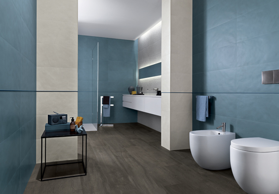
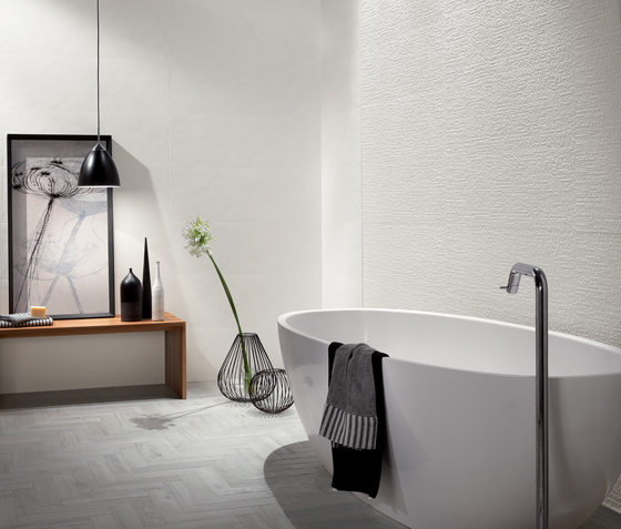
A bathroom with FAP Ceramiche’s Color Now tiles in the colour Avio in some areas and more neutral, silvery Perla in others. Glimpsed at the far end is 3D wallcovering Dot, also in Perla
A bathroom with FAP Ceramiche’s Color Now tiles in the colour Avio in some areas and more neutral, silvery Perla in others. Glimpsed at the far end is 3D wallcovering Dot, also in Perla
×FAP Ceramiche began life in the mid-1960s, the FAP part of its name alluding to its origins as Fabbrica Artistica Piastrelle, a workshop near the city of Modena devoted to producing high quality ceramic floor and wall tiles. In 1997, by now a globally successful firm, FAP Ceramiche joined Gruppo Concorde; soon after, it underwent a relaunch that saw it focus primarily on bathroom wall tiles and residential flooring.
Today, it boasts an extensive catalogue of over 30 product lines. All made in Italy, these are created by fusing traditional ceramic-manufacturing methods with cutting-edge yet environmentally friendly technology and contemporary design.
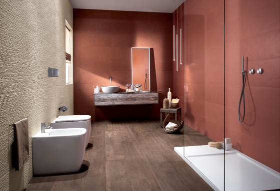
Top: Tiles in colour Marsala cover some walls, while 3D Dot tiles in Beige create a visually intriguing contrast. Below: Equally warm are these tiles in Fango and in the punchier shade, Curcuma. In the shower are Mosaico Round tiles, also in Curcuma
Top: Tiles in colour Marsala cover some walls, while 3D Dot tiles in Beige create a visually intriguing contrast. Below: Equally warm are these tiles in Fango and in the punchier shade, Curcuma. In the shower are Mosaico Round tiles, also in Curcuma
×One recent collection, Color Now — launched last September at the fair Cersaie — celebrates the world of colour and its power to arouse different emotions. The collection comes in a highly versatile, on-trend spectrum of eight, mix-and-match colours, which can be combined in many ways yet still look harmonious. These include Avio (airforce blue), Curcuma (turmeric) and Marsala. In fact, the Color Now collection is very timely: two of the most popular colours in interiors now are a deep airforce blue and rich, earthy terracotta. Offsetting such punchy colours are several comparatively timeless, cooler tones, including beige and various permutations of grey, from the relatively warm Tortora (dove grey) to the silvery tone of Perla.
Along with these fashionable hues, Color Now offers a selection of equally versatile, highly individual textures, such as the 3D, tantalisingly tactile Dot and glistening Dot Rame— which brings variety to walls and creates a subtle play of light and shadow. The tiles are rectified, meaning that they have sharp edges, very thin grout lines and barely visible joins. With their virtually seamless surfaces, they look clean-lined and symmetrical. Other tiles are made in a more traditional way and are non-rectified — their edges are softer, more natural.

Top: Bands of tiles in coordinating colours Fango and Tortora decorate this bathroom. Fango Micromosaico tiles line the shower, while a horizontal strip of Damasco tiles adds a decorative flourish. Above: Tortora tiles adorn another elegant bathroom
Top: Bands of tiles in coordinating colours Fango and Tortora decorate this bathroom. Fango Micromosaico tiles line the shower, while a horizontal strip of Damasco tiles adds a decorative flourish. Above: Tortora tiles adorn another elegant bathroom
×What’s more, Color Now also incorporates overtly decorative designs, such as the damask-like, neo-baroque Damasco and geometric Tangram, with its lively pattern of triangles in different tones of the same colour. Overall, the range brings a refreshing antidote to all-white minimalist spaces.
The Color Now Collection encourages a playful approach to covering walls, juxtaposing different designs and textures. Why stick to one design when a combination of them can create a more visually intriguing surface? Mixing other FAP Ceramiche designs — Mosaico Round with its small round tiles or Micromosaico Dot with its tiny, textured mosaic tiles — with the rectified tiles or brick-shaped ones works perfectly well. In a room where only a few colours are used, thereby creating a unified effect, the inclusion of different textures provides visual variety yet still looks elegant.
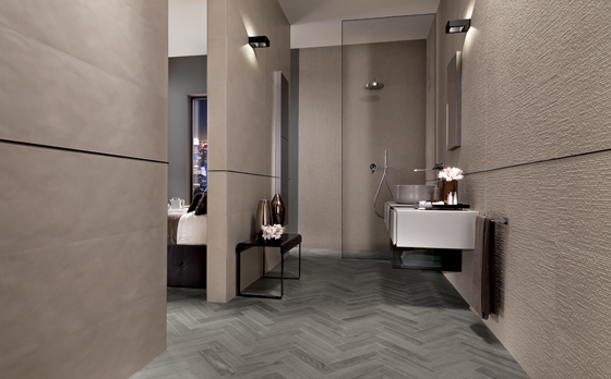
Another bathroom features Color Now’s pleasingly tactile Dot tiles in cool, soothing shade Ghiaccio
Another bathroom features Color Now’s pleasingly tactile Dot tiles in cool, soothing shade Ghiaccio
×Another colour in the range, Ghiaccio (ice-cold), looks ultra-modern when combined with Avio. Even when Ghiaccio is used on its own, the effect is never dull or conventionally minimalist since its surfaces can be broken up by contrasting textures. Another neutral colour, Fango (a warm shade named after the Italian for mud), can be teamed with the flamboyant Curcuma to create a more dramatic look. Or Fango looks good paired with the uplifting shade Marsala, the muted tone of the former counterbalancing the richer, more sensual tone of the latter.
Different kinds of lighting — from a shaft of diffuse daylight entering a window to the crisp, clear light cast by a pendant light — add yet more variety to walls adorned with Color Now’s designs.
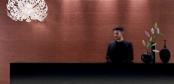
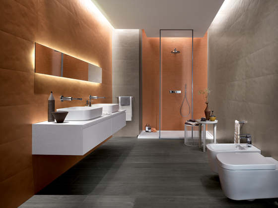
A reception area featuring glistening, 3D Dot Rame tiles in Marsala
While one way to use these is to cover the walls of a room with two or three shades only — thereby creating a graphic, colour-blocking effect — another is to adopt a more decorative style. FAP Ceramiche offers two contrasting designs that are decorative in their own way but result in different looks: the geometric pattern of Tangram seems to nod to 1950s, mid-century modern design, while Damasco evokes 19th-century, hand-printed wallpapers. Color Now not only reflects current trends but pays homage to past styles.
In fact, Color Now offers a highly adaptable palette of colours and textures that invites customers to create different moods to suit their personality and style. Color Now amply demonstrates that the potential for colour to awaken emotions — and encourage self-expression — cannot be underestimated.
© Architonic