Here and Now: new wayfinding and place-making
Texto por Richard Wolfströme
Brighton, Reino Unido
23.10.15
Wayfinding and place-making is, well, going places. Graphic designer and place-making specialist Richard Wolfströme looks at what happens when 2D gives 3D architectural space that extra dimension.
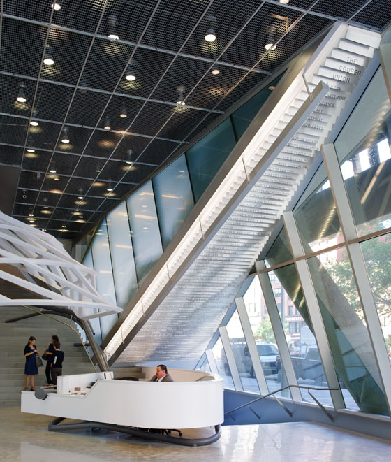
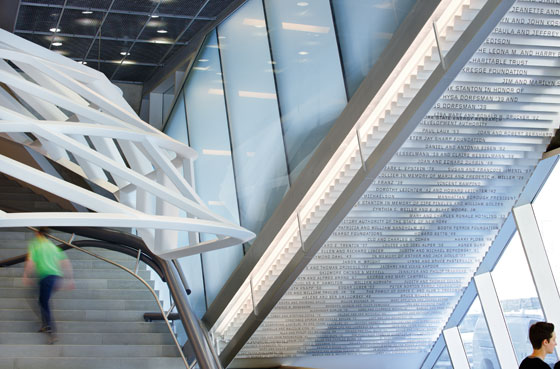
The Cooper Union, New York: the lobby atrium with donor signage that cascades down the underside of a staircase; photo: Chuck Choi
The Cooper Union, New York: the lobby atrium with donor signage that cascades down the underside of a staircase; photo: Chuck Choi
×I’m interested in the narrative of place. How do we connect people to place and give them a sense of ownership? How do we reveal a place to be rich in meaning and potential and how do we make a place legible and informative?
My journey started back in 2007 with an arts project, working with acclaimed British writer William Shaw, whose idea was to install stories in the locations that they happened. The project – 41 Places – saw us design and install 41 real-life narratives around the British coastal city of Brighton for the Brighton Festival (the second largest arts festival in Europe).
As an information graphic designer, this got me thinking – what if I was to explore the idea of fusing narrative place-making and wayfinding? Over the years, this idea has developed and although no one place is the same and can’t be templated, the exploration and development of place narrative is unique to each location.
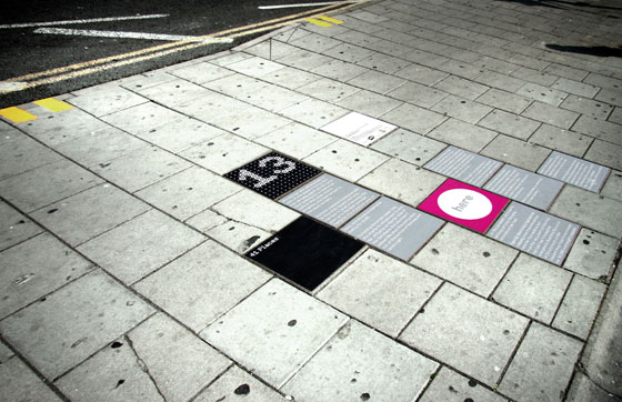
41 Places: city-wide Brighton arts festival installation, embedding 41 true-life stories around the city; photo: Kenny Laurenson
41 Places: city-wide Brighton arts festival installation, embedding 41 true-life stories around the city; photo: Kenny Laurenson
×When a new building or scheme is being developed (or redeveloped), it is an opportunity to work with architects and stakeholders to look at generating a sense of place, culture and engagement through nomenclature, narrative artworks and, of course, wayfinding.
Given there is no ‘one-size-fits-all’ solution, a process of in-depth research and due diligence that engages with as many voices as possible, to give a sense of ownership and to use the ‘ordinary’ stories of community, is essential. Considerations to design, materials, font, and so on are, naturally, also very important factors.
A recently completed project in London for The Foundry – its strapline being ‘a place for change’ – is the result of a collaboration between a number of leading trusts and foundations and the Ethical Property Company. Based in Vauxhall, it provides space for some of the country’s most innovative and progressive social-justice and human-rights organisations through the provision of ethically managed and affordable workspace, conference facilities, events and exhibition space that will support the local community, the wider public and the social-change sector.
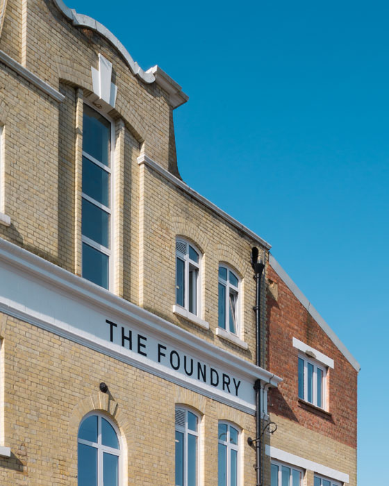
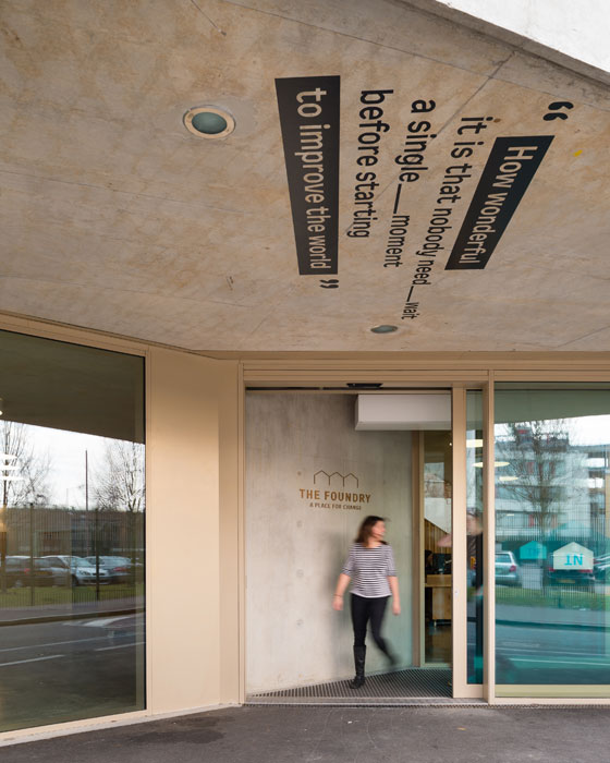
The Foundry: RIBA-award-winning building – social-justice and human-rights centre based in Vauxhall, London – with identity signage on Victorian-factory-warehouse part of site, and main entrance with narrative public art; photo: Jim Stephenson
The Foundry: RIBA-award-winning building – social-justice and human-rights centre based in Vauxhall, London – with identity signage on Victorian-factory-warehouse part of site, and main entrance with narrative public art; photo: Jim Stephenson
×The building, designed by Architecture 00, is half refurbished Victorian shoe-polish factory and half contemporary-modernist structure, replete with concrete, glass and wood surfaces. It was recently awarded a 2015 RIBA London Regional Award.
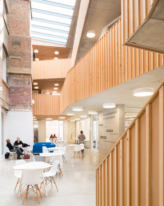
The project saw the sympathetic development and design of the building’s identity, wayfinding and its public art, where the fabrication materials complimented the building’s design to create an integrated solution.
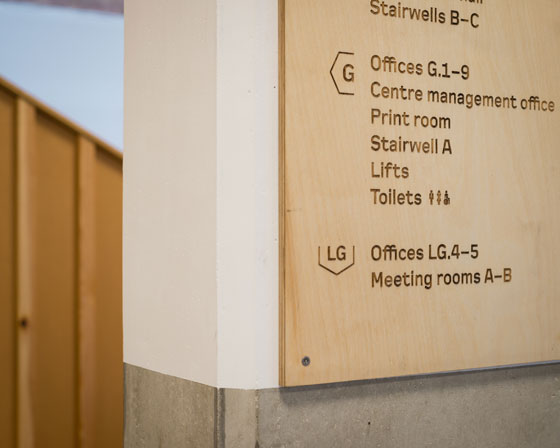
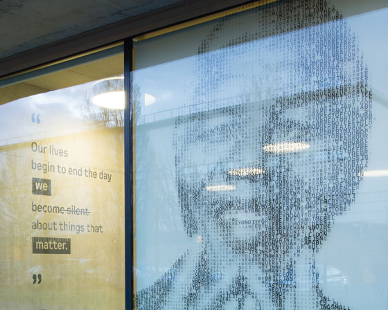
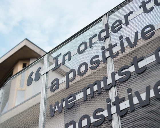
The Foundry: community space with wayfinding signage, plus laser-etched lettering into plywood and a narrative artwork with ’super-graphic’ portrait of Nelson Mandela where his words, typographically, make up his portrait; photo: Jim Stephenson
The Foundry: community space with wayfinding signage, plus laser-etched lettering into plywood and a narrative artwork with ’super-graphic’ portrait of Nelson Mandela where his words, typographically, make up his portrait; photo: Jim Stephenson
×A signage system that reflects the use of wood throughout the building and a series of narrative artworks based on profound statements made by great thinkers and human-rights leaders, from world history past and present, were chosen by the local community from a large pool of researched quotes as ones that had most resonance for them . These became part of the fabric of the building, as if seeping from the wall surfaces, to create a space in which people work on important issues that project the spirit and ethos of the place.
A set of super-graphic portraits – Martin Luther King, Aung San Suu Kyi, Nelson Mandela and Abraham Lincoln – can be seen on the ground-floor conference-hall windows, each portrait made up typographically from the person’s own words.
The Cooper Union, New York: optically extruded letterforms on the facade and a lobby staircase detail; photos: Chuck Choi
The Cooper Union, New York: optically extruded letterforms on the facade and a lobby staircase detail; photos: Chuck Choi
×Best-practice place-making, and, indeed, wayfinding, consists of systems and artworks that are anything but an after-thought. Instead, they are highly considered, forming an integral part of the development and design plan from its earliest stages.
Exemplary narrative and wayfinding projects which have successfully delivered design solutions that manage to engage users and visitors on a high level include New York’s Cooper Union building and the Casa do Conto in Porto, Portugal.
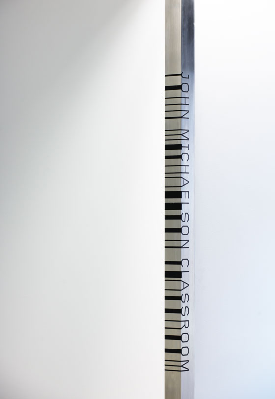
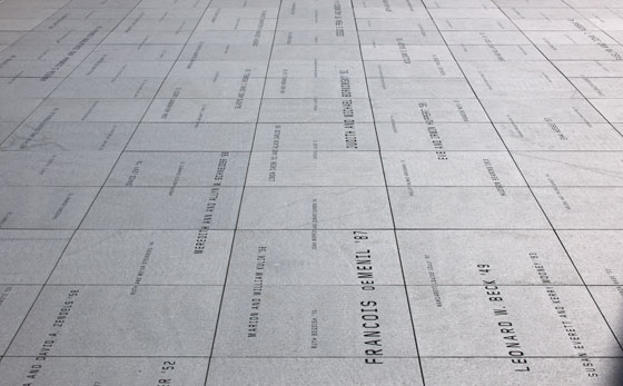
The Cooper Union, New York: donor signage appears on vertical corner guards outside classroom doors and on the building's roof terrace as a constellation of names engraved in granite; photos: Chuck Choi
The Cooper Union, New York: donor signage appears on vertical corner guards outside classroom doors and on the building's roof terrace as a constellation of names engraved in granite; photos: Chuck Choi
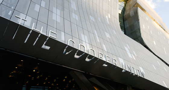
×The Cooper Union, designed by architects Morphosis, uses a typographic solution that is contemporary and sympathetic to the dynamic design of the building. The environmental graphics, designed by Pentagram, utilise the font Foundry Gridnik (developed from Wim Crouwel’s original 1960s typeface), which, in turn, echoes the font from the original 1859 building, bringing it up-to-date. As Pentagram puts it ‘Gridnik also has a tough and futuristic character that makes it especially sympathetic to the forms and materials of the new building’.
Utilised throughout the interior, the design is elegant and informative, and was created in close collaboration with the architects. Sympathetic to the building materials, the various communications are etched into glass, stone and stainless steel, forming effective wayfinding signage and other installation information.
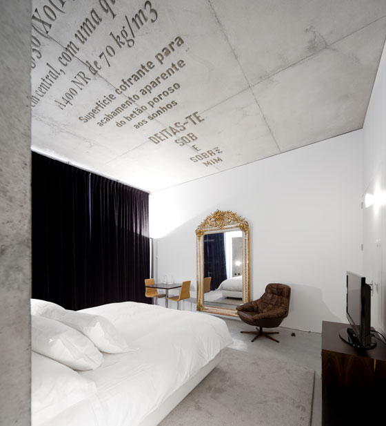
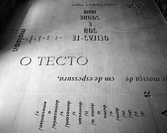
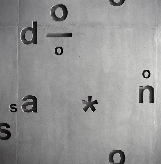
Casa do Conto, Porto: cast concrete lettering and interpretation expresses the place narrative; photos: Fernando Guerra & Sérgio Guerra (top), André Cepeda (above)
Casa do Conto, Porto: cast concrete lettering and interpretation expresses the place narrative; photos: Fernando Guerra & Sérgio Guerra (top), André Cepeda (above)
×Casa do Conto (House of Tales), by Pedra Líquida Architects, is a 19th-century home restored into a guesthouse. It suffered a fire in 2009, losing much of its ornamental plaster mouldings and wood ceilings, and was considered a great cultural loss.
R2 Design were invited to reinterpret the lost motifs and decided upon a contemporary conceptual approach for the restoration process. They asked individuals that were involved in the original restoration and who were familiar with the building to write a series of stories about each of the spaces.
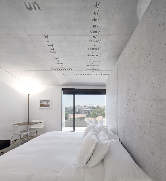
Casa do Conto, Porto: narrative design in one of the bedrooms and a cast concrete detail; photos: Fernando Guerra & Sérgio Guerra (top), André Cepeda (above)
Casa do Conto, Porto: narrative design in one of the bedrooms and a cast concrete detail; photos: Fernando Guerra & Sérgio Guerra (top), André Cepeda (above)
×The result: a beautiful, sensitive (and almost spiritual) series of texts moulded into the concrete surfaces of the building, reinforcing the individual identity of each space and engaging the interest of the guests.
Each text was assigned a different font for graphic interpretation and the overall effect is one that creates a typographic textural quality on many levels – a sublime piece of work.
And it’s not just our modern buildings/redevelopments that should receive this degree of consideration. St Paul’s Cathedral, Christopher Wren’s iconic 17th-century, baroque London landmark, has recently commissioned a wayfinding/signage strategy. It’s a complex project with many considerations, including how to create a modern, flexible system that is mindful of the heritage and fabric of the building.
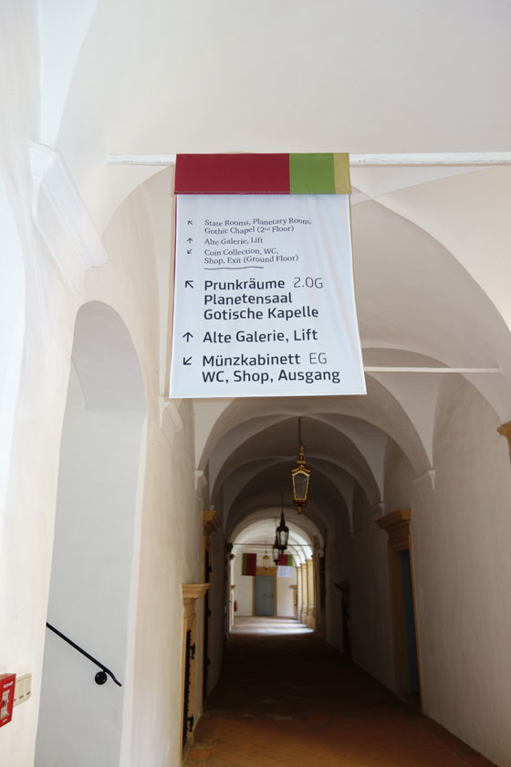
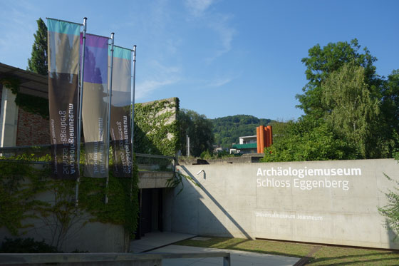
Schloss Eggenberg, Graz: signage sensitive to a UNESCO World Heritage Site, which feels modern and contemporary, yet not to the detriment of the place's historical significance; photos: Richard Wolfströme
Schloss Eggenberg, Graz: signage sensitive to a UNESCO World Heritage Site, which feels modern and contemporary, yet not to the detriment of the place's historical significance; photos: Richard Wolfströme
×Schloss Eggenberg in Graz, Austria – part of the Graz UNESCO World Heritage site – is another noteworthy project in terms of the way two-dimensional information design dialogues with three-dimensional architectural space. Completed around 1635, it is an example of the living heritage of aristocracy and culture in central Europe.
Particularly impressive is the simple and mindful solution the place adopts in its signage. Hanging textile banners are positioned strategically. Reminiscent of heraldic flags, they feel a part of, and are congruent, to the place. They are an example of elegant design to a potentially complex and sensitive historical building that don’t feel out of place. Even in the more architecturally contemporary areas of the site, such as the archeological museum, the wayfinding design respects the historical nature of the place.
It is no longer acceptable to consider place identity and wayfinding as a token after-thought. Creating 'last-minute' signage by using a default operating system font, such as Arial for example, will always short-change its users. Rigorous enquiry and a relevance to place are what’s required – preferably at the early stages of a place development. The danger in not engaging at a deeper level is that our places will lack expression and meaning. Understanding a place’s potential goes hand-in-hand with finding the right way to communicate it.
Places should inspire and promote a sense of community. Place identity is about creating a lasting sense of connection for the people that use it, so that, ultimately, they don’t feel out of place.