As you like it: GROHE SPA Colours
Historia de la marca de Dominic Lutyens
Düsseldorf, Alemania
19.12.18
With its SPA Colours collection, fittings specialist GROHE is further developing the trend towards creative, individualised interiors.

The finish of GROHE’s SPA Colours collection is exceptionally durable, scratch-resistant and even, thanks to cutting-edge PVD technology
The finish of GROHE’s SPA Colours collection is exceptionally durable, scratch-resistant and even, thanks to cutting-edge PVD technology
×Leading bathroom and kitchen fittings brand GROHE might be at the forefront of design trends but it certainly doesn’t dictate what colours to choose in the home. On the contrary, in the GROHE universe, there are no prescriptive style edicts, just a liberating, fluid ‘do as you please’ approach. The company comes down firmly in support of self-expression, of limitless freedom of choice, of boundless creativity when it comes to selecting its stylish products to suit personal taste.
This philosophy reflects the mood of our times as consumers increasingly prize individual, unique products over cookie-cutter styles and products that suggest dull conformity. Choosing bathroom and kitchen fittings that mirror our personality plays an important part in creating a home that both reflects our individuality and enhances our enjoyment of spending time there.
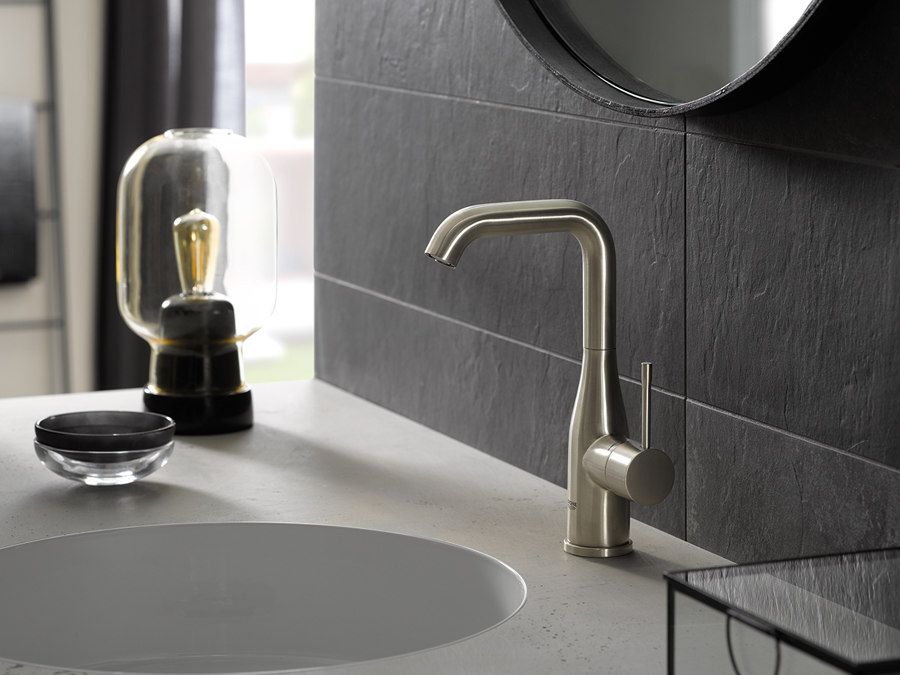
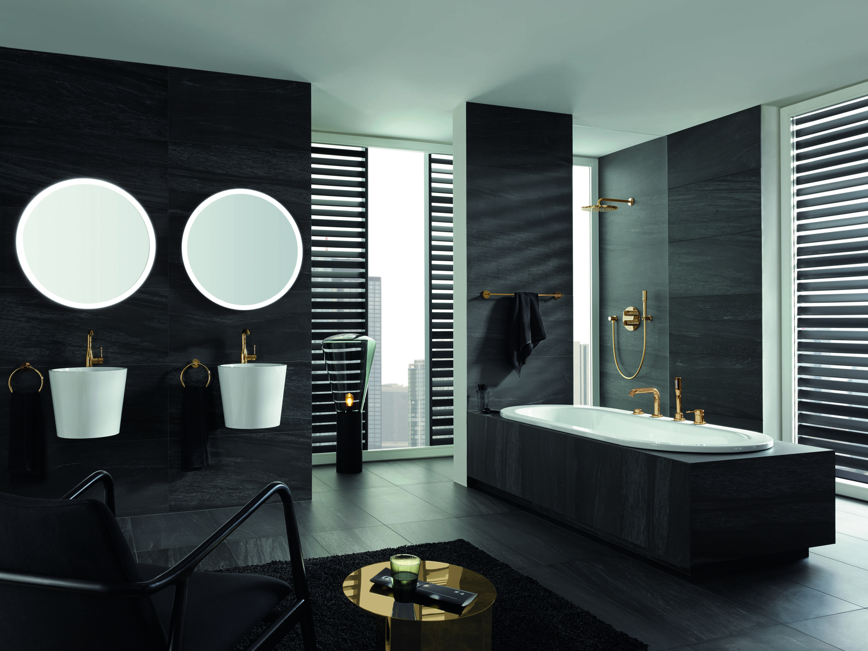
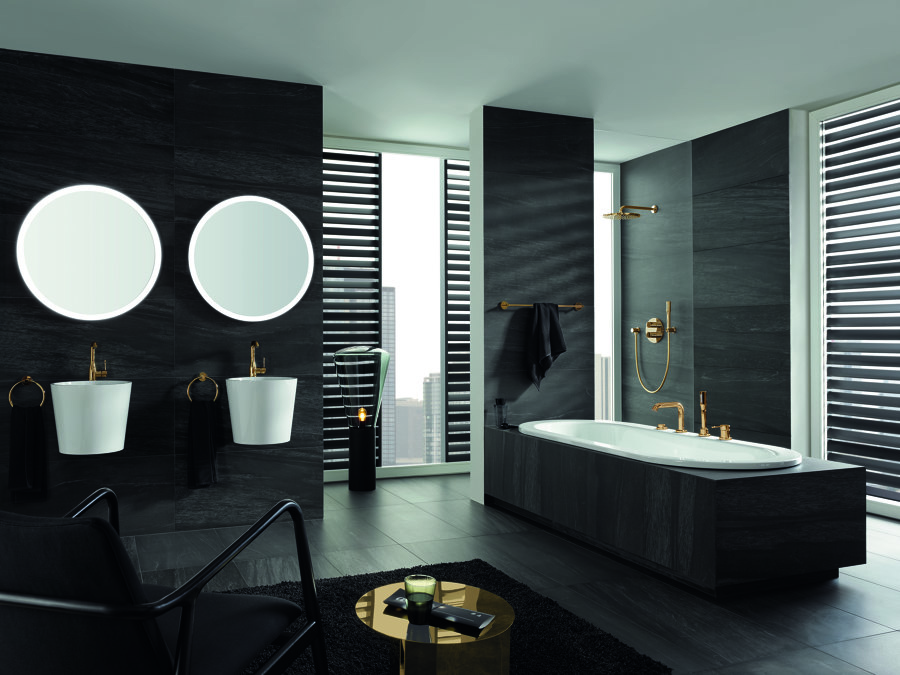
Top: Just one of 10 tones from the SPA Colours collection palette – Warm Sunset with its warm, hazy brushed surface. Above: The Essence range creates a high-contrast effect when its polished gold-toned taps and accessories are paired with black walls

Top: Just one of 10 tones from the SPA Colours collection palette – Warm Sunset with its warm, hazy brushed surface. Above: The Essence range creates a high-contrast effect when its polished gold-toned taps and accessories are paired with black walls
×GROHE’s SPA Colours range for taps, showers, flush plates, basin mixers and towel rails is extensive and nuanced — a veritably varied palette that invites you to realise your own vision of the perfect, on-trend yet subtly personalised bathroom.
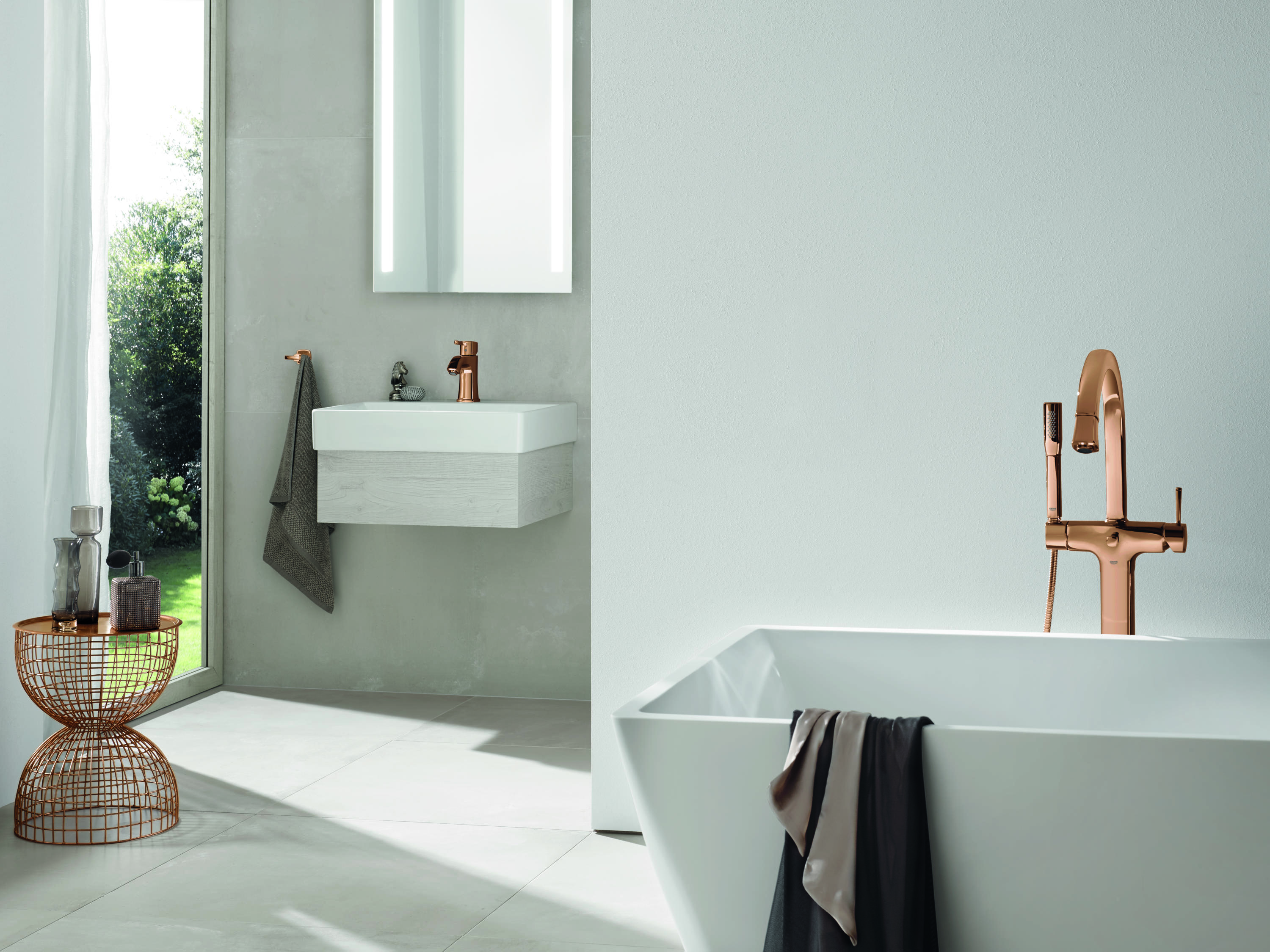
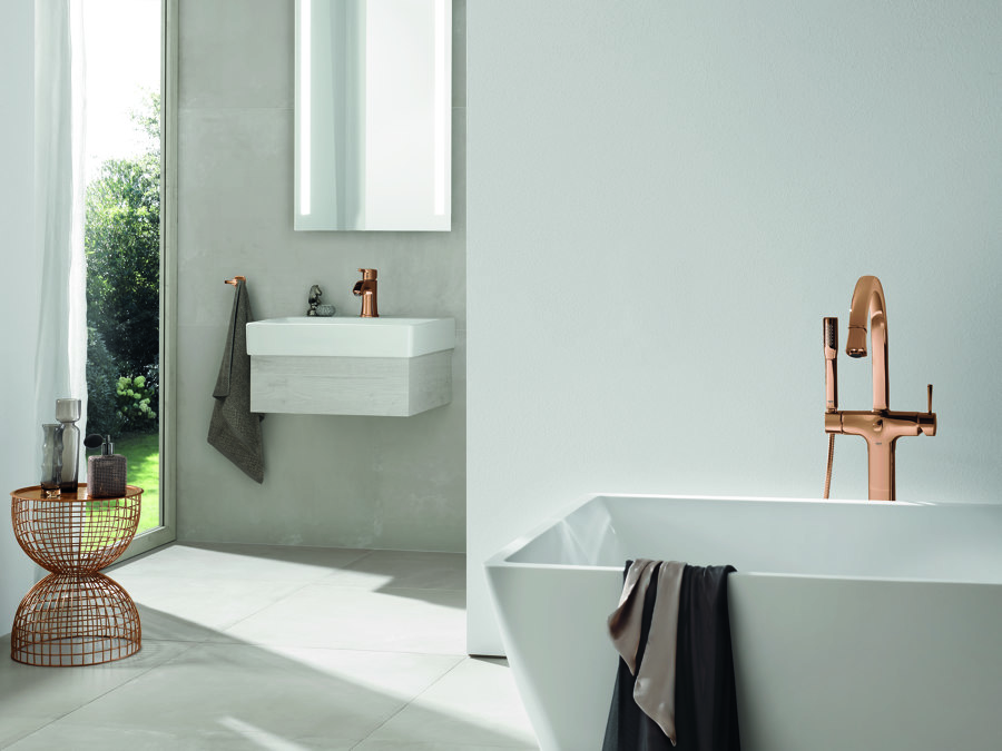
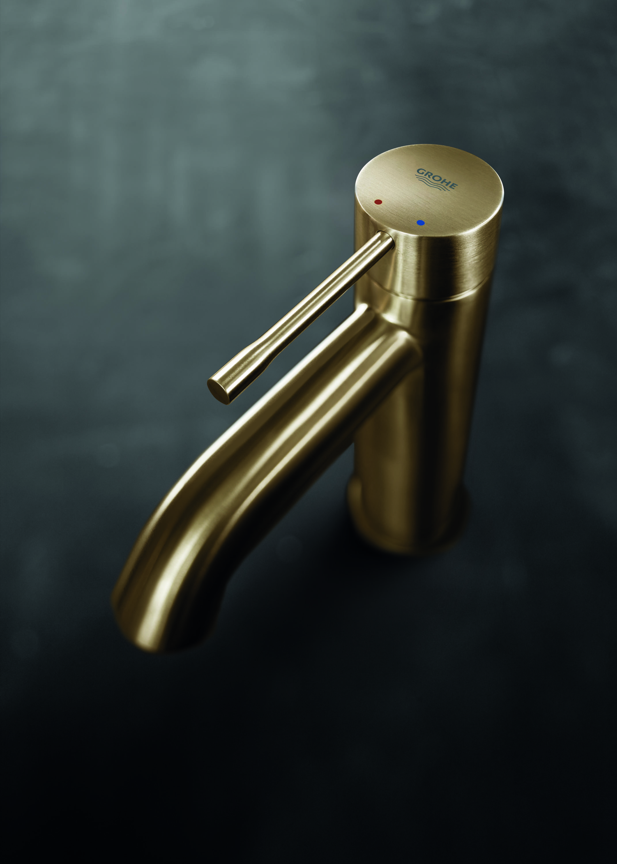
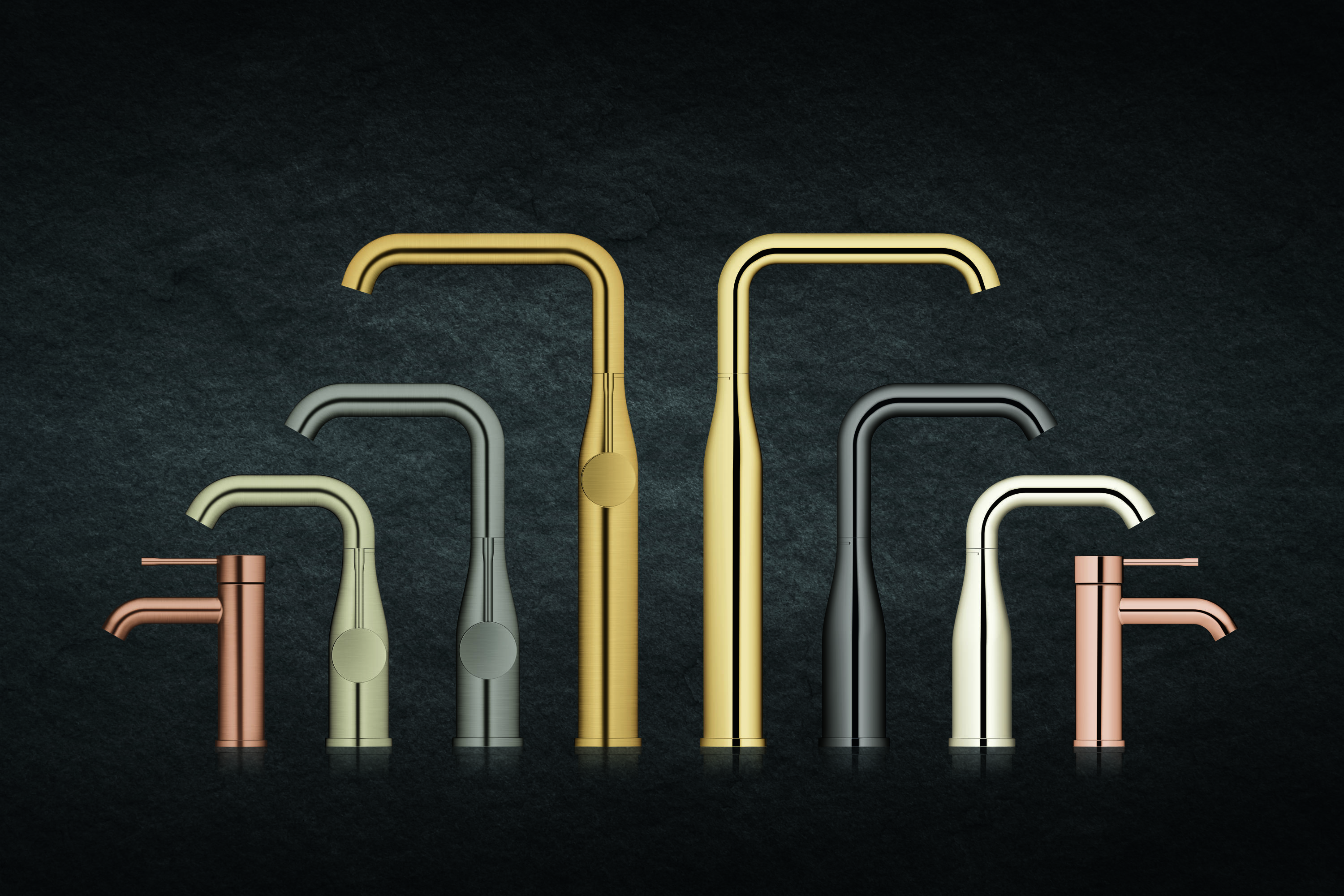
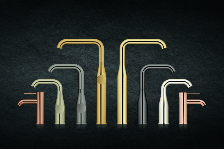
GROHE’s five colours are Hard Graphite, a dark gunmetal grey that blends well in an urban setting; Cool Sunrise, a pure gold shade that is classic yet contemporary; Warm Sunset, a warm, on-trend tone that picks up on the romantic vogue for all things copper-coloured; Supersteel, a bright, clean silver tone that’s ideal for an environment with white marble or concrete, and finally Nickel, a slightly softer, almost patinated-looking shade of silver.
What’s more, GROHE’s SPA Colours collection has been carefully and cleverly curated to reflect the way that interiors normally come in dark, light or mid tones. The darker tones in the range are highly effective when creating an interior with dramatic, bold contrasts — say black and white — or for decorating a dark, moody monochrome space, for example, a stunningly elegant all-black bathroom. At the other end of the spectrum is a paler tone, ideal for creating a softer, ethereal tone-on-tone effect. And finally GROHE also offers a mid-tone that sits well in a more neutral interior. Once you’ve picked your preferred shade, you will find that every element, from showerhead to sleek wall plate, is available in the same nuanced tone.
Top: The Grandera collection conveniently encompasses a wide spectrum of coordinating bathroom accessories. Above: The beautifully economical lines of GROHE’s taps reflect the company’s form-follows-function philosophy
Top: The Grandera collection conveniently encompasses a wide spectrum of coordinating bathroom accessories. Above: The beautifully economical lines of GROHE’s taps reflect the company’s form-follows-function philosophy
×If Grohe has embraced dark, rich, warm metallic tones in its SPA Colours collection this is in recognition of a global, enduring trend for these shades. Creatives and design-savvy consumers all over the world have long woken up to the realisation that bathroom fittings need not just come in standard chrome. GROHE’s line of thinking is: if no rules apply to what colours paints and wallpapers come in, why shouldn’t bathrooms be equally daring and individual?
Not that GROHE’s array of possible permutations ends there. The flexibility of the SPA Colours range is further enriched by another variant: GROHE’s bathroom accessories also come in two contrasting types of finish: a glossy, luminous polished surface, on the one hand, and a more matt brushed one, on the other. Choosing between your bathroom accessories having a lustrous or more muted finish might not sound like a huge advantage but GROHE strongly believes it is: these finishes enable you to create a unique, individual space that reflects your taste even more precisely.
The act of choosing specific finishes and colours doesn’t just result in creating a distinctive visual effect. These have particular connotations — polished and glossy might suggest classic luxury, brushed might convey more vintage style, softer, a little weathered-looking. With the growing market in interiors for bespoke furniture, finishes, colours and textures, it makes complete sense for products in all areas of the home to be available in a correspondingly broad, subtle spectrum of tones and surfaces.
© Architonic