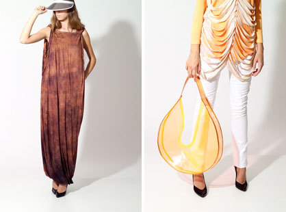
Colour therapy
Text by NoéMie Schwaller
Zürich, Switzerland
09.06.09
Ever since the indiscriminate granting of sub-prime loans led to a crisis on the US housing market the new fascination for colour has spread to the private home. In times of difficulty the trend towards excessive use of colour has always tended to increase: the gloomier people's thoughts, the stronger the uncertainty, the more colourful the prints, the brighter the designs.
Ever since the indiscriminate granting of sub-prime loans led to a crisis on the US housing market the new fascination for colour has spread to the private home. In times of difficulty the trend towards excessive use of colour has always tended to increase: the gloomier people's thoughts, the stronger the uncertainty, the more colourful the prints, the brighter the designs. The contemporary answer to social doubts and fears is called „dégradé“ – colour gradations in the form of stripes, blending of colours or created using special colouring techniques.
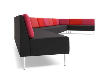
Playback
This wooden frame with chrome legs is made of non-flammable cold foam and is upholstered in fabric or leather.
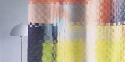
Eplexo 2008
The colourful curtain material 'Eplexo' by Création Baumann creates the effect of a picture spread throughout the room. The abstract transfer printing on Trevira CS is cut into strips and woven to a depth of three quarters of the curtain, with the remaining bottom quarter allowed to hang down free. At a width of 145 cm the fabric, which is made of 100% PLF Trevira CS, weighs 186 g/m².
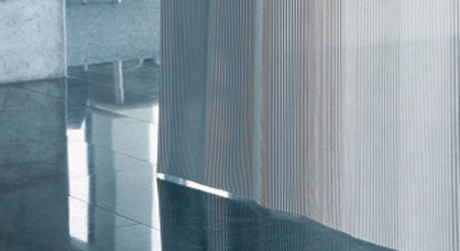
Sequenza
With its gradations from transparent to semi-transparent strips the 'Sequenza' curtain material, also by Création Baumann, has a dreamy look. At a width of 300 cm the material made of 100% PLF Trevira CS weighs 72 g/m2 and is available in six different colour versions as well as in special colours.
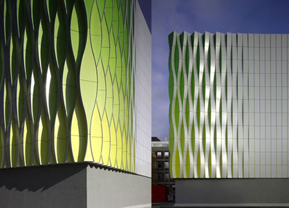
Research Laboratory, Gronongen, NL. 2003 - 2008
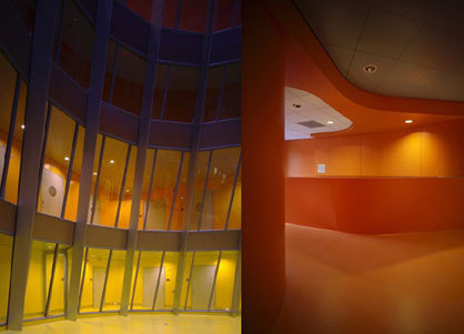
The facade isconstructed from flat, vertical aluminum slats, which, in places, are twisted outwards in bowed forms. Tall, vertical undulations are generated, which present an open or a closed aspect depending on the angle under which they are viewed. On the lower level the colour yellow is used, which gradually changes to green towards the top of the building. In the interior, two internal vertical voids allow daylight to enter the interior functioning as a form of internal facade. The two voids have the geometry of asymmetrical truncated cones which mirror each other vertically. Shared walkways surround these internal voids, creating a clear organisation whereby dark corridor systems can be avoided. On the ground floor, where daylight is at its lowest, yellow is used. Per floor this colour then deepens through to orange and finally to red.
Research Laboratory, Groningen, NL. 2003 - 2008 by UNStudio
Client: Rijksuniversiteit Groningen
Location: Groningen, The Netherlands
Building surface: 7.497 m²
Building volume: 2.3792 m3
Building site: 1.093 m²
Programme: Research laboratory as part of the medical faculty of the Rijksuniversiteit Groningen
Status: Competition 1st Prize
Design: 2003
Realisation: 2008
Research Laboratory, Groningen, NL. 2003 - 2008 by UNStudio
Museum Brandhorst
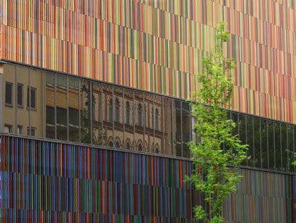
The official opening of the Brandhorst Museum in Munich, which was designed by Sauerbruch Hutton, took place on 18 May 2009. The new museum contains a large private collection of 20th-century art.
The external skin of the building consists of 36,000 ceramic rods which have been glazed in 21 shades of colour. Behind this there is a horizontally folded sheet metal facade. These different layers and polychrome variety create an ever-changing appearance which communicates the character of the museum as a location for living art to the outside world.
External view Museum Brandhorst. Photo: Haydar Koyupinar, 2008. © Museum Brandhorst
Louvre Light
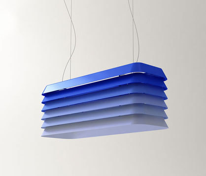
The pendant lamps designed by André Klauser and Ed Carpenter contain references to Venetian blinds, Scandinavian sheet lightning and the rear windshields of nineteen-eighties ‘muscle cars’. Louvres made of seamlessly moulded aluminium with rounded corners are built up layer by layer. This creates a formally fascinating lampshade which diffuses light that does not dazzle and can be directed. Because of its proportions 'Louvre' is ideal for positioning above a dining table. The lamp is available in two sizes and in a range of metal surfaces, and optionally as a version made of powder-coated and anodised aluminium in various colours or made of patinated bronze.
“Our aim was to illuminate the space as well as the light itself. Above that we think Louvre is like a canvas that can change character depending on the colour and finish.” Klauser & Carpenter
Louvre Light by Klauser & Carpenter for Established & Sons 2008
Stack
In 'Stack' Shay Alkalay has developed a product for Established & Sons which questions our normal concept of a chest of drawers and its formal limitations. The individual, colourful drawer units can be stacked to various heights, which leads to an unfamiliar and even random arrangement. Each drawer can be opened or pushed outwards from either end. ‘Stack’ is available in two sizes.
"I think chests of drawers look more intriguing when the drawers are left partly open." - Designer Shay Alkalay
Stack by Shay Alkalay for Established & Sons 2008
Onion
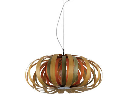
The organic lamp by Bang Design for LZF lamps is reminiscent of various natural forms. The multi-layered wooden hoops which make up the 'Onion Series' differ in their diameter and widths, and are held together by a central metal rod. The lamp is available in a range of versions.
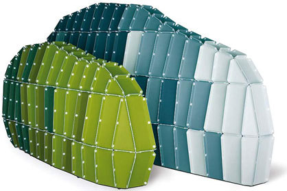
Rocks
These walls are made for deconstructing the space such as work- or sleeping-spaces. The design idea behind comes from 'software': the system allows you to elaborate your taste infinitely by building your own architecture! A special software allows controlling the formative processes. Such as the earth’s surface is in constantly change, the ' rocks' simulate the appearance of earth plates, ripples, caves. The designers have developed a numerically controlled architecture that makes it easy for the user to create different 'rocks'. By using a computerised programme, the rock can be customized in one file which transports the data to the numerically controlled cutter.
Rocks by Ronan and Erwan Bouroullec 2007. Courtesy Vitra Design Museum, Weil am Rhein. Photo: Hans-Jörg Walter

Rocks by Ronan and Erwan Bouroullec 2007. Courtesy Vitra Design Museum, Weil am Rhein. Photo: Hans-Jörg Walter
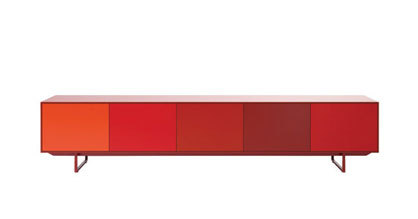
×noon
Noon is a typical product line by Pastoe and is a perfect match for the collection: refined, stylish, simple, but with a wide variety of surprising possibilities. The sideboard 'Noon' receives its special character from the frame which surrounds the whole. The fronts don't have handles but can be closed simply by pressure. Front and back are the same, which means that Noon can be placed anywhere in the room and used anywhere. The whole unit stands on a base lacquered in one of the Pastoe colours. The frame is supplied in one height, one depth and three different widths.
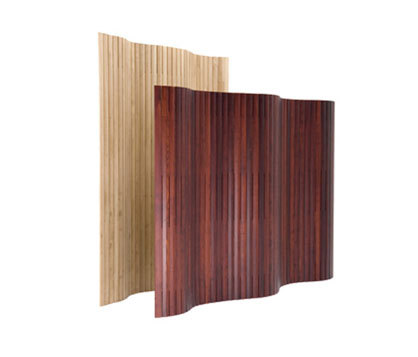
Paravent
The impressive thing about this screen is its slight cross-sections. An ingenious joint mechanism connects the individual elements, creating a surface which beautifully conveys the life and warmth of the wood.
Materials: ash stained either natural wood, red or black
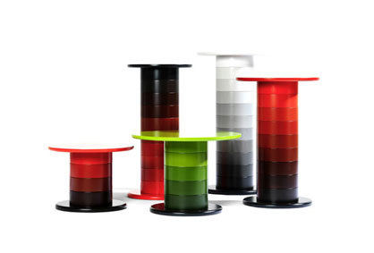
Babel
Babel is the result of a thought that became a very easily understood table system. In the world of furniture, the chair has always played the central role as the individual, and the table has been seen as it’s servant. In Babel Fredrik Mattson has found a shape that allows the table a soul and the possibility to play an important role in an interior.
Caméléon
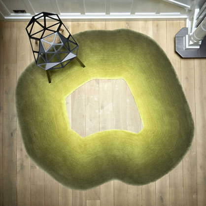
This carpet brings a touch of nature into the home. The organic form in graduated apple colours bears the name of an animal which is famous for the camouflage effect created by its changing colours, the chameleon.
Material: 100% worsted yarn
Corso
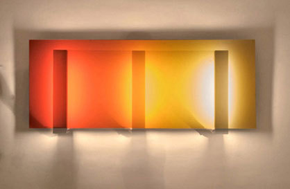
Corso is a wall lamp with a vertical light source on a horizontal background of lightly reflecting material with colour gradations. Thanks to the simple principle of reflecting light Corso is the first fluorescent lamp with chromatic colour gradations which can be varied manually.
nan15
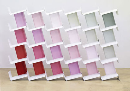
This shelving has an interesting idea behind it. Starting with the kind of bookend which is found in every library Nitzan Cohen has developed an entire shelving system. The base and back form a module with which shelving of any dimensions can be constructed. Even the smallest individual unit forms an element which functions as a mini-shelf. The product has a slightly inclined base which is attached to a side wall at right angles. This means that the books are always ideally positioned on the shelf, even in small groups. nan15 can be extended as required, and also functions as a room divider. The ingenious interlinking of base and upright section makes both sides of the shelving an attractive feature for the home or the office. Consisting only of two differently sized sections of sheet steel, the shelving can be assembled to any required length or height. No tools are required for assembly and sections can be added as required.
nan15 shelving by Nitzan Cohen for nanoo by faserplast 2008
North Tiles
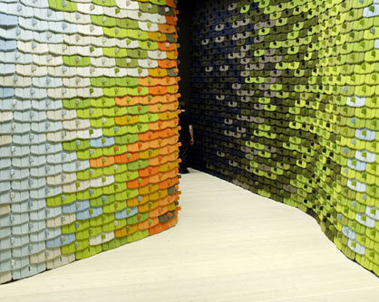
North Tiles by Kvadrat is a system of building blocks consisting of a foam core covered in fabric. These can be assembled and serve as a wall, decorative element or room divider which creates and divides up space. At the same time North Tiles has an acoustic function in that the textiles have a sound-absorbing effect. The system was originally designed by the brothers Ronan and Erwan Bouroullec for Kvadrat's new showroom in Stockholm, which opened its doors in February 2006. The sections are connected by a simple folding system which makes it possible to create textile surfaces to individual ideas and wishes. These textile surfaces can be divided and put together again, which gives the product a high degree of convertibility. The dimensions of a main tile are 28.4 x 64.5 x 1.7 cm and they are available in over 100 colours.
North Tiles by Ronan & Erwan Bouroullec for Kvadrat
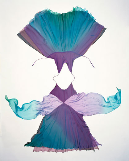
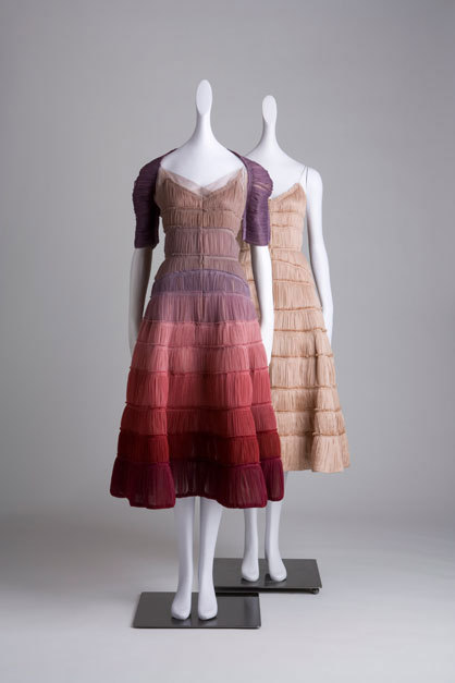
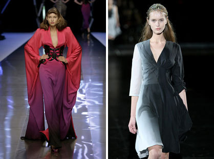
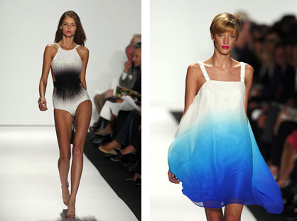
In fashion, too, a clear trend towards colour gradations can be identified. As an alternative to the batik prints from Indonesia which are created using wax applications on the basis of traditional patterns which often have religious or cultural connotations, in modern versions knots and tying techniques using string or similar are used. The patterns are created by the specific application of tying; with varying colour veins or a number of dyeing resulting from the different ways the textiles are tied creating the colour gradations – the dégradé.
Toledo
Until Michelle Obama appeared in one of her designs Isabel Toledo was for a long time known only to fans of avant-garde fashion. At her husband's inauguration as President the First Lady was clothed in a yellow creation by the Cuban designer, which was seen by the whole world and should create great interest in the retrospective exhibition of Toledo's 25-year period of creation which is to be held soon.
It was announced this week that a fashion retrospective celebrating designer Isabel Toledo is slated to open at FIT's museum New York City this June. The retrospective, entitled 'Isabel Toledo: Fashion From The Inside Out', will display approximately seventy looks from the mid-1980's to present, including pieces from Toledo's time as creative director of Anne Klein. The retrospective will be open to the public from June 17th through September 26th.
Anne Klein by Isabel Toledo, Spring 97. Photo: William Palmer
Toledo is not worried about becoming part of the mainstream after being regarded for a long time as an avant garde designer: "I've never been worried about the mainstream because I don't believe that it exists. On the contrary – I find it wonderful I find it great to be able to communicate with a wider public. My husband Ruben and I don't believe that creativity can be evaluated. Avant garde or commerce, fashion or art – creativity simply happens. We artists use our time to create things and not in naming them, giving them labels or defining what it is we do." Source: Bolero Juni/Juli 2009
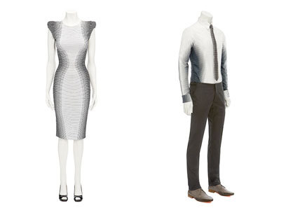
Alexander McQueen
Dress with dégradé look and, as a matching version for the male: cotton shirt with striped dégradé look, 6.5 cm collar and buttons.
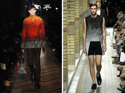
Raf Simons
Raf Simons A/W 08/09 / Raf Simons S/S 2009. Photos: Etienne Tordoir
Alexander McQueen and A.F. Vandervoorst
Knitted viscose dress with stretch, dégradé look, square-edged shoulder pads and buttons / A.F. Vandervoorst S/S 2008 Photo: BST Photos

Knitted viscose dress with stretch, dégradé look, square-edged shoulder pads and buttons / A.F. Vandervoorst S/S 2008 Photo: BST Photos
×Accessoires
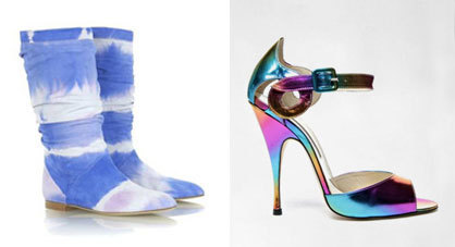
Flat summer season boots in fluid, blue batik look by Brian Atwood. Dégradé-optic also at the disco.
Badgley Mischka
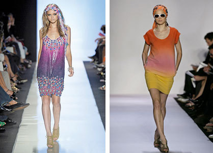
Diane von Furstenberg
Diane von Furstenberg S/S 2009 / Diane von Furstenberg S/S 2008 Photos: BST Photos
Hartmann Nordenholz
