Northern lights: Montana
Brand story by Alyn Griffiths
Haarby, Denmark
10.10.19
In cooperation with the renowned colour expert Margrethe Odgaard, Danish manufacturer MONTANA has developed an impressive new colour palette.

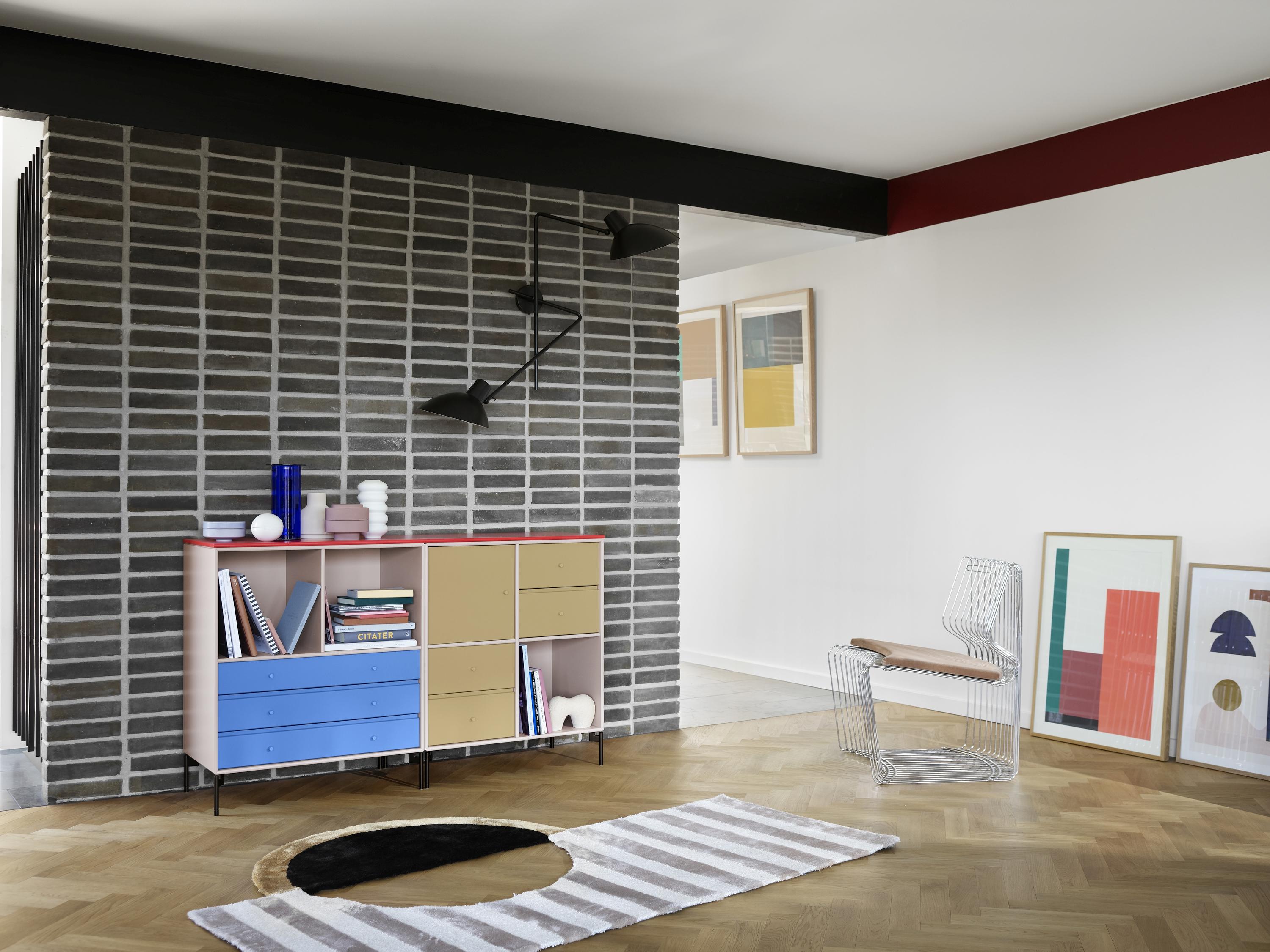
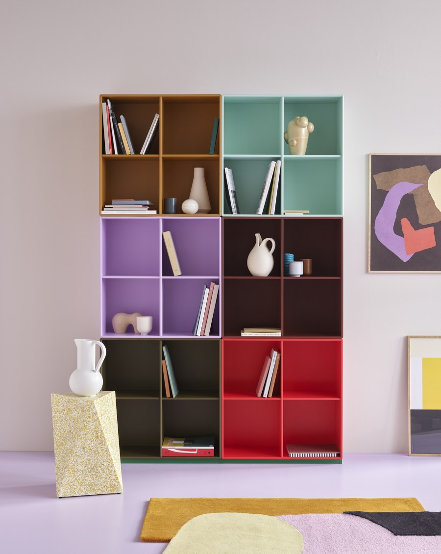
Montana’s modular storage products are available in 40 different colours and two veneers, which can combine in different ways to create a unique composition
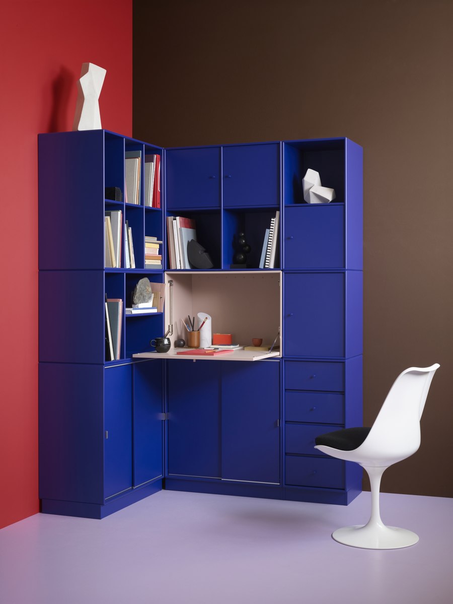
Montana’s modular storage products are available in 40 different colours and two veneers, which can combine in different ways to create a unique composition
×This year marks the 100th anniversary of the founding of the Bauhaus and, throughout the year, a series of exhibitions, events and publications are examining the legacy of the famous school established by Walter Gropius in Weimar, Germany. Perhaps one of the most significant and enduring ideas to emerge from the Bauhaus was a novel approach to colour theory, which was pioneered by the Swiss artist and professor, Johannes Itten. 'Colour is life, for a world without colour appears to us as dead,' said Itten, who examined the use of colour from both an artistic and scientific perspective.
A century later, and colour theory is seen as a vital component of interior design teaching. Itten’s ideas about how colours impact the viewer emotionally, and his texts on the importance of colour contrast and temperature, remain central to the curriculum at many art schools. Contemporary designers also understand and appreciate colour theory and its role in creating a desirable mood within an interior scheme. Warm colours can make a space feel cosy, bright or energetic, while cool colours promote a sense of calmness and serenity.

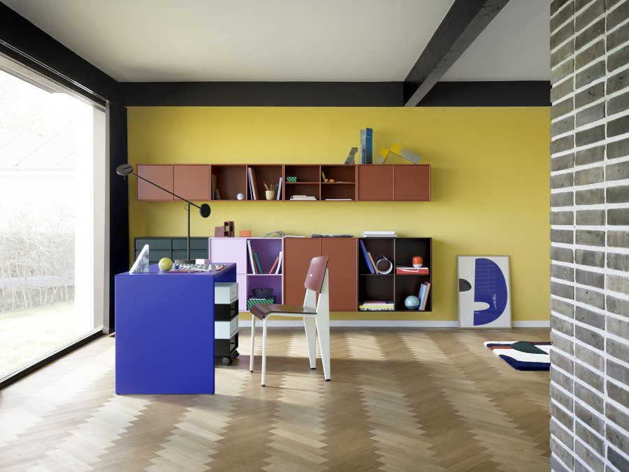

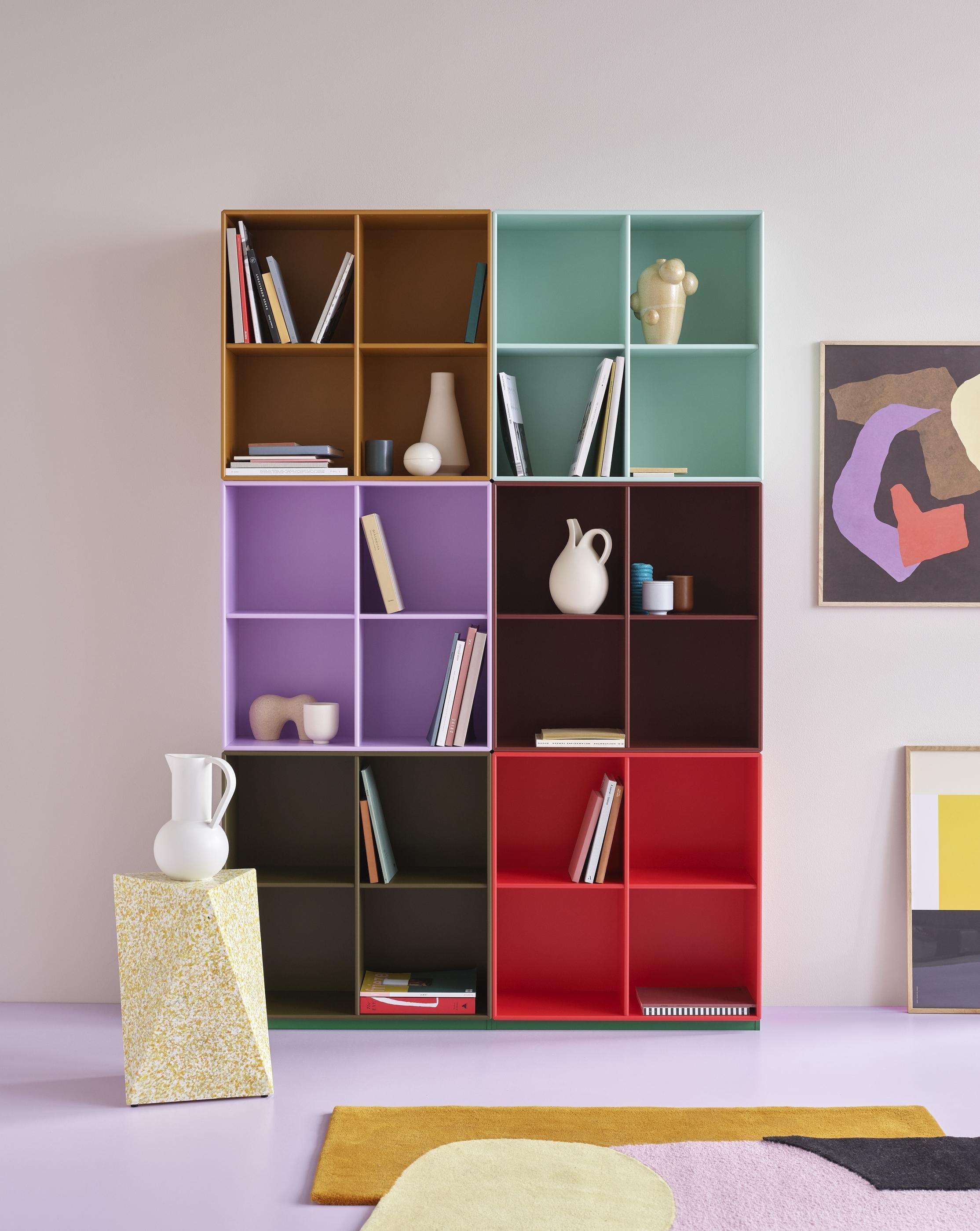
The new palette developed with colour expert Margrethe Odgaard features a variety of poetic and complex colours created to stimulate the viewer’s emotions
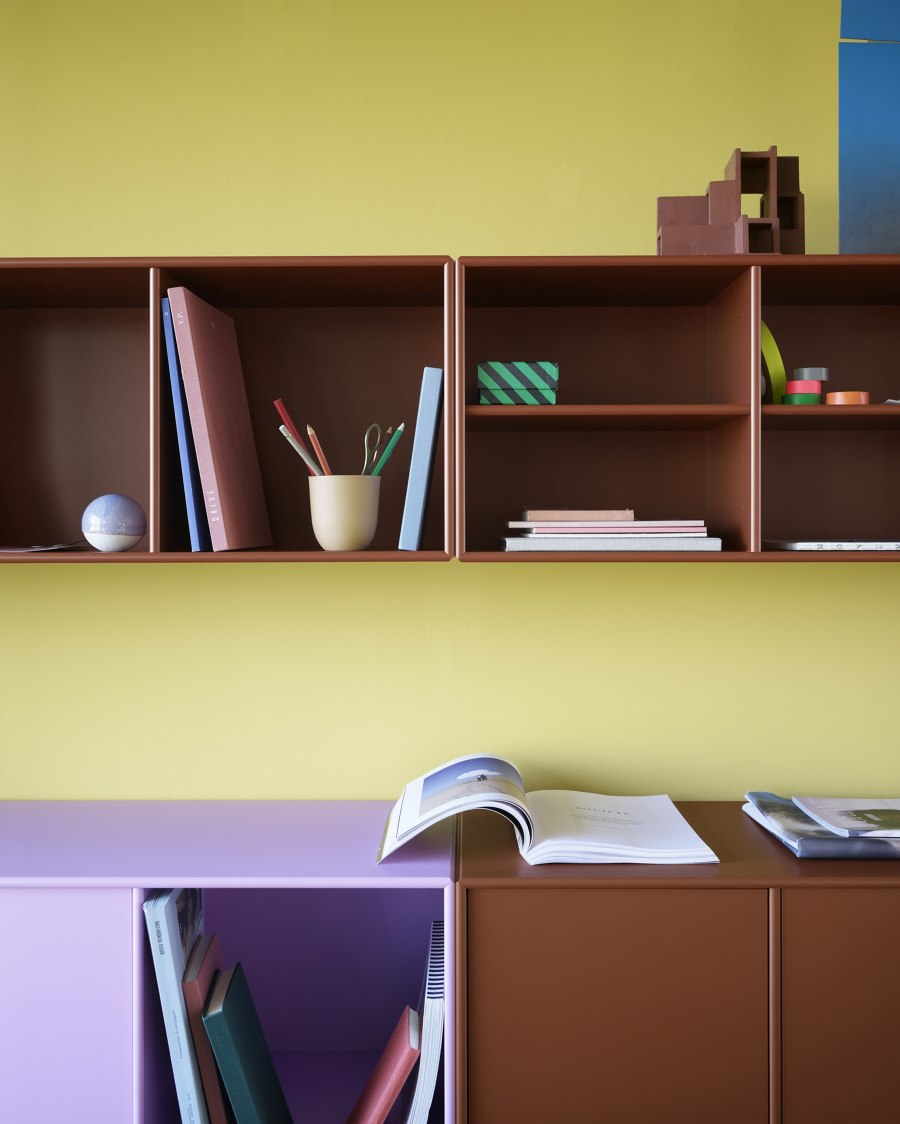
The new palette developed with colour expert Margrethe Odgaard features a variety of poetic and complex colours created to stimulate the viewer’s emotions
×For family-owned furniture company, Montana, the colours of its products and how they work together are crucial for achieving optimum versatility. The Danish brand is best known for its modular storage system designed by Peter Lassen. Its products are refined and pared-back, with the design focusing on simplicity, functionality and attention to detail. As such, the importance of colour is amplified because it is applied uniformly across all surfaces. The palette also needs to ensure a harmonious feel is achieved when different products and colours are specified.
Montana updates its colour palette every eight years, and this year it is launching new hues developed in collaboration with colour expert Margrethe Odgaard. The Danish designer constantly explores colour in her work, and is the author of the book ‘Shades of Light’, which presents 276 colours designed in response to the delicate Nordic light. The palette of 30 new colours created by Odgaard for Montana responds to the company’s human-centred philosophy, which focuses on how people perceive their environment through the body’s five senses.

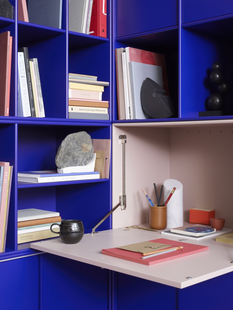
'Just as the modules offer infinite possibilities for combination, the colours also need to be able to be mixed and matched,' says Odgaard of the potential for creating bespoke systems

'Just as the modules offer infinite possibilities for combination, the colours also need to be able to be mixed and matched,' says Odgaard of the potential for creating bespoke systems
×Odgaard based the new colours on positive emotions and our deep-rooted relationship with natural materials such as wood, stone, leather and fabric. This appreciation of nature is integral to Montana’s DNA, and also informs its determination to create products that are made to last, using materials and components from carefully selected suppliers. The company was the first Danish furniture manufacturer, and among the first in Europe, to achieve the official EU Ecolabel for its products, including the colours.
The introduction of six different textural finishes, ranging from glossy to grainy, lends Montana’s furniture an additional tactile dimension. It’s important how the colours relate to other senses such as scent, taste and touch,' says the designer. 'If the colour has a balanced and nourishing expression, if it evokes memories of pleasurable tastes or scents, you are much more prone to surround yourself with it in your home.'

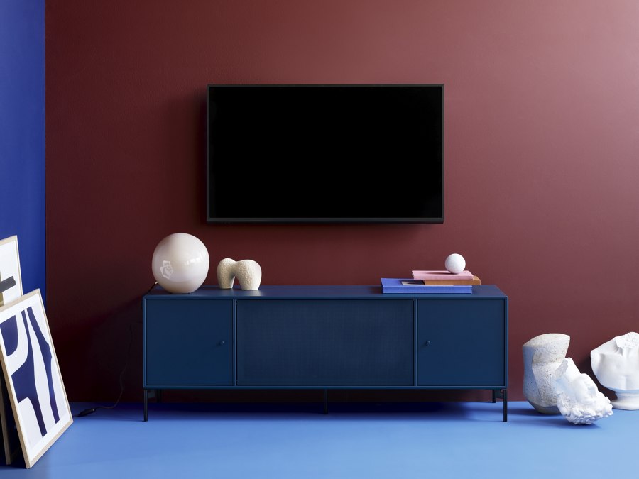

Montana’s water-based lacquer colours are odourless, free from solvents and ecological, which helped the company achieve the EU Ecolabel for its shelving systems
Montana’s water-based lacquer colours are odourless, free from solvents and ecological, which helped the company achieve the EU Ecolabel for its shelving systems
×The 30 colours were crafted to complement ten existing greyscale shades and two veneers, which can all be combined in infinite complementary configurations. Each colour is treated like a person, with its own character and a name that refers to the senses it invokes, such as Truffle, Chamomile, Oyster, Mushroom and Pine. By remaining true to the brand’s core philosophy of caring for the needs of the human body, Odgaard was able to generate colours that feel timeless and lend Montana’s products a new personality. 'It was a joint project, but we trusted Margrethe completely and gave her free hands in the process,' says Montana CEO and Peter Lassen’s son, Joakim Lassen. 'I think that she succeeded in staying true to Montana’s identity and at the same time pushed it to an inspiring new level.'
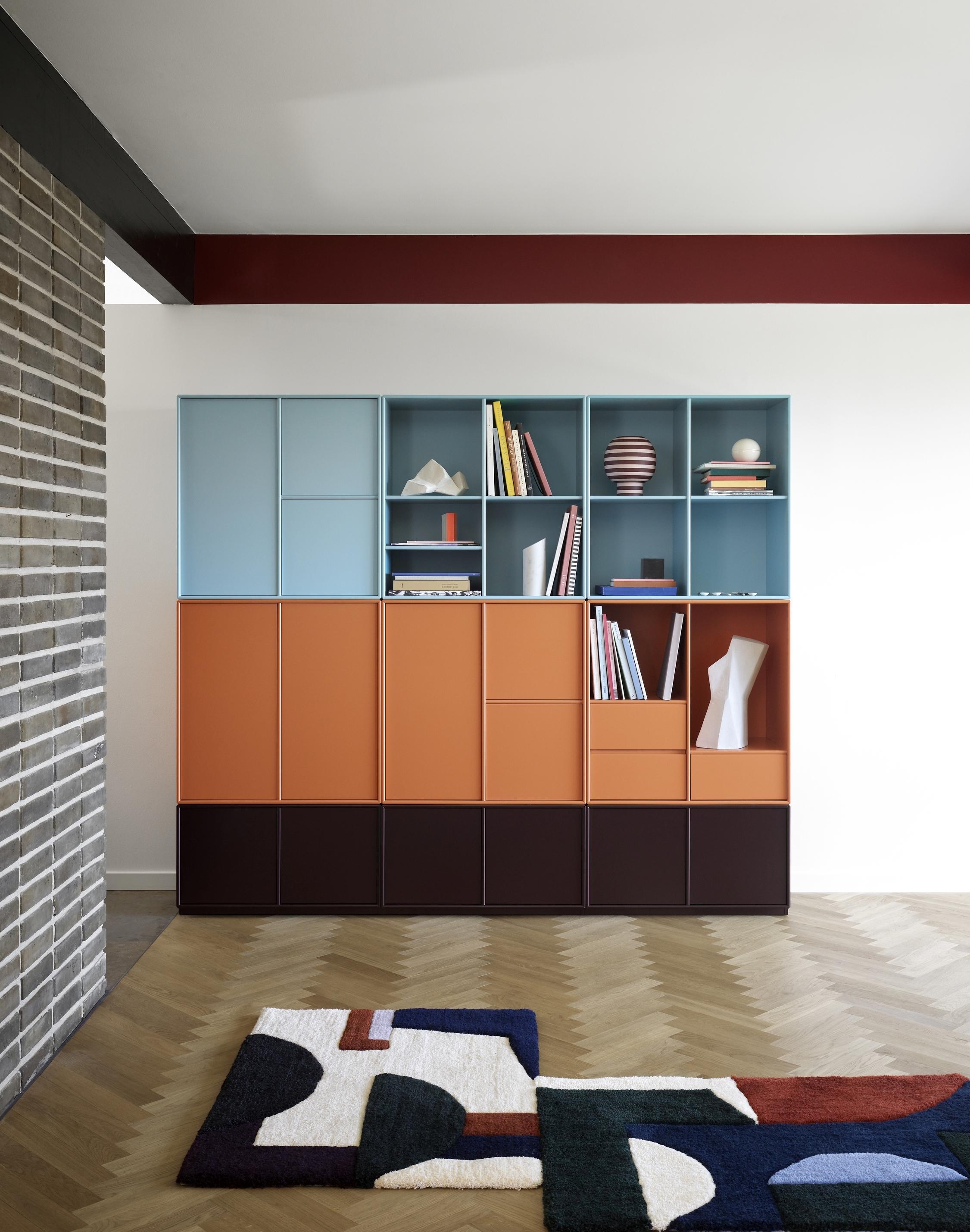
In addition to ten greyscale shades and the two veneer options, the 30 new lacquer colours can transform a room to match its owner’s personality
In addition to ten greyscale shades and the two veneer options, the 30 new lacquer colours can transform a room to match its owner’s personality
×In her statement about the way in which Montana’s new colour palette seeks to evoke memories and feelings in the viewer, Odgaard echoes the sentiment of Johannes Itten, who claimed that: 'Colours are forces, radiant energies that affect us positively or negatively, whether we are aware of it or not.' Those words, published in Itten’s seminal text The Elements of Color in 1961, encapsulate the enduring power of colour to alter how we perceive our immediate environment and the objects we surround ourselves with.
© Architonic