
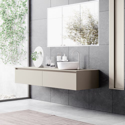
Corian® Citrus Orange
Lastre minerale composito di Hasenkopf

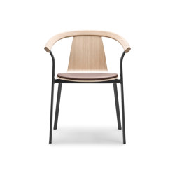
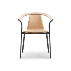
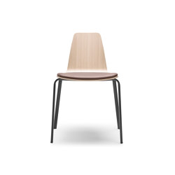
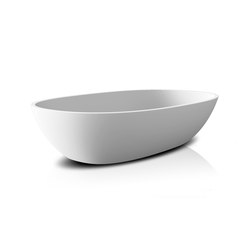
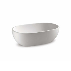
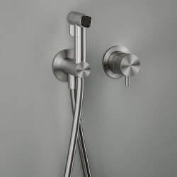
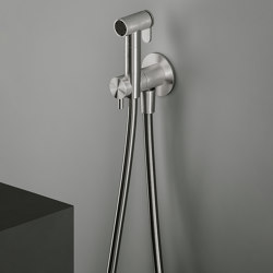
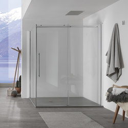
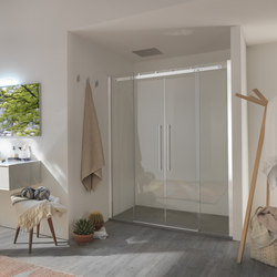
Descrizione del prodotto


Produttori simili
Produttori simili