Man of the Cloth: Cristian Zuzunaga talks textile and more
Text von Simon Keane-Cowell
Zürich, Schweiz
25.11.10
In the (unfortunate) hierarchy of design disciplines – just ask any architect and they'll confirm this – textile design has traditionally occupied a less-than-superior position. Spanish-born Londoner Cristian Zuzunaga has been troubling the creative order of things recently, however, with his conceptually and technically innovative work for such leading textile manfuacturers as Kvadrat and Nanimarquina. Architonic met up with Zuzunaga at the Design Post in Cologne during this year's Orgatec fair to pick at some threads.
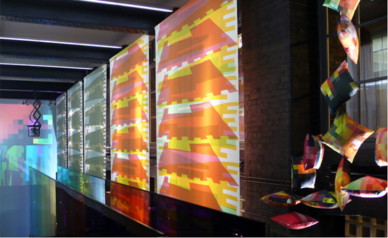
Cristian Zuzunaga's new urban-landscape-inspired collection for Danish design-textile brand Kvadrat, shown at their London showroom during the 2010 London Design Festival
Cristian Zuzunaga's new urban-landscape-inspired collection for Danish design-textile brand Kvadrat, shown at their London showroom during the 2010 London Design Festival
×He may have trained as a graphic designer, but Cristian Zuzunaga is anything but two-dimensional.
Like the material construction of his concept-led designs for high-end Danish textile manufacturer Kvadrat, the young Spanish-born creative's work weaves together a multiplicity of visual and theoretical references. It's fair to say that Zuzunaga, perhaps best-known to date for his digital-meets-analogue pixel design conceit, articulated in its bold application to upholstered furniture (such as Ligne Roset's somewhat iconic Michel Ducaroy-designed 'Togo' sofa) and in its use in fashion, makes his work work as hard as he does. Beyond its function as a strong aesthetic, somewhat ironic, statement, this type of work also sets out to examine the relation between the two- and three-dimensional, the micro- and the macroscopic, the static and kinetic. Not bad for a bit of fabric.

'A life without pattern would be like a life without identity': London-based Spanish designer Cristian Zuzunaga
'A life without pattern would be like a life without identity': London-based Spanish designer Cristian Zuzunaga
×But Zuzunaga is keen to show us there's more to him that just being 'that pixel guy'. His latest work for Kvadrat pulls the plug on the digital references and instead uses the dense architectural landscape of the world city, with its large-scale formal language, as a starting point for abstraction. The architectonic richness (and, at times, craziness) of urban space is marshalled in this new project to create textiles that serve, in their use, to help define interior spaces. The outside steps inside.
Zuzunaga is himself a citizen of the big city, having decided to remain a Londoner, as he chooses to identify himself, since graduating from the Royal College of Art. (Spain's loss is the UK's gain.) He's such a Londoner, in fact, that when we arranged to meet at the Design Post in Cologne during this year's Orgatec fair, he turned up late, still on English time. Naturally, he was very apologetic. And Architonic readers need not fear being short-changed. The passionate way in which the man spoke about his work and the broader ideas that inform it more than made up for it.
'Letterpress allowed me to study the idea of time and evolution in a city': Cristian Zuzunaga, who graduated from London's Royal College of Art in typography
'Letterpress allowed me to study the idea of time and evolution in a city': Cristian Zuzunaga, who graduated from London's Royal College of Art in typography
×....
Why did you create these new textile designs for Kvadrat?
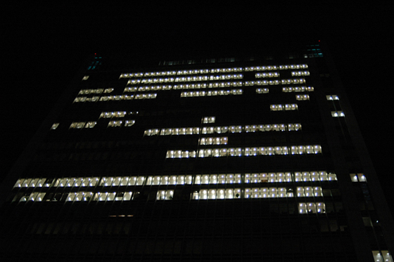
It's been a long project. People might know my work from the pixels. But I was ready to move forward from it. This work is inspired by cityscapes, from the urban landscape in America, Europe and Shanghai. It's the relationship we have as human beings with our environment. How much it changes as much as it is changing us. So in this collection I tried to reflect the idea of time, repetition and space in colour and form and to introduce a movement into the static-ness of the prints. For example, my 'Cityscape' design features three simple shapes, but they repeat every 8,000 or 10,000 metres.
That is some repeat.
I didn't calculate it. I was kind of naïve. But it's really interesting. It shows the idea of being able to recognise something, but at the same time it being different. So it's like ourselves or the environment, changing every day.
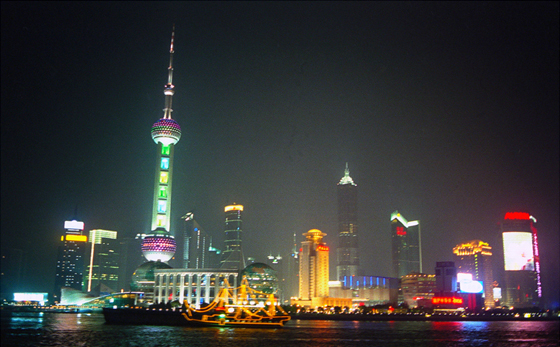
Zuzunaga's new collection for Kvadrat is inspired by the architectural forms and cadences of such world cities as New York and Shanghai; photo of Shanghai by Cristian Zuzunaga
Zuzunaga's new collection for Kvadrat is inspired by the architectural forms and cadences of such world cities as New York and Shanghai; photo of Shanghai by Cristian Zuzunaga
×I think it's interesting that there is a reference in these designs to the built environment. Here you are, a trained graphic designer – which, conventionally, suggests the two-dimensional – designing fabrics that are both two- and three-dimensional and are used to inform and define space, which, graphically, refer to large-scale, three-dimensional architectural forms. There's a lot going on there. Do you consciously try to cultivate this in your work?
100 per cent. I trained as a typographer, but 2D was always frustrating because the environment is always 3D. Then in 2004 I discovered letterpress. When you hand-print stuff, suddenly you have different layers building up. Textures and colour and shape become more prominent, more feminine in a way, because they were not as flat as on a computer screen. But still, the result is paper, unless you wrap it up, or give it a different value, or collaborate with a different discipline or designer.
At the same time, I was researching about architecture and how it makes us be, and how we should be designing a city in relation to the human being. I felt compelled to explore the past through print and I did this through visiting and revisiting the city. And in London it was perfect: you have everything from a Roman wall to a modernist building to the postmodern. Letterpress allowed me to study the idea of time and evolution in a city.
So, it's amazing to be working with Kvadrat some years later: working with scale, working with 2D elements but you know it's going to be woven or printed. There are different options there. And restrictions as well, of course, which is important. But, you know the product is going to have an effect on the environment, it's going to go within a building. It's going to change the inside, the outside...
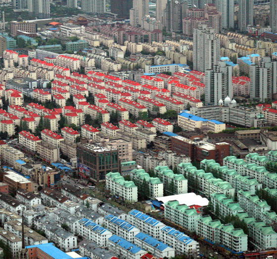
From urban fabric to actual fabric: Shanghai as one of the cites to inspire Zuzunaga's textile designs; photo Cristian Zuzunaga
From urban fabric to actual fabric: Shanghai as one of the cites to inspire Zuzunaga's textile designs; photo Cristian Zuzunaga
×For someone who did train in typography, has that acquisition of awareness of how your work relates to space in a three-dimensional way been challenging in terms of a learning process? And, if so, how?
It's been challenging, but thanks to the tutors I had at the Royal College... Again, letterpress made it. And screen-printing and etching. Because it's a three-dimensional approach to design. You are really playing with shapes. They have weight. Some of them are heavy. You start having a different approach to typography compared to working on computer. So, in that sense, it helped enormously because suddenly negative space, positive space become really necessary to work with. Once you master type or type as image, then you start to understand 'Why not architecture? Why not the urban environment?'
I learned was that, when you work with scale, if you reduce something it will always become much stronger. The opposite doesn't happen normally. So the challenge with this particular project was how to design with a three-metre curtain in mind, and try to challenge ways of working that have been around for centuries. I always try to add something new.
As you say, there is often a desire on the part of graphic designers to reduce in scale. Particularly when it comes to type. Along the lines of 'make it as small as possible'.
True. But this had to be a statement, also. I was inspired by Shanghai and New York, but especially Shanghai. As a metaphor for young creativity. Architects and interior designers, trying to mimic what we've done in a 150 years, they've done it in 15 years. It's a sign of power. Tacky at times. If I had to be true to the project and evolve, and feel that it was going somewhere, it had to be a bit bolder. It had to have detail as well, when you get close to it, but it had to have elements of, for example, how Shanghai glows at night. And that we've successfully, even without printing. Just using thread that traps light. From a distance you see an image, but when you get closer you see the mini threads, which is the mini skyline. It's macro and micro. I hope it's inspiring for other people, such as architects.

Did you have architects in mind as possible users of these textiles when you were designing them, given that one of the ways of reading the designs, graphically speaking, is as the built urban environment?
One one level it was a tribute to all the architects who have inspired me. In a way giving something back. I swallow cities visually. In terms of the modern architects, Jean Nouvel and Rem Koolhaas have inspired me. Norman Foster also, to a certain extent. Richard Rogers and Renzo Piano, too. But I didn't want to encapsulate them in time. I just started to look at some iconic buildings. From above, from different angles. I was kind of drawn to these shapes and images. But some of the shapes, now that I look at the curtains, I think 'I didn't plan that to happen.' It's strange. It's like when I see certain buildings now. They can influence me, even if I don't know who made them.
Well, the impressions the environment makes on us operate on an unconscious level as well as a conscious one, for sure.
I wanted to ask you about your previous work, and the way that it refers to things digital, or, rather, to how things that are rendered digitally look. What role does the digital play itself in the creation of this type of design work, in terms of process, given the way it's referred to aesthetically?
When I went to Shanghai for the first time when I was at the Royal College, that's when I really saw and understood the digital age. Just how powerful it can be. Both positive and not so positive. And at the time I was still working with old techniques. I realised if I wanted to do something that wasn't just about me, but to really give something, then I'd have to try to use new technologies. The funny thing was that because I'd used old technologies like letterpress for so long, as soon as I went into wanting to represent the digital age, I didn't really know much about how to use computers – Illustrator, Photoshop, and so on. Some friends, of course, mocked me. But it actually became an advantage.
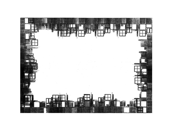
'Encoded Message': architectural form echoes digital interfaces; photo (London) by Cristian Zuzunaga
'Encoded Message': architectural form echoes digital interfaces; photo (London) by Cristian Zuzunaga
×How so?
Because it means that you have to work intuitively. For me, it was a process that was really random. It's when you realise that you've clicked into something and it's bigger than you are and you really need to let it grow. It's going to inform you, who you are. You can't really dictate it. So that's what's been happening. And recently, on this new collection, it was about looking at very analogic ways of working – walking through the city, taking a lot of pictures from all angles and then getting hundreds of cityscapes and then taking them back to the computer and trying to identify elements that are recurrent. And then abstracting them.
So it's both a digital and an analogue way of working that allows this friction to happen. The colours that we've chosen are consciously vibrant and are combined in a way to create a glow that represents the digital. That kind of glow you get when a computer screen opens. But the shapes also, while suggesting the cityscape, are also very digital. They relate in places to the pixelisation of image. Like when you're watching a YouTube film and suddenly the picture breaks down. To me, I love these moments. I think they are moments of reality.
Yes, those accidental moments are important interventions, where you wake up and become aware of the medium.
I thought it was hilarious when my friends in Spain first started getting plasma TVs. By choice I've not had a television for 14 years. I was drawn to the crap quality. I'd ask 'What's happening there on the black?' 'Nothing.' 'What do you mean, nothing?' They just didn't want to see what I was seeing. Probably because they'd paid a lot of money for it. (Laughs.) That's what started my thinking about pixels.
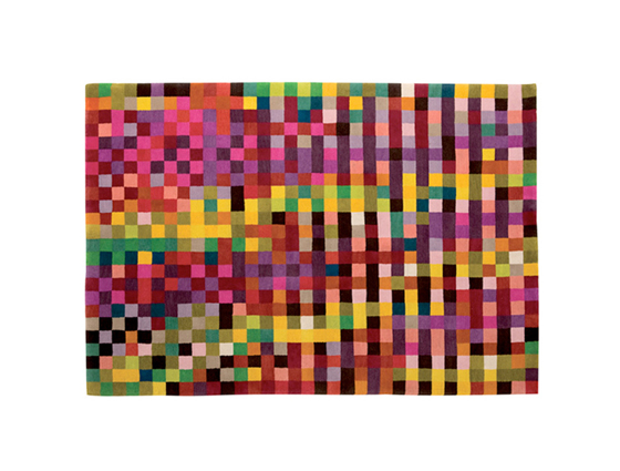
'Digit' rug by Cristian Zuzunaga for Nanimarquina, 2010
You've reminded me of a recent conversation I had with my father about him wanting to buy an incredibly large plasma-screen television. We appear to be being sold the desire to enter into a digital reality, to be part it, fully immersed. But what strikes me is that you still see the pixelated-ness of the image. Again, the macro and the micro.
I don't know if it's a loss or not. I think we're privileged as a generation in the sense that we had the analogue. I still remember having a black-and-white Philips television in the 80s in Spain, with just one channel. Or 'Star Wars' in black and white. Then, for me, the excitement of seeing it ten years ago in colour, and then seeing it in HD. It's like watching a new movie every time. The story in itself doesn't change. What changes is the perception of it through new developments in a way. And think that's enriching for our senses. But what does that say about reality? I'm not that sure.
How conscious are you in the design process, the production process and the longevity of the products you design of things environmental?
Now, thanks to this collection, I think the message is starting to get across, because there's something other than the pixels to talk about. And I'm really happy about that. It's easy to be compartmentalised, but also easy to fall into your own trap. I'm just a designer. But every designer ought to be conscious of the effects of what they create. About the lifespan, about the environmental and the economic implications.
When I was in China, I realised that my work needed to be a criticism at the same time of what we are doing. That we are living in an unsustainable way. And I realised this is because we are fragmented, and we have a lack of feeling as individuals. Some people, of course, are more balanced than others. Perhaps I was projecting and it was me who was fragmented and dark inside, and that's why I was using all these colours.
Digital meets analogue in Zuzunaga's pixel design conceit, applied here to cushions for Kvadrat
It could be both.
In a way we are channels. We are alchemists. We are not robots. We are so much more than something mechanical that is simply switched off when we die. We have to live for and through the senses. That's why I use multicolours. And when I saw how people reacted to them I realised what I was doing was selling emotions.
And the point at which design establishes that emotional connection with users, there's more chance that those types of products, objects will have a longer lifespan because they will be kept. They'll be held onto. They'll become companions.
Absolutely. But I try to work with companies, like Kvadrat, who themselves are trying their best to produce responsibly in terms of the environment. With digital technology, it allows you to reduce the use of chemicals. When you print, for example, it's like a tattoo. You print onto the fabric. It's not like using solvents to wash screens and so on. Obviously, I have more to learn, so I try to be involved in the production process as much as possible. You have to design with that in mind.
Can you imagine a life without pattern?
No. (Laughs.) It would be like a life without identity. If you look back to ancient tribes, you had pattern. Like tartan for example. In every place there was a sense of colour and shape. Pattern has helped us to be who we are. To evolve and differentiate. To create depth, distance. If you go to South America, you see why they used certain shapes and you listen to their stories, and it all makes sense. I think we need more pattern, to be honest.
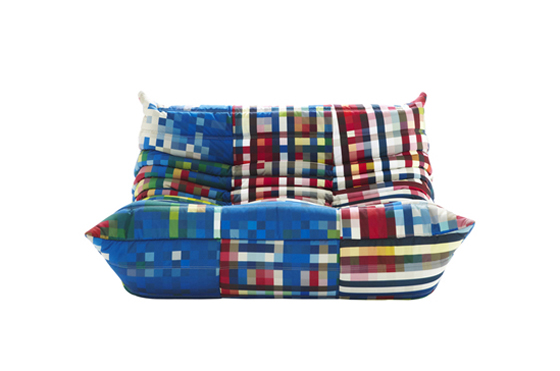
A classic sofa design – Michel Ducaroy's 'Togo' for French manufacturer Ligne Roset – enters the digital age with the application of Zuzunaga's pixelatd fabric as upholstery
A classic sofa design – Michel Ducaroy's 'Togo' for French manufacturer Ligne Roset – enters the digital age with the application of Zuzunaga's pixelatd fabric as upholstery
×Yet, pattern design has, historically or at least in modern design history, has occupied a somewhat lower position in the hierarchy of creative disciplines, being so closely associated with the purely decorative. There's been this idea that it's not essential, or perhaps even frivolous. That we could live without it, and so on. Look at modernism, defining something through line. Pattern is seen, in contrast, as optional.
Well, pattern would be the feminine, perhaps, in society. The element that would tie the whole thing together. I love buildings that are simple, but some of them are extremely cold. I love the work of the modernists, that stripping-down of the decorative impulse of the past. But I think we lost too much. But even there, for example in the use of marble in Mies van der Rohe's work, this was pattern. It's just that it wasn't repetitive. What I was trying to do in Asia with the digital – and the pixel allowed this, although it took a few years to convince companies – was that you can have a repeat that is 50 metres long.
At that point, one's awareness that the pattern is a repeated one disappears. It's sameness, but with an awful lot of difference in between.
And that's what I like. But at the same time such patterns are difficult to explain.
You're operating in this fascinating space between 2D and 3D, between the graphic and the architectural, the space-defining. Do you plan to keep working at this interface?
Well, I love it. It's challenging, and through it I come into contact with challenging people. To me, I don't like to be in a box. I try to grow as projects come to me, or as I get drawn to them. I want to continue collaborating with companies or individuals that allow that growth. It's been great to design a curtain collection not having trained as a textile designer. Sometimes you can waste too many years trying to know what you can do that you end up losing the perspective of things. Recently, I've been given the opportunity to design some logos and branding with typography. And it's extremely fulfilling, whereas it used to be so boring.
It seems like there's very little repeat in your career as well as your textile designs. Cristian, thank you very much.
.....